Established in 1872 in Neenah, Wisconsin, Kimberly-Clark, a company behind such popular personal care brands as Kotex, Kleenex, and Huggies, has updated its visual identity. This is the company to which we owe familiar products like toilet paper, baby diapers, paper towels, and other hygiene items. All these products were once invented to meet the needs of a developing society. Today, Kimberly-Clark’s engineers develop new technology that will help reduce the prices of supplies and facilitate waste recycling. Now headquartered in Irving, Texas, the company enjoys an average annual revenue of $18 billion, with a staff of more than 40,000.

Feeling the need to further evolve its identity, Kimberly-Clark approached Someoddpilot, a design agency from Chicago, Illinois. Recognizing the scale and historical significance of the brand, the designers came up with an idea based on the company’s innovative potential. However, the new brand system, according to the agency, should highlight “responsible innovation” as the core principle of Kimberly-Clark, in contrast to “disruptive innovation”.
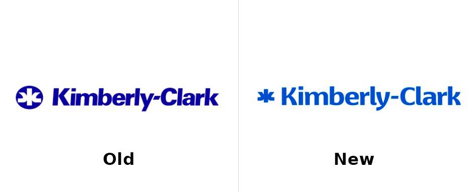
Paying tribute to its 152-year heritage, Kimberly-Clark retained the basic structure of the logo, which is quite reasonable for a long-standing company. Both the icon and the wordmark were slightly redesigned to have a more modern appearance. The K-C lettering is now executed in Basel Neue Bold by Isaco Type, abandoning a barely visible slope. The kerning changes are noticeable in the more rounded strokes in the “K”, “b”, and “y”, as well as slightly wider spaces between the letters.
In line with the typographical adjustments, the icon’s outline was also corrected. The monogram reflecting the company’s initials dropped the outer circle, while its curves demonstrate a greater balance with a more compact size. Although the old version wasn’t bad, the redesign’s rationale required some minor updates to the icon as well. For broader branding, the symbol was reimagined to become a motif element for different images and visuals.

The branded typography is not limited to the K-C wordmark’s font. Additionally, the corporation will use the Lato typeface designed by Lukasz Dziedzic. It belongs to the top ten fonts available on the Google Fonts website, distinguished by offering ten different styles. In fact, Lato, along with Montserrat or Roboto, is a common choice for companies looking to avoid additional costs for typography.
The brand’s color palette consists of three hues. Deep Sky, as the primary color, symbolizes the essence of the brand, connected with the technological and innovative image of the company. Tangerine, a shade of orange, conveys the “care” associated with Kimberly-Clark’s branded products. Treeline (green) is intended to reflect the company’s commitment to eco-friendly production and a special relationship with nature in general.

Illustrations always add diversity and interest to a brand. In the K-C branding, the images feature versatile forms and shapes that directly showcase the company’s products. While this may seem like a straightforward solution, it is designed with a certain taste, representing practical depictions of goods for everyday use.
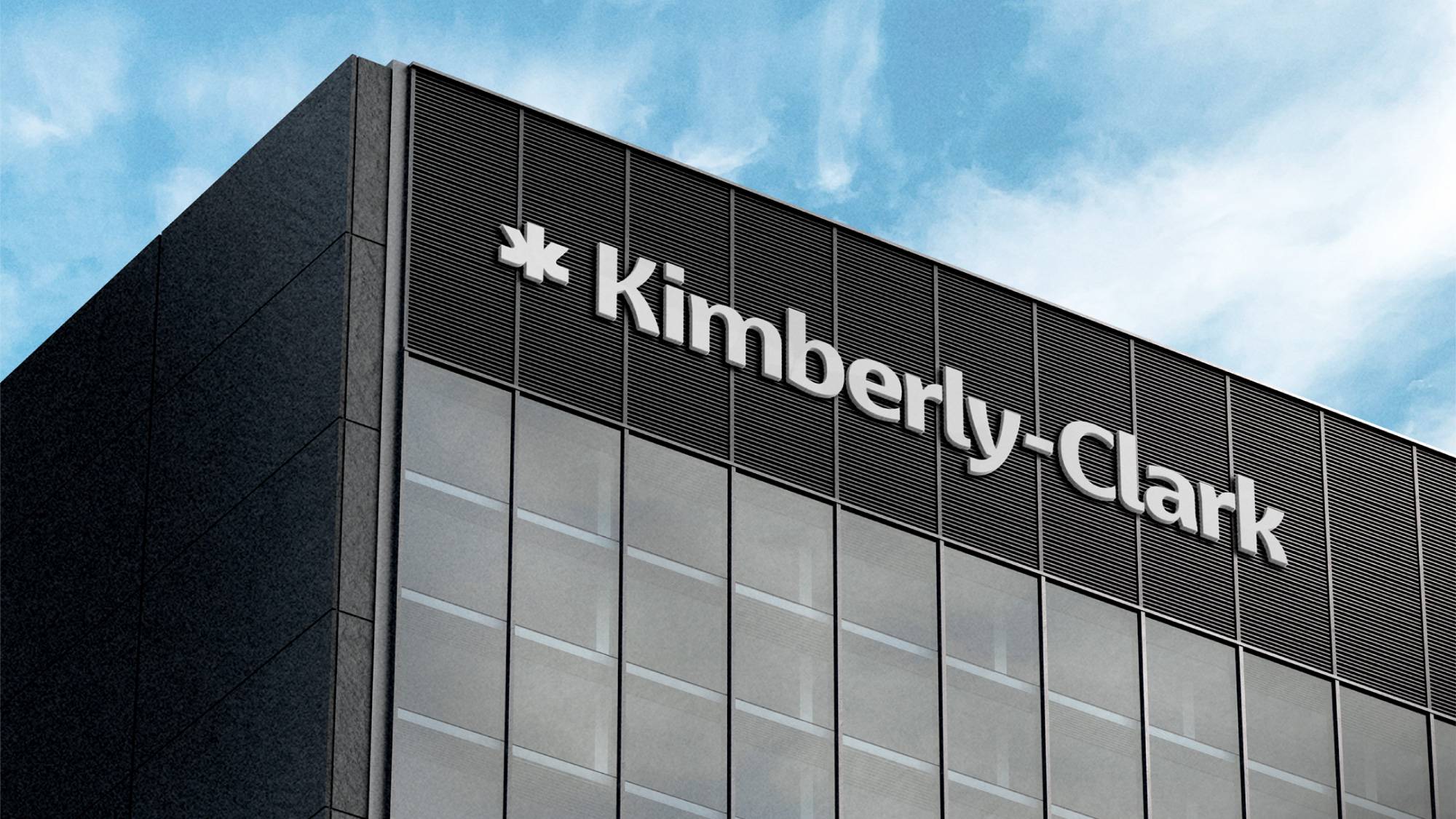
Kimberly-Clark is undoubtedly an iconic company, whose history is connected, in a way, to the global history of the past century and a half. Now, the firm’s traditional identity is reinterpreted according to modern design trends, remaining a symbol of quality and care that makes everyday life a bit easier.





Leave a comment