Such cosmetic and perfume brands as Paco Rabanne, Nina Ricci, and Jean-Paul Gaultier are rather popular among fashion and luxury enthusiasts. However, few know that all of them belong to Puig, a multinational company based in Barcelona, Spain. Established in 1914, the firm actually has a rich history, associated with iconic products like the Milady lipstick and the fragrances Agua Lavanda and Agua Brava.
Due to its collaboration with many fashion houses, Puig, which still remains a family business, has become one of the largest corporations in the industry, with a net annual income of more than $450 million. Earlier this month, the company held the largest IPO in Spain since 2015, which was accompanied by a presentation of Puig’s new visual identity.
Unveiling the fresh design, the brand marks a transformational moment and more clearly emphasizes its positioning as a “Home of Creativity.” As the company’s CEO Marc Puig said, the whole history of the company has been full of commitment to innovation, and the firm has been a welcoming place for different brands to gain extra luster.
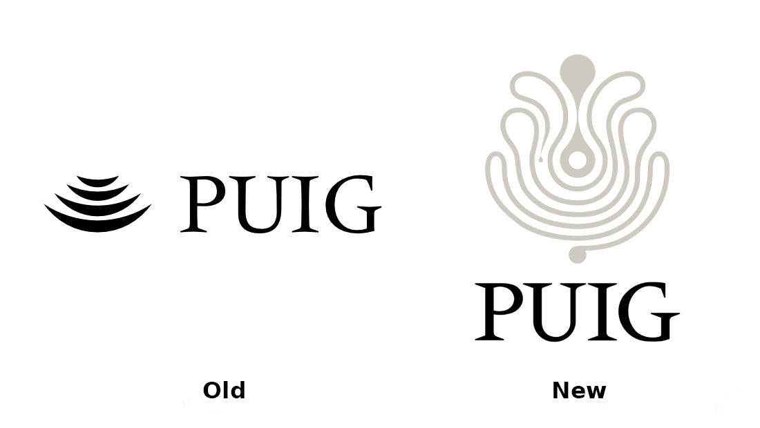
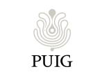
The current rebranding is the first logo change of Puig in 45 years. The company’s previous emblem, known as Four Moons, was created by Swiss designer Yves Zimmerman. For the new iteration, the Paris-based studio M/M rethought that iconic symbol, creating an ornamental sign drawn with a continuous, labyrinth-like line. Resembling a fanciful flower, the pattern is said to be inspired by works of the prominent Spanish painter Joan Miró, who collaborated with the brand as well.

According to Puig, it perfectly reflects the culture and values of the brand. “We are placing creativity at the very center,” the company adds. As the studio explains, in the creation of this logo, they wanted to add some sensibility and human voice to the brand’s image, just what the old emblem was lacking.
Creating the Four Moons logo in the late 1970s, Zimmerman took inspiration from avant-garde art, and for the wordmark, he chose the Méridien typeface developed by Adrian Frutiger in 1955, as the font’s slightly curved serifs were a good fit for the semi-circular shapes. Respecting that classic look, M/M redesigned Puig’s traditional typography into a new custom typeface named Paralelo, distinguished by an asymmetrical design with straight serifs, enhancing the assertiveness of the glyphs with a combination of angles and curves.
At first glance, the new Puig branding may seem inconsistent with an abstract icon and a strict wordmark if measured by the general rules of modern design. However, we should consider the field and heritage of the company as well as the desire of the M/M designers to pay homage to Puig’s legacy itself and the great European artists who were giving their creativity to the brand. In fact, Puig stays within the traditions of the fashion and fragrance industry, where you can find very different combinations of styles, colors, and scents.






Leave a comment