Switzerland has revamped its tourism brand, replacing the logo known as Goldblume (“golden flower”) with a new emblem featuring the Swiss Cross and the English name of the country.

Since 1995, Switzerland’s tourism sector has been overseen by Switzerland Tourism (ST), a national organization. Thirty years ago, ST adopted the Goldblume as its inaugural logo, designed by Swiss designer Hermann Strittmatter from the GGK agency. The emblem depicted a three-dimensional image of a shimmering nine-petal flower (resembling an edelweiss, the country’s floral symbol) with the Swiss flag at its core.
This rebranding initiative is part of a broader transformation of ST, formerly known as the Swiss Transport Center. The primary objectives of the overhaul are to enhance the tourism brand, establish a distinctive digital presence, and raise global awareness of Switzerland Tourism.
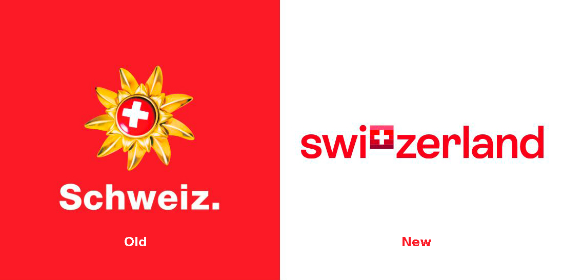
By incorporating “Switzerland” into the new logo, the organization is pursuing a unified brand strategy. While the country is known by different names in its national languages and internationally, its English name emerged as the most recognized during a pre-rebrand survey conducted in Germany, France, Italy, South Korea, and the Gulf countries.
Regarding the rebranding, ST highlighted its history of setting new standards in tourism advertising. Presently, ST is striving to innovate within the realm of a “digital brand world”. The use of the English “Switzerland” as a foundation for tourism and travel in the country conveys a universal promise to visitors about Switzerland’s natural beauty, hospitality, and reliability.
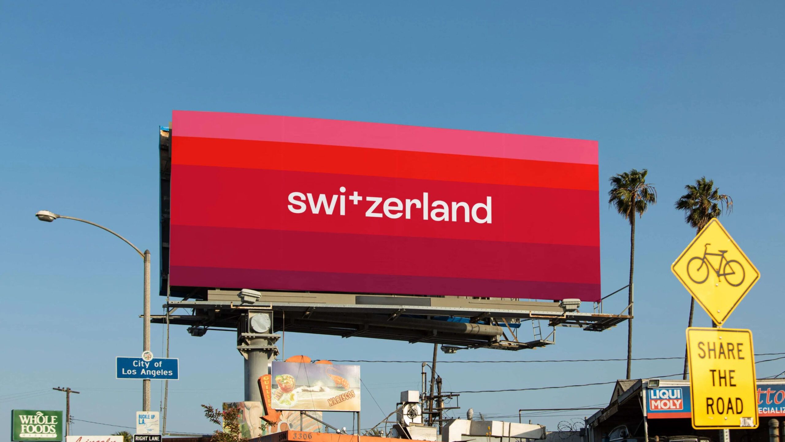
The logo features the Swiss Cross instead of the “T”, emphasizing the destination. Beyond representing the national flag, the symbol incorporates a five-shade red gradient to symbolize diversity, modernity, and independence.
In fact, the lowercase lettering is designed in the brand’s new corporate typeface named ST Allegra developed by Type Foundry Extraset from Geneva. Though, it shouldn’t be confused with the Swiss Allegra font family by Jost Hochuli and Roland Stieger. Made Identity, a design agency responsible for ST’s rebrand says that ST Allegra has a clear language, describing it as a “font that smiles and welcomes you”. The new typography has replaced the previous set that included different fonts, like Helvetica, Messina, Nantes, and Lato.
The new brand identity is centered around the slogan “Our nature energizes you”. Through visuals, the essence of Swiss nature is conveyed, with the five-tone icon resembling the glowing sunrise in the Alps capturing Switzerland’s energy.
To present the revamped brand, Switzerland Tourism released a promotional video titled “Ready for Tomorrow”. The updated visual identity can already be observed on the organization’s official website, myswitzerland.com, with plans for additional brand-new apps in the near future.









Leave a comment