
The redesign has been carried out by the New York-based design studio Franklyn and aims to redefine and expand the assets of WeWork, which could co-exist with the pre-existing things, not changing the image of the company.
While WeWork’s previous branding by GretelNY partly included a colored design for the logo and other visual elements, the new look features a black-and-white version of the logo only. This formal solution, according to the company, seeks to make the brand more consistent in different contexts, whether in digital apps or physical signboards.
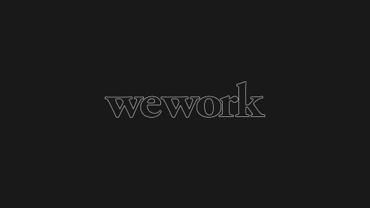
The project is also concerned with improving and stylizing the kerning which now makes the logo more legible and finer. A special zest here is separating the serifs in the “w”’s which were connected previously, forming a kind of a triangle inside the letters. This iteration doesn’t only improve the aesthetics of the logo but also makes the old and new signatures easily co-exist, as WeWork explains. The company is apparently planning a gradual transition, using both versions for some time.

Another important aspect of the WeWork redesign is the change in the brand’s visual assets. Franklyn presented a new palette of additional colors which will complement the black-and-white logo. These new colors give the brand more opportunities, providing greater flexibility in visual communication.
Besides the colors, the rebranding also includes hand-drawn images of people and working spaces, which will be used as a part of the visual identity. These pictures add some warmth and humanness to the brand and are a significant innovation, compared to the old photo-based design.
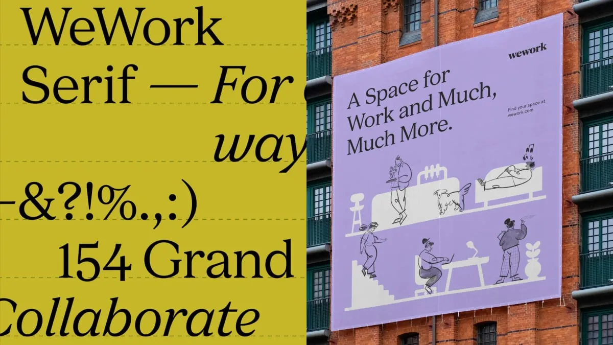
When it comes to typography, Franklyn offered a new typeface named WeWork Serif that represents an advanced version of the brand’s previous font. An additional font called Aperçu Pro is designated for body texts.






Leave a comment