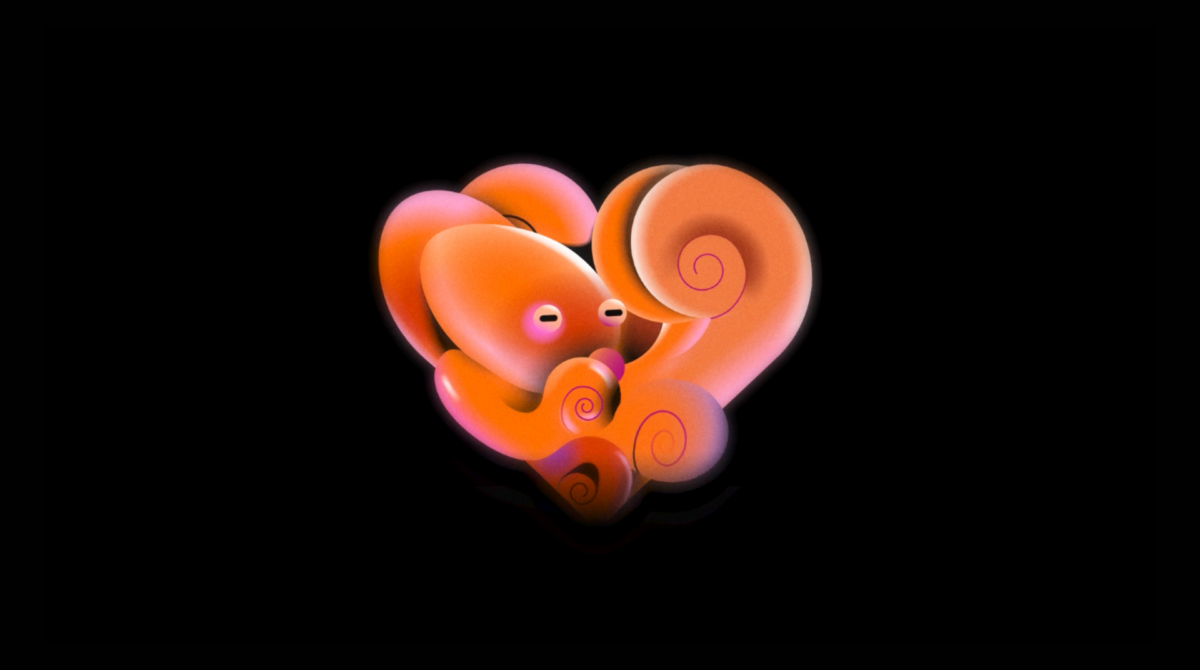
Why touch the logo of an iconic brand like Netflix? Is it necessary? Actually, no. The goal of the Netflix project was to create a proper language. According to Koto, the streaming service wanted this language to be implemented into its experience with production and beyond. Starting from this point, the studio upgraded the previous design system with brand-new iconography, typography, and imagery.
Koto departed from the unidimensional and oversaturated approach to the graphic language which is so typical for the technology and streaming world. This resulted in “a style appealing to movie lovers and essentially feels like Netflix”. And besides, it stays true to the company’s basic values: to be pioneering, welcoming, and inspiring.
![]()
Functionality and adaptivity are crucial points in the new visual system. With different visualization experiences of the platform, one of the goals was to ensure that iconography stays unchanged for various formats and devices. Additionally, the custom typeface Netflix Sans of 2018 was changed in weight and size. The typography correction provides flexibility while adapting to different screen proportions and fonts.
In combination, the Netflix visual system includes a range of features that cover different messages inviting users to interact with popup hints. The graphic language provides storytelling tending to a cheerful and casual tone, while the set of images is intended to guide the audience to create a stronger experience.
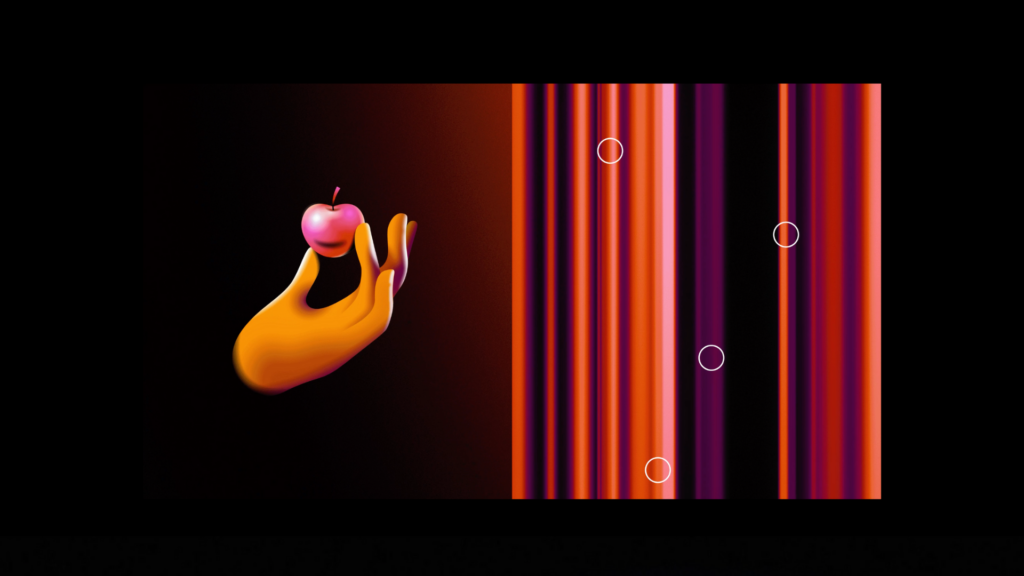
The result is actually uncommon compared to what we are used to. While looking cheerful, it seems, at the same time, a bit obscure and enigmatic. As Koto says, it’s a creative exercise that is connected to the roots of the movie universe, referring to effects and methods that remind the process of filmmaking, and thus, remind Netflix.




Leave a comment