The Italian sports car brand 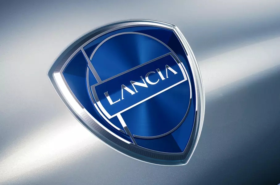
Lancia opened a new chapter in its history at the Lancia Design Day couple of days ago, when presenting an updated logo, a whole design language for its cars, as well as a concept called Pu+Ra Zero representing an integrated style of the brand’s future models. The “e-mobility era” emblem is mainly based on Lancia’s 1957 logo. It is said to rethink the seven previous versions, hence being named Progressive Classic.
Pu+Ra, the name of Lancia’s design language, stands for “Pure and Radical”. It can be associated with the soft and sleek forms of the Aurelia and the Flamina, united with the style of the Stratos and the Delta as well as the latest trends in architecture, fashion, and even furniture making.
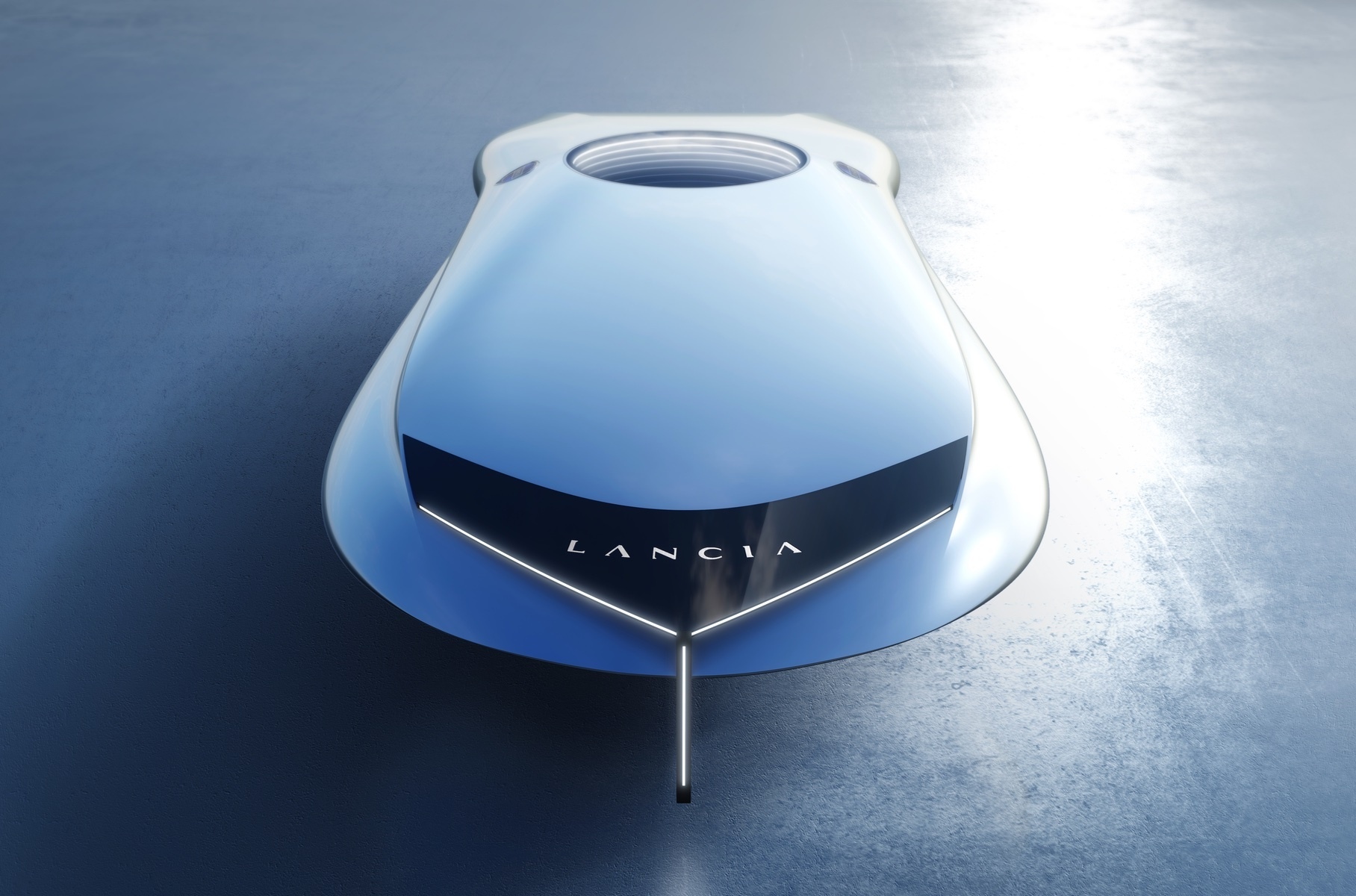
The new visual identity features more refined, elegant, and futuristic lines. While the Lancia emblem retains its shield form, its inner design was completely reworked. The even blue coloring was changed to a metallic blue gradient of a lighter shade. The logo now showcases a smaller Lancia nameplate featuring quite futuristic letterforms, instead of a centered wordmark previously, while the circle, symbolizing a steering wheel, is drawn in a more subtle way. Another thing to mention is the lance the brand has brought back as a distinct element.
Lancia’s rebranding conveys the new technology the brand is going to implement in the coming years. The exterior design of the Lancia cars is planned to represent a combination of simple figures such as circles, rectangles, and triangles. In general, it has to be something eclectic and non-automotive. In terms of interiors, the marque promises to adhere to the same principle, taking inspiration from Italian-style lounges. The design will be prevailed by contrasting colored parts and a simple architecture with unconventional solutions.







Leave a comment