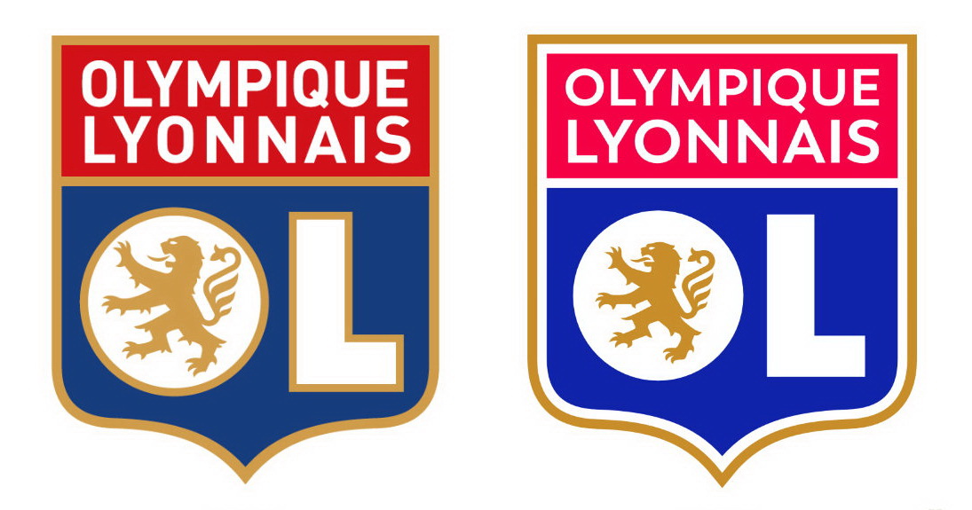
Playing in Ligue 1, France’s top football division,  While the club’s traditional red and blue are brighter now, the gold bordering in the big “O” and “L” was removed, and the outer borderng became thinner. The “Olympique Lyonnais” is redesigned in the Trenda typeface which was developed by Daniel Hernandez and Paula Nazal Selaive in 2013. With this, the lion’s outline was optimized – now, it has smaller dimensions, with smaller claws and fewer clumps of hair. Overall, such a design makes the logo more scalable.

At the same time, the logo update is rather surprising, and besides, getting disapproval from the French Football Federation. The point is that, a couple of weeks ago, Lyon presented new jerseys for the upcoming season, which feature the club’s old logo. So, the branding policy of the club has proven to be rather inconsistent. It’s not clear yet how Lyon will settle this problem.


Leave a comment