Norton, a brand owned by software developer NortonLifeLock Inc., is known for utility applications as well as the Norton Security anti-virus program. Recently, the software brand’s visual identity was refreshed to position it as a “digital ally for customers”, offering a modern and comprehensive design.
The Norton products are developed by NortonLifeLock which, in turn, is a part of the software company Symantec. As the company’s press release says, the rebranding marks a new era for Norton. Like people and life, the Norton brand and its products have been developing over the last twenty years. Digital life means just life now. Device security, identity protection, and privacy on the web have been a part of people’s daily life. And a new, modern design should express these values of the brand.
Evolving into a “Cyber Safety platform”, the Norton brand has won the confidence of customers, guarding the cyber security of users across the world. And Norton’s new visual identity is intended to correspond to its modern image. The refreshed logo of the brand showcases a bolder design with a brighter yellow for the circle which is open now, conveying the openness of Cyber Safety. With it, the checkmark is designed more clearly, without the previous version’s pixels – this is to symbolize the developer’s easy solutions.
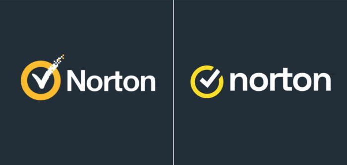
The only renovation in the Norton wordmark is the lowercased initial “n”, making the brand a little friendlier. Overall, the design is quite approachable and simple, reflecting people at the center of the brand’s philosophy, according to the company.






Leave a comment