It seems that time has come for 
The brand’s slogan “Citroën, inspired by you” has also been removed. Spots are added to Citroën’s francophone Twitter that features a monochrome animated version of the chevrons.
Citroën hasn’t published an official press release on the redesign yet. And it is certainly worth to be reported as it concerns not only the trademark, but also the wordmark.
 .
.
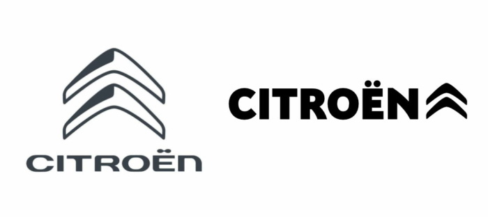
The trademark introduced in 2016 and the wordmark that has been used since 2009 are giving way to a flat “double corner” sign as well as an all-caps lettering in the corporate typeface Citroen. The company has been using the font for many years, and now it is integrated into the Citroën logo. In different versions of the emblem which have so far been unveiled, the wordmark is placed to the right or to the left of the chevrons. Unlike the previous emblem, the new one can be displayed in different colors – versions in black, white, red and blue have already been presented.





Leave a comment