Founded in 1907, Protective Life Corporation is one of the oldest insurance enterprises in Alabama. Recently, the company has carried out a rebranding by shortening its name to just Protective and adopting a new visual identity. The renovation has to emphasize the institution’s focusing on improving its services as well as its self-positioning in the sector.

To refresh its look, the Birmingham-based company applied to the Lippincott design agency which is known for its works for PBS, Walmart and 
While the emblem also includes a generic sans-serif lettering, it is colored in purple that, according to the designing team, is a combination of red standing for energy and blue meaning stability. Such a coloring makes the brand stand from a range other insurance companies, giving it an unique and recognizable face.
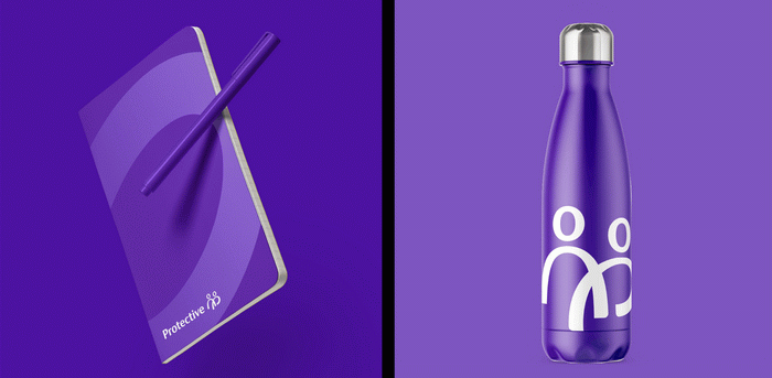
The proper style with a purple-and-white color palette has been implemented in the design of Protective’s updated web-site, digital and printed materials as well as merchandise.


Leave a comment