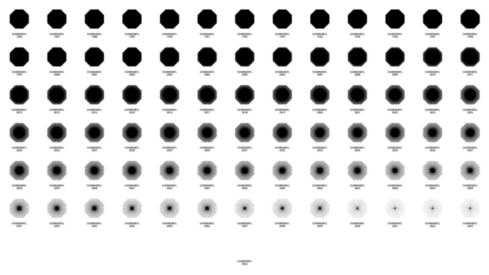
35 years have passed since a reactor exploded at the Chernobyl nuclear power plant, resulting in the worst nuclear disaster in history. Meanwhile, more and more people visit the exclusion zone including the ghost city of Pripyat near the NPP every year. Although the Covid-19 pandemic has slowed down this trend, the government of Ukraine is trying to breathe life into the disaster site by all means including creating a logo.

Since 2011, tourists are allowed to visit the Chernobyl area covering 4300 sq km. Although the radioactive pollution still prevents people from living here, short-time tours are safe, according to the Tourism department. The all-day staying in the area equals to an hour-long plane flight, and the radiation dose is 3000 times less than the x-ray emission in computed tomography.
The Tourism department of Ukraine declares the exclusion zone as a developing area. “So let’s start planning your unforgettable journey to Chernobyl”, the official tourism web-site says. The government’s goal is to increase people’s awareness of the region, and add some sites of the exclusion zone to the World Heritage list. Re-openning the area for tourists, the officials launched a Chernobyl brand with a logo, so peculiar as this place itself.

The emblem, designed by the Kyiv-based design agency Banda, is different from many tourism logos by the color and concept. It is conceived to change its form year after year, losing the intensity of black, until it has finally disappeared. For this, the agency created 78 versions of the logo based on the octagonal form of the exploded nuclear reactor.
The Banda team say they aimed to create a symbol generating thoughts. The places and cities that used to be crowded will disappear over time. Wildlife is expanding more and more within the area, literally devouring such places as Pripyat. According to Banda, a static emblem couldn’t fully reflect the history of this site, and the disappearing logo is to be a symbol against oblivion.


Leave a comment