The first big rebrand of 2021 unexpectedly comes from the 
Although CIA’s revamped emblem still represents a roundel, it features an entirely new design, distinguished with wave-like patterns with multiple intersecting white lines against a gray background. It also includes the centered wordmark “CIA” and triple circular lettering “Central Intelligence Agency”.
This is a really unusual design solution for such a solid governmental institution which previously used a seal in the style of the State symbols. This cliché-breaking move of CIA perfectly reflects the new recruiting and diversity policy, in which the organization aspires to enroll young and talented Americans from different communities. According to Gina Haspel, the first female head of the Central Intelligence Agency, the new recruitment program will provide people with a dynamic environment in the intelligence service.
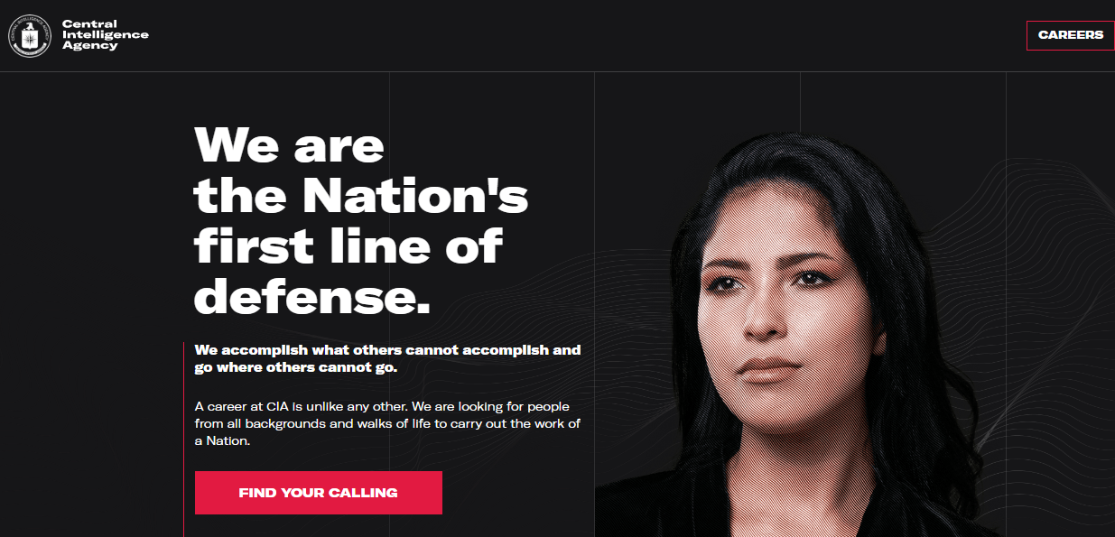
At the same time, despite the agency’s serious purposes, its new emblem caused a lot of fun in social media. For its peculiar look, it was compared to a music brand logo that would fit more for a Boiler Room project, the MUTEK electronic music festival or a flyer for a rave party.




Leave a comment