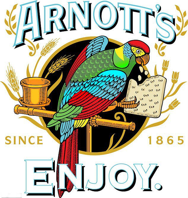
Established in 1847, Arnott’s is a popular Australian brand producing biscuits and snack-foods including Tim Tams, Saos, Mint Slices and Wagon Wheels. Throughout most of its history, it has used a logo with a detailed drawing of a macaw parrot. And when the company has recently rolled out a new, much simplified emblem, many were disappointed, thinking that it would replace Arnott’s iconic macaw.

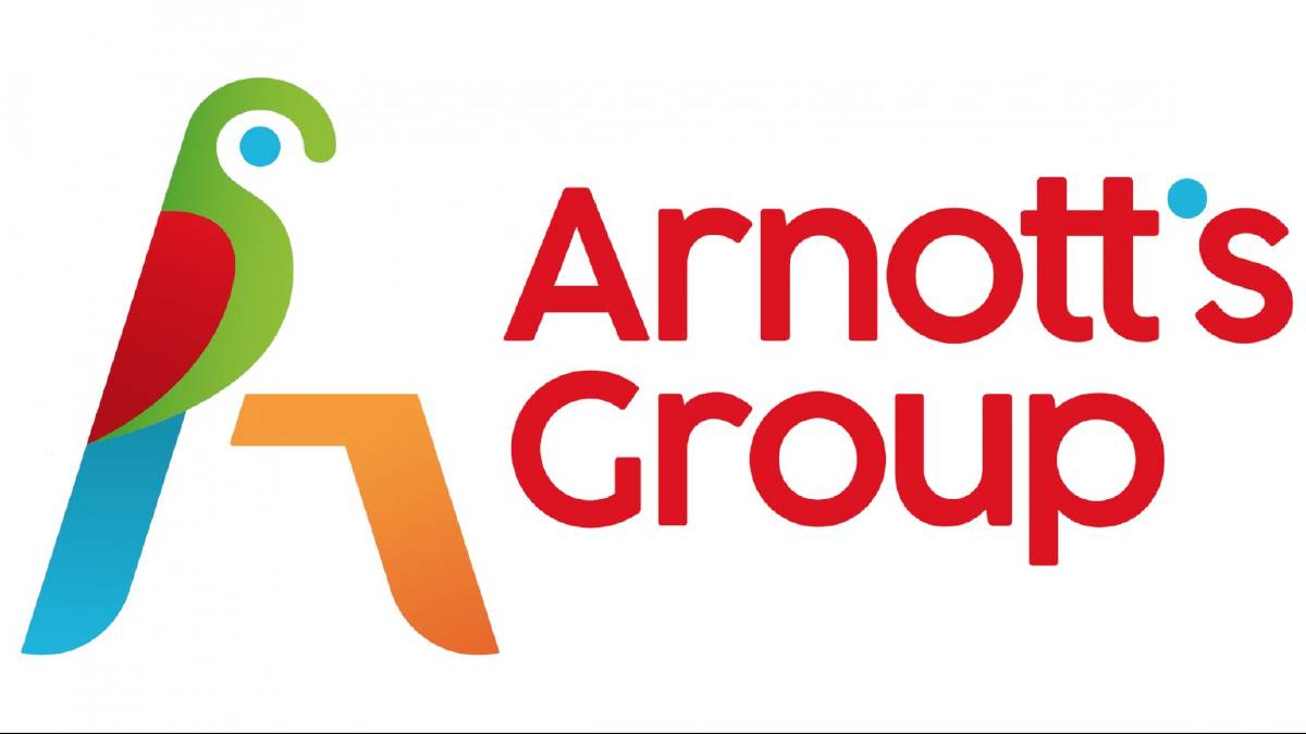
The Arnott’s new logo, unveiled on social media, evoked a backlash. People expressed their disapproval, calling it ugly, “big fat no” and even a blasphemy. However, the company was quick to calm its fans, saying that the new emblem will be used only as a corporate logotype that has “to convey the next generation of the business and its proud history”, and it shouldn’t be considered as a new brand identity, and the beloved parrot will stay on the packages as the brand’s official logo.
The corporate emblem represent a generic depiction of a parrot, as the company’s mascot, and the wordmark “Arnott’s Group” in a sans-serif typeface, distinguished with a blue dot as an apostrophe.

The Arnott’s macaw has been the symbol of the brand for almost 150 years. Originally, the logo was drawn by a daughter-in-law of William Arnott, a founder of the company, who received a similar bird as a gift from the captain of the ship in which he had returned from Scotland.
Arnott began its business from a small bakehouse in Morpeth, New South Wales. By the mid 1860s, he moved to Cooks Hill where he launched the Steam Biscuit Factory. Eventually, through a number of mergers and acquisitions, Arnott’s has become a nationwide Australian brand.


Leave a comment