The 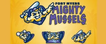 According to Andrew Kaufman, the owner of the Fort Myers franchise, one of the reasons for making the rebrand was the wish to show more connections between the team and the local community. The main goal in the task of choosing a new name was to make it regionally specific while also conveying the idea of leading a sport healthy lifestyle. Mighty Mussels perfectly satisfied both conditions. Florida’s freshwaters is a habitat for over 60 species of mussels, which are useful for ecology, as they cleanse water by removing bacteria, algae, and organic material.
The new identity was designed by Brandiose, the San Diego-based design studio, which collaborates with Minor League Baseball teams almost on a regular basis. Thus, within the previous month alongside completing the Mighty Mussels project it created logos for the Worcester Red Sox and Missoula PaddleHeads.
One more connection with the region is the official team colour scheme, which coincides with the colours, representing Southwest Florida, i.e. it includes Twins Navy, Gulf Purple, Golden Sun, Sunset Lavender, Sky Blue and Yellow Sand.
The team’s new primary logo features the musclebound mussel with a batt and spesific gesture. One of the two alternate logos sports the mussel lifting a dumbbell with baseballs for weights, the other — two mussels with warm greetings to each other.
As the Fort Myers Mighty Mussels the team will play its first game against the St. Lucie Mets, affiliate of the New York Mets, on April 9 at its home stadium.







Leave a comment