Blog

Sixt makes small changes to its logo

Founded in 1912, Sixt’s rebranding is connected with the company’s new international campaign entitled “Rent E-mobility!” which will feature the brand’s modernized look including a logo designed in a different typeface. Although Sixt’s new logo retains the general structure of the previous version, you can immediately notice the difference including an altered color scheme, a new form of the “S”, and a bit extended curved stroke over the “i”. The brand still upholds its customary colors: black, orange, and white. However, the Sixt emblem now showcases a deeper shade of orange (#ff5f00), which is closer to red. Apparently, the color…

2026 FIFA World Cup identity introduces new design system

Last week, The 2026 FIFA World Cup in North America will be the first global football event with 48 national teams. In total, they will play 104 matches at 16 stadiums (12 – in the US, 2 – in Canada, 2 – in Mexico). As CONCACAF President Victor Montagliani said at the presentation, the upcoming World Cup is going to be the greatest, most inclusive, and most diverse. Presenting the logo, FIFA wants it to be considered as a symbol of football and diversity. According to the association, the basic visual concept, combining a depiction of the trophy and a…

Ohio has returned to its old tourism slogan, refreshing its brand identity

The State of Ohio has updated its tourism brand, bringing back a slogan that was used back in the 1980s-1990s. The announcement took place this Wednesday when the state was celebrating Tourism Day. The new visual identity is hoped to attract new visitors and businesses. Located in the US Midwest, Ohio is the seventh-most populous state, with a population of 11.8. In the state’s new brand identity, the new old tagline “Ohio, The Heart of It All” is as important as the logo which conveys a retro-feeling of the 1950s through the typography. It replaces the slogan “Find it here”…

Hispano-Suiza: Reviving a luxury brand

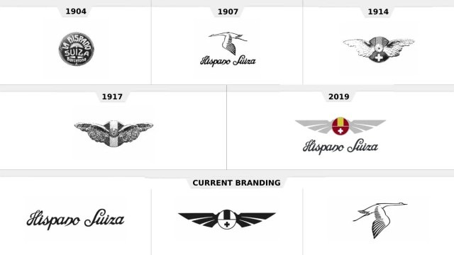
For many in Spain, Hispano-Suiza had long been another word for a luxury car. Founded in 1904, the firm is one of the oldest car brands in the Iberian Peninsula and became famous for its high-quality vehicles with their chic, safety, and fuel economy, as well as its numerous wins in racing competitions. However, the brand disappeared after WWII, and it needed a really new approach to be revived. What is Hispano-Suiza doing now to be relevant in the totally changed industry, staying true, at the same time, to its historic heritage? The main task of FutureBrand, which developed Hispano-Suiza’s…

Pentagram remasters Channel 4 brand

Established in 1982 to create a cultural alternative to BBC and ITV, According to Luke Powell, Pentagram’s creative director, Channel 4 had conducted research, defining what and why should be changed in its image to visually correspond with technological innovations, before it applied to the studio. One of the most important things for the broadcaster was to improve the recognizability of the Channel 4 content no matter on what platform people are watching it. Another priority of the channel for the rebranding was to “maintain the creative spirit inherent to Channel 4”. As 4creative’s head Lynsey Atkin explains, the agitational…

Porsche updates its iconic shield

Porsche has presented a new version of its logo as a result of a thorough rebranding that ran for three years. The work on livening the iconic shield, according to the company, aimed to convey the connection of the brand’s history and vision of the future. The refreshed identity continues the design created in 1954, showing off slight changes. The update was actually caused by the 75th anniversary the brand celebrates this year. The new iteration of the One of the remarkable changes concerns the red stripes which now have a cell pattern inside. The use of slightly different shades…

ILM: Trust, Magic, and Innovation

Industrial Light & Magic is a creative studio involved in making visual effects for motion pictures. The company has a rather legendary background as it was founded in 1975 by George Lucas specifically to provide inimitable effects for his Star Wars. Besides this iconic film franchise, ILM’s track record includes such hit movies as Terminator 2: Judgment Day, Jurassic Park, Transformers, and Men in Black. As of today, the studio won 15 Oscars for Best Visual Effects. Nearing its 50 years in the industry, ILM has presented a new visual identity. The studio’s new branding was created by Hoodzpah, a…

Jaguar Land Rover presents its first corporate logo

Jaguar Land Rover, a car brand owned by the Indian automaker Tata Motors, has received its first-ever corporate logo. According to an official press release, the new visual identity is the next step as part of the Reimagine strategy, while reflecting the company’s ambition in the luxury car segment. Tata Motors acquired two separate brands Jaguar and Land Rover in 2013 and merged them into one company. In 2021, Thierry Boloré, who was the predecessor of the current JLR head Adrian Mardell, presented a new electric strategy for the company for the coming years. By launching the Reimagine program, the…

More