Blog

UK’s TV news company carries out the first rebranding since 1970

Founded in 1955, Independent Television News is a British television production company that operates three news channels, including ITN’s new look was developed by London-based Rudd Studio and Undivided design agency. Working on the company’s visual identity, the joint designing team was keeping in mind ITN’s reputation as an independent and accurate news agency that pioneered much of the world of news. Based on research among the company’s staff and customers, a new brand positioning was created, under the slogan “Truth to Life” which reflects ITN’s shift to more diverse content including factual, entertainment, and corporate production. Feeling that the…

NBC updates its peacock logo

The The peacock’s current image as we know it today appeared in 1986, designed by the Chermayeff & Geismar studio. That rebranding also brought the NBC lettering executed in a corporate typeface based on the Futura font family. While the new version retains traditional coloring, its distinction lies in a bit different design of the peacock and a new font for the “NBC”. The previous facelift of the NBC logo was in 2013. The network, like many other companies at that time, aimed to maintain communications via a brand identity with such visual effects as glossiness, shadowing, and pseudodimensionality. However,…

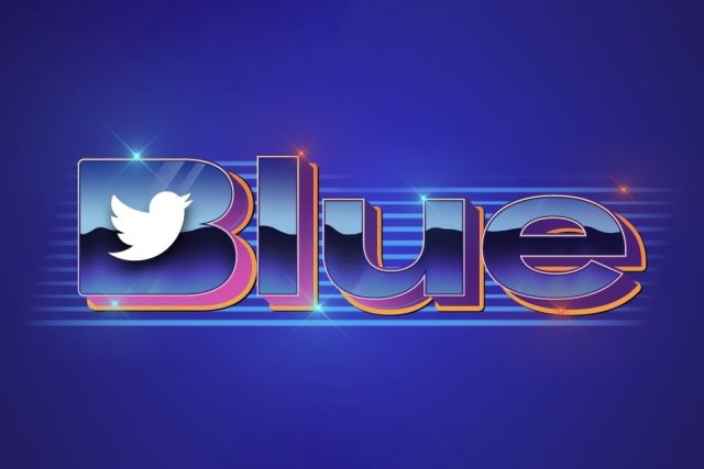
Musk’s Twitter presents a “perfectly awful” logo for its subscription service

After acquiring Described as a “disaster” and a “perfectly awful branding” on the web, the emblem resembles a 1980s-style design as if it was taken from the Strange Things series. Given the mass layoffs that have been in Twitter in the last two months, this logo may have been created by an external design group. Or perhaps, it was compiled by a neural network like Midjourney or DALL-E 2 that are talked about so much lately. Maybe, we’ll never know who forged Twitter Blue’s logo, but anyway, it would be foolish to think that it was carried out by Musk…

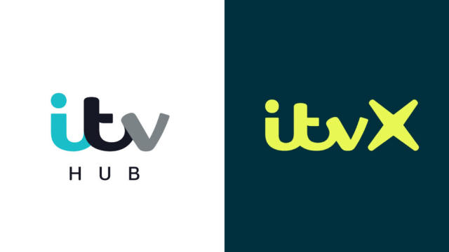
ITV unveils new visual identity, relaunching its streaming service

One of the leading TV networks in the UK, ITV was launched in 1955, with the idea to break the monopoly of BBC at that time. Over four decades after that, the network had been operating separate TV companies which shared common programs and series, having, however, each its franchise. Now, after several mergers and acquisitions, these fifteen regional franchises are owned by two networks: STV which broadcasts in Scotland, and ITV for the rest of the UK. The journey of the network has been full of TV hits, like The Saint, Mr. Bean, and Downton Abbey. ITV has also…

Holiday brand Center Parcs updates its logo

Established in 1968 by Dutch entrepreneur Piet Derksen, Center Parcs is an international network of holiday villages that currently operates a number of resorts in eight European countries as well as China. The tourism brand has entered the new year with a new visual identity, hoping to refresh its image in the industry. Tourism has accelerated much after the tough times of coronavirus, promising to increase the income for many providers. According to Frank Daemen, a member of the board of Center Parcs, the company became one of the leaders in the industry last year. “We can now look back…

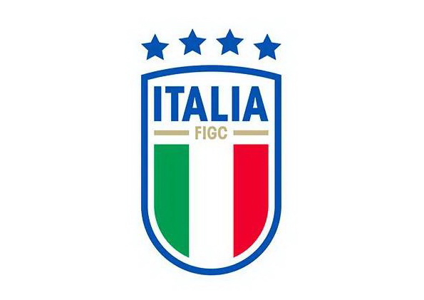
Italia’s Azzurri are about to start new season with new identity

At the beginning of the year, Federazione Italiana Giuoco Calcio (Italian Football Federation) announced a new identity for the Italian National Football Teams, including a logo and even a sound logo. The new symbols will officially be adopted in March. According to FIGC, the refreshed shield is “an expression of the feelings and the passion of the Italian football fans”. The Azzurri, the national football team, will present it to the wider public in the opening matches of the qualifying round for the 2024 Euro which will be held in Germany. The redesign also coincides with the fact that the…

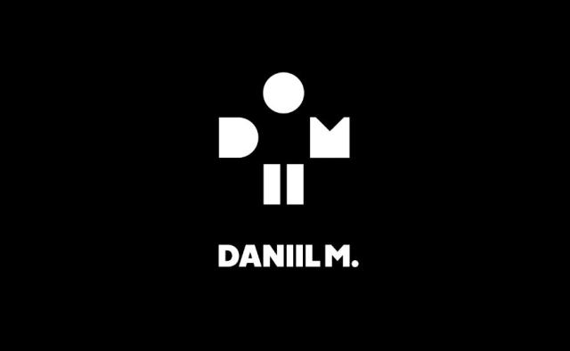
Daniil Medvedev gets a personal logo by Lacoste

On the occasion of the 2023 Australian Open which started this Monday in Melbourne, Daniil Medvedev has unveiled his own logo created in cooperation with Lacoste. Thus, the Russian tennis player has joined Roger Federer, In his logo concept, Medvedev aimed to highlight one of his passions – gaming – designing the emblem to resemble the buttons of a gamepad. Presenting the logotype, the tennis player published a gaming-style video featuring two fans of Daniil who fight in a “guess game”, with Medvedev himself as a judge, and try to guess what the logo’s elements mean. “Very happy to launch…

Fans get offended by the logo of Pink Floyd re-edition of Dark Side of the Moon

Fifty years ago, Long-time fans of Pink Floyd surely know that the original Dark Side of the Moon of 1973 featured a cover depicting a triangular prism dispersing a white light beam into the colors of the rainbow. Designed by Hipnognosis, a design group that worked with many musicians and bands at that time, that gatefold became as classic as the album itself. But apparently, the new generation of fans is unaware of this fact as the cover logo for the re-edition caused a backlash when presented. Alluding to the 1973 edition, the anniversary logo combines a triangle, the number…

More