Blog

Holiday brand Center Parcs updates its logo

Established in 1968 by Dutch entrepreneur Piet Derksen, Center Parcs is an international network of holiday villages that currently operates a number of resorts in eight European countries as well as China. The tourism brand has entered the new year with a new visual identity, hoping to refresh its image in the industry. Tourism has accelerated much after the tough times of coronavirus, promising to increase the income for many providers. According to Frank Daemen, a member of the board of Center Parcs, the company became one of the leaders in the industry last year. “We can now look back…

ITV unveils new visual identity, relaunching its streaming service

One of the leading TV networks in the UK, ITV was launched in 1955, with the idea to break the monopoly of BBC at that time. Over four decades after that, the network had been operating separate TV companies which shared common programs and series, having, however, each its franchise. Now, after several mergers and acquisitions, these fifteen regional franchises are owned by two networks: STV which broadcasts in Scotland, and ITV for the rest of the UK. The journey of the network has been full of TV hits, like The Saint, Mr. Bean, and Downton Abbey. ITV has also…

NBC updates its peacock logo

The The peacock’s current image as we know it today appeared in 1986, designed by the Chermayeff & Geismar studio. That rebranding also brought the NBC lettering executed in a corporate typeface based on the Futura font family. While the new version retains traditional coloring, its distinction lies in a bit different design of the peacock and a new font for the “NBC”. The previous facelift of the NBC logo was in 2013. The network, like many other companies at that time, aimed to maintain communications via a brand identity with such visual effects as glossiness, shadowing, and pseudodimensionality. However,…

Google Chrome gets new logo for the first time in eight years

The world’s most popular web browser is going to get a new logo. While Chrome has maintained Google’s branded four-color palette since 2008 and received the trendy flat look in 2011, the refreshment deals with only subtle changes. As we can see on the images presented by Google, the colors in the facelifted Chrome logo have become brighter, the central blue circle has got larger, and the shadows, which were in the previous version, have been removed. The new emblem first was unveiled in a tweet of Elvin Hu, the chief designer of the Chrome redesign project. Calling the new…

Brussels unveils new, but not original logo

Owned by Germany’s Brussels Airlines’ new logo inherits a dot motif from its previous emblem that represented a lowercase “b” made up of red dots. Now, the company’s symbol is nine red dots of different sizes. The wordmark has been redesigned as well, featuring a bigger “Brussels”, still lowercase though, and an uppercase word “Airlines”. Commenting on the logo, Brussels Airlines said it regards its new brand identity as a symbol for the future of the company. The company aspires “to reinvent itself”, expanding its fleet with new A320neo planes and digitalizing its services. However, the rebranding was not without…

Houston’s Dynamo and Dash change their logos

Back in 2006, the While keeping its traditional colors, the Wildcatter orange and Raven black, the Houston Dynamo’s logo has changed its form from a shield to a hexagon, and according to John Walker, the club’s president, the six corners of the new insignia are a nod to the six original wards of Houston as well as the team’s inaugural season in 2006; plus, the hexagon stands for strength, stability and unity, as a Dynamo press-release says . The central feature of the crest is the interlacing “H” and “D” whose “channel” design is a reference to the city’s waterways,…

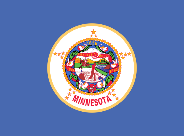
Minnesota initiates redesign of the state flag

Following Mississippi and Utah, which adopted new flags not so long ago, Minnesota is moving toward a new flag design. The rebranding project is still in its early stages. However, two requirements make the Minnesota redesign process especially tough. According to NY Times, lately more and more US states have taken the decision to change their banners. Mississippi, which did it three years ago, pioneered this trend. Last year, the Utah people voted for a new state flag designed in a simpler manner compared to the previous one. It is to be adopted officially in March 2024. Now, the Democratic…

Cupra facelifts its car brand emblem, named the future of SEAT

In 2018, SEAT launched Cupra as a separate car brand. And it was a complete success, as the creation of Cupra appeared to be the key to reviving the Spanish automaker. Less cars and more money – that has been the strategy of SEAT, which has allowed it to stand out in a very competitive market. The manufacturer just followed the approach of other big car brands like Fiat, Renault, and Citroën. Before Cupra was created as a brand, its name was just an abbreviation of Cup Racing, which was used for the sportiest model of SEAT. With Cupra as…

More