Blog

Netflix: New look, same logo

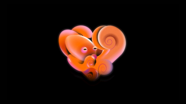
Why touch the logo of an iconic brand like Netflix? Is it necessary? Actually, no. The goal of the Netflix project was to create a proper language. According to Koto, the streaming service wanted this language to be implemented into its experience with production and beyond. Starting from this point, the studio upgraded the previous design system with brand-new iconography, typography, and imagery. Koto departed from the unidimensional and oversaturated approach to the graphic language which is so typical for the technology and streaming world. This resulted in “a style appealing to movie lovers and essentially feels like Netflix”. And…

Nokia updates its logo for the first time in 45 years

The announced redesign is the most dramatic renovation in Nokia’s history. The brand’s logo representing an all-caps wordmark has been used unchanged since 1978. As the MWC 2023, held in Barcelona, is the first event’s edition after the coronavirus break, the company has chosen it to present its new face. Backed by the new corporate strategy, the brand identity has to reflect what the Nokia brand is now – “a B2B technology leader pioneering the future where networks meet cloud”. Expressing the present day’s image of Nokia, as the company’s press release says, the visual identity also conveys the renewed…

Lancia rolls out a Progressive Classic logo anticipating a revolutionary design for its cars

The Italian sports car brand Lancia opened a new chapter in its history at the Lancia Design Day couple of days ago, when presenting an updated logo, a whole design language for its cars, as well as a concept called Pu+Ra Zero representing an integrated style of the brand’s future models. The “e-mobility era” emblem is mainly based on Lancia’s 1957 logo. It is said to rethink the seven previous versions, hence being named Progressive Classic. Pu+Ra, the name of Lancia’s design language, stands for “Pure and Radical”. It can be associated with the soft and sleek forms of the…

Google continues unifying its products with a new Google Play logo

While the Play symbol still consists of four sections in different colors, it has been somewhat altered. First of all, its corners are rounded now, making the emblem softer. The four parts have been redrawn and adjusted as well, having less space for blue which was dominating in the previous version. Thus, the other sections have received more space, while the general design is more proportional. The logo looks flat as the subtle gradient was removed. The logo redesign comes with other brand elements featuring the same rounded corners and colors as the main emblem. This solution makes the Google…

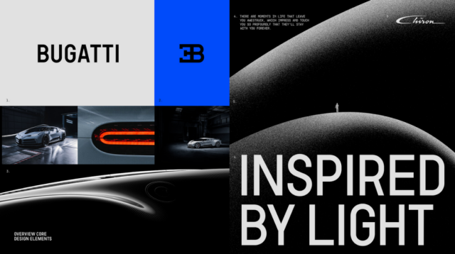
Bugatti updates its look with new color palette and typography

The sports car maker As Bugatti’s marketing director Lorenz Nause says, the redesign was a serious task for the company as it needed to find a balance between creating new things, that would allow to express the manufacturer’s ambitions for the future, and saving the basic elements to continue the visual tradition of Bugatti. The new Bugatti branding is based on the brand’s iconic EB symbol and blue color which is new for the company’s identity and alludes to the history of French motorsport. The EB monogram will be used as a logo. Being a simpler sign, it is more…

Aston Martin redesigns its logo with “subtle but necessary enhancements”

Aston Martin’s iconic wings are ready for a new flight in 2022 as the brand is aiming to be increasingly competitive in the new conditions of the luxury car market. This plan is going to be implemented under a revised branding. To refresh its visual identity, including a logo, the British car maker hired Peter Saville, one of the UK’s prominent designers. The famous wings were first adopted as the car maker’s logo in 1927, and the new version is the eighth overhaul of the emblem in Aston Martin’s history. The logo’s modern structure was created by SCH Davis in…

Buick officially presents its new logo

While some images of Buick’s new badge, in black and white, leaked on the web about two months ago, the company is now announcing the renovation officially. Refreshing its brand identity, Buick reworked the iconic “tri-shield” which is rooted in the family crest of the brand’s founder, David Dunbar Buick. In the new iteration, the shields were re-arranged horizontally, departing from the clearer heraldic style of the previous diagonal layout. In addition, they were remarkably reshaped, having apertures inside with borders colored in Buick’s traditional red-white-blue gamma. Placed with some spacing between them, the elements will be depicted without the…

Steiff: A new logo for Teddy bear anniversary

The toy brand Steiff, known for its plush toys, has rolled out a new visual identity. The updated look is focused on the famous Teddy bear which is celebrating its 120th anniversary this year. Steiff was founded in 1880 as a reformed company that evolved from a felt goods business owned by Margarete Steiff in Giengen, Germany. In 1902, a plush bear, which was designed by Margarete’s nephew Richard Steiff and wore the ordinary production name Bär 55 PB, was “born”, having movable arms and legs. One year later, the bear got popular in the United States after an American…

More