Blog

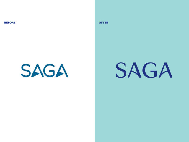
UK’s Saga Group presents new visual identity by SomeOne

Established in 1951, Saga Group is a British company offering insurance, travel, financial services for people who are over the age of 50. Through its divisions, the enterprise provides holiday tours, a wide range of insurance products, credit cards, saving accounts, and much more. Marking over 70 years of its journey, Saga has updated its visual identity forged by one of the UK’s most prominent design agencies SomeOne. Involving Saga’s employees and customers into the rebranding process, the SomeOne team worked out the basic principles for the new look of the company that should convey, among other things, the idea…

Magnolia Network makes its cable debut with original visual identity

Three years ago, Chip and Joanna Gaines, who hosted the Fixer Upper series on the DIY Network, announced they would launch a new broadcasting company in cooperation with Named after the previous company of Chip and Joanna they have in Waco, Texas, the Magnolia Network will carry a refreshed programming, focusing on documentary series related to home repair and renovation. The network will broadcast under an original visual brand connected with the Gaines’ agricultural business in Texas. The visual identity for the Magnolia Network was created by the New York-based design agency Loyalkaspar that has a lot of experience in…

Radio France: New campaign, new look

Radio France, a French broadcasting public company, has presented a new branding as well as new programming logos as it is launching a nationwide campaign. The French broadcaster is currently expanding its digital offerings, promoting them with a special campaign. Under the motto “Entrez libre” (“Enter freely”), the company is planning to create, on the Radiofrance.fr platform, an alternative to the media services which became popular in recent years, as an official press release says. “Entrez libre” is an invitation for listeners to discover the lively worlds of seven radio channels and four musical communities, according to Radio France. An…

Eredivisie’s Willem II updates its logo

Playing in the Netherlands’ football top division Eredivisie, the Willem II is approaching to its 125th anniversary the club will celebrate next season. On this occasion, the team has updated its logo. The new emblem, which is the sixth iteration in the club’s history, was created, considering the traditional symbolism of Willem II as well as the long-time wishes of fans to return to the logo basics used from 1952 to 1983. The traditional colors of the team from Tilburg have always been red, white and blue, accordingly to the Netherlands’ national flag. Based on this fact and the design…

Nivea: Rejuvenating the brand

The personal care brand First thing to notice in the new logo is a lighter shade of blue. On closer examination, you may also see some changes in the wordmark which is designed in a thinner font now, and this makes the spaces between the letters visually larger. Compared to the previous version, the lettering looks airier. Nivea is one of the few brands that copyrighted its branded color. The Nivea Blue (Pantone 280 C) is registered as a trademark since 2007. However, the status of the new Nivea blue is not clear yet. Anyway, the fact that the redesigned…

INSP TV rolls out a western-inspired logo

Initially launched as a Christian TV channel in 1978, the INSP network has transformed into a digital broadcaster over the last decade. With a rebranding in 2010, the network switched to new programming oriented to the family values, introducing a new logo and adopting its current name. A couple of weeks ago, INSP changed its visual identity again, reflecting its western-based programming. The previous INSP logo, launched almost 12 years ago, represented a yellow arc over a lowercase wordmark. Although it was a laconic emblem, it still had an unclear meaning, having a weak connection with the network’s main entertainment…

M&M’s revamps its visual identity for an inclusive future

Having a more than 80-year history, the chocolate brand M&M’s is launching a new rebranding, announcing a strategy oriented towards public communications, inclusiveness and diversity. To emphasize these values, the new identity focuses on the brand’s recognizable ampersand. M&M’s new look was created by Jones Knowles Ritchie, a prominent design agency known for its works with big food brands like Burger King and Baskin-Robbins’. Including a lot of details, the project deals not only with visual branding but also a verbal image and the storytelling about M&M’s individuality. Fulfilling its mission, JKR developed a flexible visual identity that allows the…

Florence’s new logo gets an F

City logos is a special topic. Often, new emblems meet critics from residents and people on social media for the odd design or lack of expressiveness. And that’s the case of the city of Florence, Alabama, where the new city logo even made the residents create a petition on Change.org requesting to restore the previous insignia. At the moment, the petition has collected almost 8,000 signatures as people are resenting the renovation of Florence’s logotype. The emblem features a capital “F” and “lo”, placed one on another, forming a kind of an exclamation mark. In the full version, the “lo”…

More