Blog

Very: A very digital rebrand

Established in 2009, Very is a British online retail brand focusing on household goods. Through its parent body, The Very Group, the enterprise traces its roots to Littlewoods, a once-famous retail and football betting company. According to recent research, Very is still seen as a brand oriented mostly toward a female audience. Not content with that, the brand decided to gain credibility among a wider group of consumers. And this new strategy is expressed by its fresh visual identity, created by design studio SomeOne. For the new identity, the design team reworked Very’s recognizable look, including the iconic pink square….

Microsoft’s Xbox Series X logo leaks online

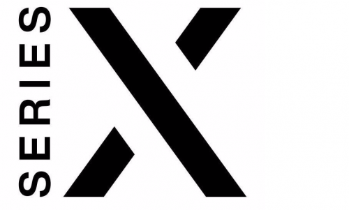
Microsoft is currently developing the The logotype features a vertically-oriented word “Series” along with a big “X”. Having a laconic design, it reminds of some design solutions for the Xbox 360 as well as the Xbox One with a similar splits in the “X”. However, the Xbox Series X’s strokes are thicker and the gaps are larger. While the new logo follows the Xbox’s recognizable style, the slight changes in it tells that the Series X will differ from its predecessor. At the same time, the emblem can give a hint how the logotype for the Xbox Series S should…

Sydney’s Inner West Council presents a $90,000 logo labeled as “waste of money”

Inner West Council was formed four years ago after a merger of three councils located in the western region of the Sydney metropolitan area. Right after its forming in 2016, the council adopted an interim logo, planning to create a more consistent identity in the future. Recently, it has finally presented a new logotype that, however, has been severely criticized by the local residents saying it is a waste of money as it cost $90,000.   According to an official statement on the Inner West Council website, the work on the new look began two years ago. The development group…

Merged Truist gets a logo

Truist Financial Corporation, launched after the merger of BB&T and SunTrust Banks in December 2019, continues forming its new identity by unveiling a logo. The name for the merged company was announced in June 2019, and according to the banks’ representatives, it appeared as a result of branding researches and surveys among the employees and focus groups. However, “Truist” met some criticism for being an odd word that is hard to pronounce and “sounds like a medicine against arthritis or eczema”. Nevertheless, the branding process goes on, and the company has recently presented its visual identity intended to express its…

Joget Inc. rolls out a new logo for its next-gen application platform

Joget Inc. is a company developing an open source workflow application platform. Launched as a project on Sourceforge.net, it has eventually evolved into a serious business. Having moved to Columbia, Maryland, in 2014, the company started a new chapter in its history. Offering its flagman application development platform Joget Workflow, which has been downloaded over 200,000 times, Joget Inc. created a community of more than 10,000 members. With business model transformation and new workflow digital solutions, Joget has recently presented a new logo that reflects the company’s growth and pays a tribute to its Malaysian origins. As Joget itself was…

Canadian Energy Center introduces new emblem replacing initial unsuccessful logo

When the Canadian Energy Center, an organization advocating oil & gas industry safety, had unveiled its new logo in a tweet this Thursday, it called forth a backlash. It turned out that the CEC emblem is similar to the logotype of a US software company. On Tweeter, users noticed that the Canadian agency’s white dimensional blocks on a blue field is a copy of the patern in green used by the Boston-based Progress Software Corp. Informed of that, the US company thanked those who drew their attention to CEC’s new logo, saying they would be looking into this issue. Meanwhile,…

Jaguar Land Rover presents its first corporate logo

Jaguar Land Rover, a car brand owned by the Indian automaker Tata Motors, has received its first-ever corporate logo. According to an official press release, the new visual identity is the next step as part of the Reimagine strategy, while reflecting the company’s ambition in the luxury car segment. Tata Motors acquired two separate brands Jaguar and Land Rover in 2013 and merged them into one company. In 2021, Thierry Boloré, who was the predecessor of the current JLR head Adrian Mardell, presented a new electric strategy for the company for the coming years. By launching the Reimagine program, the…

ILM: Trust, Magic, and Innovation

Industrial Light & Magic is a creative studio involved in making visual effects for motion pictures. The company has a rather legendary background as it was founded in 1975 by George Lucas specifically to provide inimitable effects for his Star Wars. Besides this iconic film franchise, ILM’s track record includes such hit movies as Terminator 2: Judgment Day, Jurassic Park, Transformers, and Men in Black. As of today, the studio won 15 Oscars for Best Visual Effects. Nearing its 50 years in the industry, ILM has presented a new visual identity. The studio’s new branding was created by Hoodzpah, a…

More