Blog

Swiss insurance company receives new logo

CSS Insurance, the largest insurance company in Switzerland, has updated its look. While currently being on the rise, the company is seeking to accent its new role as a partner of health care institutions, using its new visual identity. Established in St. Gallen in 1899, CSS now provides its services to over 1.6 million people. As the company claims, it is the leader of the Swiss insurance market. A few days ago, the enterprise announced it would act under a new logo and brand identity, aiming for continuous changes. According to a press release, CSS initiated its transformation from “a…


Anheuser-Busch InBev: Cheering redesign

Last month, Anheuser-Busch announced its new global goal, beginning to hold a customer-oriented strategy under the motto “We Dream Big to Create a Future with a More Cheers”, which has to drive further growth. While betting on this, the St. Louis-based company has unveiled its new look. According to AB, the revamped visual identity better reflects the things the company is advocating for, and where it wants to move to. Showing off simple and contemporary motifs, the design perfectly fits the company’s ambitious and optimistic spirit, celebrating the great plans of Anheuser-Busch, as the group’s global brands vice-president Richard Oppy said….

Google Chrome gets new logo for the first time in eight years

The world’s most popular web browser is going to get a new logo. While Chrome has maintained Google’s branded four-color palette since 2008 and received the trendy flat look in 2011, the refreshment deals with only subtle changes. As we can see on the images presented by Google, the colors in the facelifted Chrome logo have become brighter, the central blue circle has got larger, and the shadows, which were in the previous version, have been removed. The new emblem first was unveiled in a tweet of Elvin Hu, the chief designer of the Chrome redesign project. Calling the new…

Washington Redskins rebrand to Washington Commanders with new visual identity

Amid discussion on the racial issues, NFL’s Over years, the National Congress of American Indians (NCAI) argued against the name “Washington Redskins”, which was used since 1933, as well as the team’s logo that depicted a head of a Native American. The members of NCAI considered them racist, discriminating and stereotypic. In the wake of antiracist protests after George Floyd’s death, the criticism against the team’s name and logo arose again. So, abolishing the “Washington Redskins”, the team initiated a rebranding process in search of a new identity, adopting the interim name Washington Football Team. Finally, the new name and…

Anheuser-Busch updates its logo, following the ABInBev rebranding

Days after AB InBev presented its new visual identity, its American subsidiary Anheuser-Busch followed the lead, unveiling its new logo as well. Headquartered in St. Louis, Missouri, Based on the mission announcement “Futures with more cheers” which was recently published by its parent entity, the company used the opportunity to furtherly develop its brand identity. Over last four years, Anheuser-Busch has been implementing a steadfast business strategy more oriented towards customers, and now, it has to make it visible to the world outside, as an official press release says. Refreshing its corporate colors, logo and typography, the brewing company is…

Sanofi introduces a new logo

Originally founded in 1973, Unveiling a new logo, the corporation is aiming to unite “many cultures, identities and brands” under a single trademark. Making this step, Sanofi has great plans for the future, as a press release says. Sanofi’s previous logo was introduced in 2011. This round emblem that was called The Bird of Hope gives way to a lowercase wordmark. The corporate colors were changed as well – instead of a green-and-blue palette, the company will use purple as the only brand color. As for the new logo, it was inspired by “simple and moving-oriented codes of the technological…

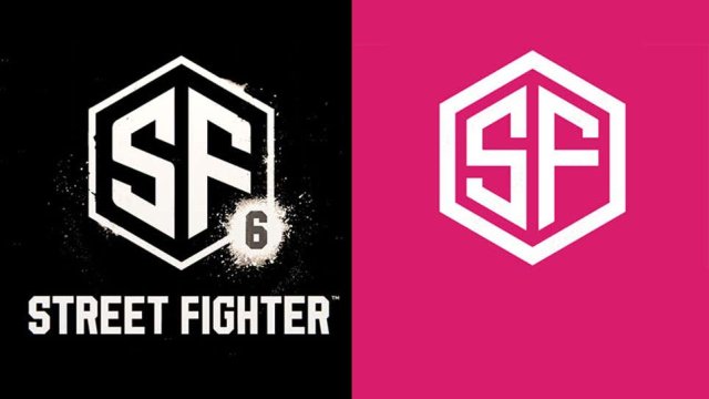
Capcom presents Street Fighter 6 logo looking like a clipart piece

The Japanese game publisher recently present a teaser for Street Fighter 6. Although the developer showed a little of the upcoming game, the fans of the franchise got an opportunity to look closely at its logo. Some of them noticed that it looks like a stock image, and they turned out to be right. Street Fighter 6 will be the last game of the long-time series which became well-known, including for its logos. They perfectly conveyed the feel of game fightings as well as martial arts movies. They were bright, bold and crazy. However, the latest SF emblem was described…

EFE: Seriousness and credibility

Founded in 1939, EFE is a Spanish news agency that is the world’s fourth-largest wire company after Associated Press, Reuters, and Agence France-Press. The media corporation manages press, radio, TV, and web services. Having a staff of nearly 3,000 employees, EFE operates in 120 countries. To refresh its corporate image and emphasize its position in the global media industry, the agency has launched a new brand logo reflecting steadfastness, dynamism, and modernity. This is the fourth EFE logo update in the 83-year history of the company. According to the agency’s president Gabriela Cañas, the rebranding has been a natural process,…

More