Blog

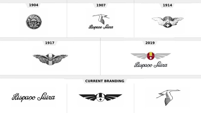
Hispano-Suiza: Reviving a luxury brand

For many in Spain, Hispano-Suiza had long been another word for a luxury car. Founded in 1904, the firm is one of the oldest car brands in the Iberian Peninsula and became famous for its high-quality vehicles with their chic, safety, and fuel economy, as well as its numerous wins in racing competitions. However, the brand disappeared after WWII, and it needed a really new approach to be revived. What is Hispano-Suiza doing now to be relevant in the totally changed industry, staying true, at the same time, to its historic heritage? The main task of FutureBrand, which developed Hispano-Suiza’s…

Freeform gets free forms for its visual identity

When a brand experiences some unsteadiness, revision of its visual identity can be an effective means to stabilize the business and make the goals clearer. And the recent rebranding of Freeform, a Disney-owned cable channel, is a good example of this idea. Formerly owned by “They haven’t come of age yet, and are in a state of constant becoming, so they need shows which will help them expand the world, but not escape from it”, Collins says. So the uniqueness of the brand is in the attractiveness to its audience, embodied in productions with profound stories giving people different points…

Jonathan Ive creates an emblem for Charles III coronation

In late 2011, Queen Elizabeth II knighted Jony Ive had worked at Apple for 27 years, creating, among other things, Bondi Blue, a shade of blue, that was used for the back of the legendary iMac introduced in 1998 — a turning point in Apple’s history. The forms of iPhone and MacBook Pro owe to Ive, too. In 2019, he left the company to start his own business with LoveForm, a team of creative people working in different directions. The coronation emblem designed by Ive and LoveForm will officially be presented during the festivities in May, including the coronation service…

Eurostar: How to transform a symbol into a flexible design system

Launched in 1994, Eurostar is a pioneer brand involved in international high-speed railway transportation. Its network connects the United Kingdom, France, Belgium, the Netherlands, and more recently Germany. This year, the company is undergoing a rebranding after a merger with Thalys, a high-speed railway provider that connected Paris and Brussels. The prominent DesignStudio developed a new look for Eurostar, having made a great job, completely changing the visual identity of the company. The project was based on a new concept named Spark which comes to life under the motto “Spark new experiences” and puts forward a new symbol replacing the…

Formula E gets a new visual identity

Launched in 2014, Formula E is a motorsport championship for electric cars. Early this year, the competition announced that it would introduce new Gen3 cars for the 2022/23 season. These vehicles are expected to have a capacity of 350 kW (470 hp). The technical update will be accompanied by some other renovations like recharging pit stops and new tires from The Formula E new look is based on the “torque loop” representing the “excitement and energy” of the championship. The loop motif also supports new typography and the design for the news section of the brand. Formula E has kept…

Glenmorangie: A new design for a whiskey brand

Established in 1843, Glenmorangie is a Having a long history, the Glenmorangie distillery is a subsidiary of the French group Moet Hennessy Louis Vuitton since 2004. In recent years, the company has increased its appeal in the overseas luxury goods market, offering new brand whiskies like Nectar d’Or, The Quinta Ruban, and LaSanta. As for the redesign, the brand’s look was comprehensively revised. Apart from the general visual elements, it affected the packaging for Glenmorangie’s major products including the forms of bottles and labels. According to the distillery’s Global Head of Brand Louise Dennett, the remastered packaging conveys the taste…

The Bronx Museum presents a new visual identity

Founded in 1971, the Bronx Museum of the Arts is a unique artistic space dedicated to contemporary art. Exhibiting a collection of more than 2,000 works, the museum calls its mission “connecting diverse audiences to the urban experience through special exhibitions and education programs. Aspiring to clearly articulate the ideas of capturing the modern culture as well as the spirit and tenacity of The Bronx, BxMA has unveiled a new visual identity created by the New York-based design studio Team. The Bronx itself gave inspiration for the museum’s updated look as this is NY’s only borough with “The” in its…

Utah is about to adopt a new flag

Since 2018, the legislature of Utah has been working on creating a new design for the state flag. The lawmakers who initiated the redesign process argue that a new flag will improve the spirit of the Utah community, helping people identify themselves with the state. Last year, a task force was established after the members of the state’s House of Representatives had lively discussions to revise or completely change the flag. The ongoing redesign process is supervised by the Utah Department of Cultural & Community Engagement (DCCE) and supported by the Office of Governor Spencer Cox. The project launched under…

More