Blog

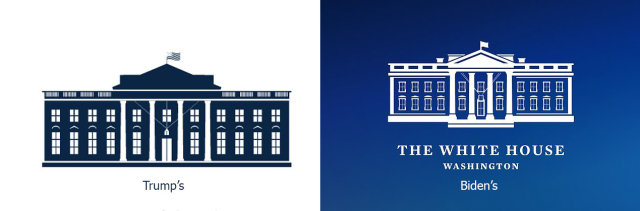
Joe Biden’s adminstration rolls out new White House logo

After Joe Biden was sworn in as the 46th President of the United States, his administration has unveiled a new logo of the White House. While changing the presidential residence’s emblem under each new President has become traditional, the new iteration’s design represents something opposite to that of Donald Trump’s presidency. The work on the new White House logo began more than a month ago. For this, Joe Biden’s administration hired Wide Eye, a Washington-based design agency, that already cooperated with the Democrats, developing the visual identities for Camala Harris’ vice-presidential campaign and the Democratic National Convention. According to the…

New Renault logo and Dacia logo disclosed

Last July, just after his appointment, Renault’s CEO Luca de Meo announced a strategic plan to relaunch the Group’s brands. The relaunching plan, called Renaulution, envisages a change of the brands’ positioning to provide a more effective adaptation to the era of hybrid and electric vehicles. A few days ago, a tangible step on the Renaulution way was made when the company presented its new 5 Prototype concept car which can be seen as an electric revival of the Renault 5 manufactured from 1972 to 1996. Designed in the neo-retro style, the concept features the basic traits of that vintage…

Amazon: More iconicity for the smile-arrow

Just like Nike’s Swoosh which is a sign of the company in itself, Although the previous version’s shopping cart reflected the initial commercial ambitions of the brand, it looks a bit amusing now when Amazon has reached the top in e-commerce, digital streaming, cloud computing and artificial intelligence. So, ditching the cart, the app’s new logo conveys the company’s contemporary image, representing a cardbord box with rounded corners and the smile-arrow that together with a blue band on top, resembling a fringe, makes up a kind of a smiling face. This is quite an admirable design solution creating a cheerful…

Pentagram designers create MIDI visual identity

The Musical Instrument Data Interface (also known as MIDI) is a technical standard connecting electronic musical instruments and digital devices. While the MIDI Manufacturer Association, a maintaining body for the technology, presented the MIDI 2.0 version last year, there was a need to update the MIDI visual identity as well. This task was delegated to Yuri Suzuki and Sascha Lobe who work in Pentagram. MIDI’s new brand identity, including a logo, typography and sound design, was influenced by the technology itself. The curves, that make up the central motif of the design, were inspired by sine waves which appear on…

Inter Milan’s new logo leaked

Over the last couple of weeks, people on the web have been discussing a photo of a pre-match jacket with an allegedly new logo of The new Inter logo retains the overall design of the team’s traditional symbolism, that appeared with the club’s founding in 1908, as it features the interlacing “I” and “M”. However, it lacks the current emblem’s “F” and “C” standing for “Football Club”, and that may be a hint that Inter Milan can really be renamed. While team’s full name in Italian is now Football Club Internazionale Milano, it’s not ruled out that its short version,…

Poco unveils its new visual identity

In January of 2020, Xiaomi’s Indian subsidiary Poco declared its independence from the parent company, claiming it would have its own team and much more. To celebrate its first successful year as an independent enterprise, the brand has announced its new logo and mascot that can be another evidence of the fact that it is trying to set itself apart from the Chinese manufacturer. The new mascot is essentially based on the angry/mad emoji with addition of a kind of a growling mouth, halo as well as Android robot-style antennas. Sharing the explanation for all these elements, Poco says that…

Varta updates its logo

Founded in 1887, Varta is a German company manufacturing batteries for global consumer, industrial and automotive markets. Celebrating the most successful recent year in its history, the brand has announced a new logo as well as a renovated brand strategy. The Ellwangen-based battery company is staying in the fast lane. With its record high share price and top income last year, Varta shows a great development dynamics even after 135 years since its inception, and now this success is getting an additional impact with a new emblem and an updated brand policy. While Varta has previously had the slogan “In…

Peugeot unveils new brand logo symbolizing upmarket move

On February 25th, While the logo was announced ten month ago, and its details have been kept a secret during this time, it will mark the hood of the Peugeot 308 that is going to be presented in March. According to the company, the emblem was influenced by the logo of the 404, which was produced in the early 1960s, and especially by that one noticed on the e-Legend concept the manufacturer presented at the 2018 Paris Auto Show. Peugeot has saved the overall design of the lion, but it has abandoned the detailed forms, giving the emblem some dynamic…

More