Blog

New branding for American Library

Founded in 1963, the American Library (formerly known as the 2nd Air Division Library) is an institution established to honor the US Air Force troops who fought in Europe during WWII. Located in Norwich, UK, the library contains a collection of materials dedicated to the USAF, American relationship with Britain and American culture in general. Adopting its current name, the American Library was looking to a new visual identity as well. The institution’s brand, including a logo, printed materials and some merchandise, was renovated by The Click, a Norwich-based design studio. In the brand creation, the designers started from the…

Google Fonts gets new logo, expanding its catalog

Google Fonts, a font library launched in 2010, has received a new logo. As with The font library, previously known as Google Web Fonts, has long been a web standard. Ten years ago, the benefits of web fonts still had to be explained, while today the fonts, available on the service, are a usual part of web-sites. At the moment, Google Fonts offers 1043 font families that can be used for web-pages as well as print products. According to Google’s Material Design blog, the icons, created within the Material Design project, are also included in the Google Fonts catalog. So,…

Swarovski adopts new visual identity, openning new stores worldwide

Crystal brand First of all, the fresh design’s leitmotif can be seen in the updated Swarovski logo. The iconic swan in the new iteration is facing to the right, featuring a more elongated neck and two wings, more clearly drawn compared to the old one-wing version. The brand chose the swan as its emblem in 1988 as a symbol of everlasting love and nature’s beauty, the notions that have always been associated with Swarovski’s crystal glass and jewelry. For the logo, the swan has been placed into an octagonal frame that symbolizes a faceted crystal as well as the idea…

Eftpos updates visual identity

Australia’s Eftpos (Electronic funds transfer at point of sale), a popular e-payment system, has rolled out its new visual identity, updating the logo and brand colors. The rebranding is intended to show the recent digital innovations of Eftpos. To create its new look, the payment brand collaborated with Hulsbosch, a Sydney-based design studio. Hulbosch’s work resulted in a new Eftpos symbol which represents a big “e” formed like a curved band. Colored in Raspberry red (a brand color from now) with some other shadow hues, the letter is accompanied by an Eftpos wordmark in a lowercased typeface, featuring connected “f”…

Reckitt Benckiser rebrands as Reckitt, rolling out new brand look

While such brands as Sagrotan, Durex or Vanish enjoy their popularity among consumers, the name of their parent company Refreshing its look, the company has dropped the second half of its name which appeared after the UK’s Reckitt & Colman merged with the Dutch company Benckiser in 1999. The rebranded Reckitt considers its new corporate identity, including a logo and some other visual elements, as an important step in the company’s ongoing transformation towards sustainable development. Reckitt’s visuality is intended to be more recognizable and reflect the company’s aspiration for better health care, protecting and education to make a clearer…

Eichhof: New traditions of brewing

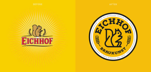
Officially established in 1834, Eichhof is a beer brand that is popular in the central Switzerland. Acquired by the Netherlands’ Heineken in 2008, the Lucerne-based brewery produces 11 different beers. Beside lager, its production line also includes such craft beers as the turbid natural Klosterbräu, ale-like Hubertus or strong Barbara (alc. 6,5%). To modernize its image, Eichhof hired the British design studio Pearlfisher that renovated the brand’s visual identity. In their work, the Pearlfisher designers were inspired by a table they found in the brewery. It featured engraving of different traditions of Eichhon as well as a blank section for…

Rebranded Schweitzer introduces new logo

As many businesses today, Schweitzer Mountain Resort, located near Sandapoint, Idaho, is facing some difficulties due to the COVID-19 pandemic. The enterprise has already suspended its extension plan for 30-unit boutique hotel. However, hoping for better times, the resort decided to refresh its look by rebranding itself to simply Schweitzer and adopting a new logo. On its website, Schweitzer shared some details about the renovated visual identity, saying that its new emblem pays tribute to its heritage, while embracing its future. Now, the symbol of the ski resort is a stylized “S” formed by three strokes whose design Schweitzer describes…

Stark Group unites its brands under a single logo

Founded in 1896, Denmark’s Stark Group unites the largest distributors and retailers of building materials in Northern Europe. Along with Danish enterprises, the firm owns four merchant chains ni Germany, Sweden, Norway and Finland. While transforming to a new business model, the brand has updated its look. Stark Group’s new visual identity is conceived as an “umbrella brand” gathering together all its member companies. The rebranding, connected with a range of acquisitions and the following reorganization, will concern all the enterprises of the group which will receive a single trademark. The Stark Group’s new logo, inspired by the ancient Nordic…

More