Blog

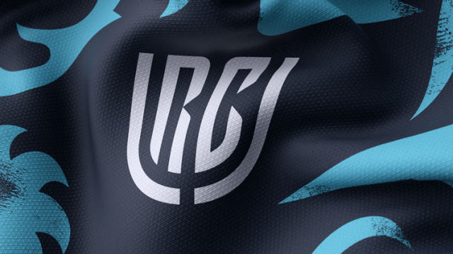
Pro14 rebrands as United Rugby Championship with new visual identity

Extended with two more clubs from South Africa to 16 teams, the Pro14 rugby league has changed its name to United Rugby Championship. Apart from the South African teams, the competition includes teams from Scotland, Ireland, Wales and Italy. Preparing to start the next season under the new name in September, URC has also unveiled a new visual identity. The league’s new look was developed by Thisaway, a branding agency from Bath, Somerset. The URC branding project, entitled “A different league”, was inspired by the fact that the transformed competition brings together teams from different cultures. In their work, the…

BBC slightly redesigns its logo for “tens of thousands of pounds”

The British Broadcasting Corporation has updated its logo. However, the new iteration hardly shows considerable changes. The slight redesign of the In fact, this design has already been used on the corporation’s streaming service BBC Select launched in the US and Canada this February. However, the innovation went unnoticed then. Although BBC’s representatives said that the costs of the redesign were not so significant as it is supposed to be, the refreshed logo with its minuscule changes was stigmatized as a waste of taxpayers money. It was also named a bad parody of the current emblem. At the same time,…

The Most Fashionable Football Club Logos In The World

In the vast and dynamic world of football, where passion meets creativity, the club’s logo is a powerful symbol that speaks to the identity, history and spirit of each team. These symbols are more than just design; They are a visual symbol of the city’s values, ethos and aspirations. From iconic logos steeped in tradition to contemporary marvels of design, the football venue offers a range of iconic brands that captivate fans worldwide, with some of them standing out for their timeless beauty and boasting a new idea or bold aesthetic. Let’s explore the most fashionable team logos in football….

UEFA presents logos for Europa League and Conference League

Reducing the Europa League from 48 to 32 teams and launching the Europa Conference League from the 2021/22 season, Turquoise had experience working with the European football union earlier when the studio “built a good understanding of the requirements and needs”, as its creative officer Gareth Mapp says. Developing the UEFA leagues project, Turquoise tried to refresh the UEL branding with a new design which could tell that the league will show more competitiveness even with fewer teams now. With this, the Conference League’s logo should reflect the ideas of openness and inclusiveness. Both logos share a general design including…

Manischewitz: Mazel tov on the new look!

Since 1888, the food brand Manischewitz has been represented in American stores as an iconic example of high-quality traditional Jewish kosher products. What began as a small Jewish bakery in Cincinnati, Ohio, has grown into the leading distributor of kosher food in the United States. The company owes its success to the automated process of making matzo, which was invented by its founder, Dov Behr Manischewitz. As the Jewish community nears the Pesach celebration, where bread holds significance, the brand has introduced a new identity to reaffirm its festive and timeless spirit. Despite the brand’s previous recognition among loyal customers,…

Renault Group finally rolls out new Dacia visual identity

In February, we could see an So, the mark says goodbye to the chrome-like emblem which was introduced in 2008. Instead, href=”https://www.picpapa.com/dacia-logo”Dacia will use a symbol made up of the abstractly stylized letters “D” and “C”. The geometric typography, purposely diminished, reflects Dacia’s essence and designates the most important things in the car industry, according to the company. The merging letters convey the feeling of movement due to their arrow-like shape. Earthy colors will prevail in Dacia’s visual identity. The green khaki is chosen as the main brand color. It is intended to emphasize the “street spirit” of the mark…

Chicago Fire restores Florian Cross for new crest

In November 2019, the Chicago Fire carried out the The big “C” in the center, the team’s another revived symbol, is now designed in a cornered style, but still keeps the iconic spike, while the six-pointed star is pretty similar to the stars in the Municipal Flag of Chicago, being an echo of the 1998 crest’s ring with six point. The colors of the cross, “C” and star are also a replication of the colors of the city’s banner. Overall, the Fire’s new crest can be called a distinctive and laudable move as the team return to their roots in…

Edmonton Eskimos rebranded as Edmonton Elks with new logo

The Edmonton Eskimos, playing in the Canadian Football League, have rebranded as the Edmonton Elks. Renaming themselves, the team meets numerous requests from indigenous people’s organizations arguing that the “Eskimo” has a controversial connotation. Alongside the new name, a new logo has been presented as well. The rebranding process began last November when then called Eskimos launched an online campaign, asking people to choose a new name for the team. In four months, a list with more than 2000 proposed names was shortened to seven. A final survey among the club’s players, couches, stakeholders and fans, with some advice from…

More