Blog

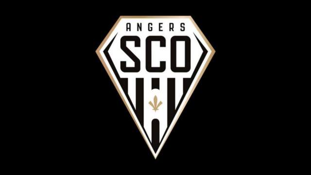
Angers SCO changes logo as Stéphane Moulin retires

Lately, changes of logos have become regular and make a lot of noise, like those of Juventus or Inter Milan. Such rebrandings often aim to develop the club image, and we know that today, people play football off the field too, holding huge marketing stakes. However, crest changes are not executed just with a twist of the spanner – usually, this is a sign of an upcoming new era. And that is the case of the So, the Angers’ updated logo shows a new turn in the club’s journey led by Said Chabane now. If fans are afraid to see…

England’s Football Association presents England Football brand

The world’s oldest European football organization, the Football Association of England has launched a new brand reflecting its aspiration to unify all levels of the sport – from the managing bodies to the ordinary players. Named England Football, the new brand was visually designed by Matta, a design studio from London. Inspired by the Royal arms of England and the FA crest, the England Football logo depicts a lion, lioness and cub. According to Louis Swann, Matta’s creative director, this has to symbolize men’s teams, women’s teams and youth teams. The emblem’s red color, which is described as “striking red”,…

Stark Group unites its brands under a single logo

Founded in 1896, Denmark’s Stark Group unites the largest distributors and retailers of building materials in Northern Europe. Along with Danish enterprises, the firm owns four merchant chains ni Germany, Sweden, Norway and Finland. While transforming to a new business model, the brand has updated its look. Stark Group’s new visual identity is conceived as an “umbrella brand” gathering together all its member companies. The rebranding, connected with a range of acquisitions and the following reorganization, will concern all the enterprises of the group which will receive a single trademark. The Stark Group’s new logo, inspired by the ancient Nordic…

LA Clippers unveil new nautical-themed logo and unis for the next season

Getting ready to relocate to the Intuit Dome in Inglewood, California for the upcoming season, the Los Angeles Clippers are embarking on a new chapter in their history. Concurrently, the NBA franchise has unveiled an updated visual identity. Previously considered outsiders in the National Basketball Association, the Clippers struggled to secure playoff berths until a significant shift occurred in 2014. This transformation transpired when the team was purchased for $2 billion by former Microsoft CEO Steve Ballmer. Subsequently, the Clippers have emerged as formidable contenders in the Western Conference, earning spots in the NBA championship series. The refreshed Clippers’ identity…

Eichhof: New traditions of brewing

Officially established in 1834, Eichhof is a beer brand that is popular in the central Switzerland. Acquired by the Netherlands’ Heineken in 2008, the Lucerne-based brewery produces 11 different beers. Beside lager, its production line also includes such craft beers as the turbid natural Klosterbräu, ale-like Hubertus or strong Barbara (alc. 6,5%). To modernize its image, Eichhof hired the British design studio Pearlfisher that renovated the brand’s visual identity. In their work, the Pearlfisher designers were inspired by a table they found in the brewery. It featured engraving of different traditions of Eichhon as well as a blank section for…

Why Casino Logos Look the Way They Do: 5 Common Symbols

A casino’s logo is like its signature – that special mark that sets it apart from all the rest. When designers create these icons, they choose symbols that spark our imagination and get our hearts racing with dreams of hitting the jackpot. Casinos want their logo to pull us into an exciting world of risk and reward. The graphics tap into what motivates people to the game – the thrill of winning, the allure of luxury, the freedom of not knowing what Lady Luck has in store. Let’s explore the psychology behind five classic casino symbols and what they represent…

Swarovski adopts new visual identity, openning new stores worldwide

Crystal brand First of all, the fresh design’s leitmotif can be seen in the updated Swarovski logo. The iconic swan in the new iteration is facing to the right, featuring a more elongated neck and two wings, more clearly drawn compared to the old one-wing version. The brand chose the swan as its emblem in 1988 as a symbol of everlasting love and nature’s beauty, the notions that have always been associated with Swarovski’s crystal glass and jewelry. For the logo, the swan has been placed into an octagonal frame that symbolizes a faceted crystal as well as the idea…

The Mora: Take a pause for luxury holiday

As one of the world’s leading players in the tourism industry, Germany’s TUI Group is striving to broaden its range of offerings and destinations. In line with this objective, the company has introduced a sub-brand intended to establish a presence in the luxury hotel market. Named The Mora, this establishment situated in Zanzibar is centered around a concept of hospitality that aims to offer travelers more than just a change of scenery. Additionally, the brand is positioned as a source of energy that caters to individuals in their own unique ways. Set to open in spring 2024, The Mora targets…

More