Blog

The Unity Of Belarusian Opposition

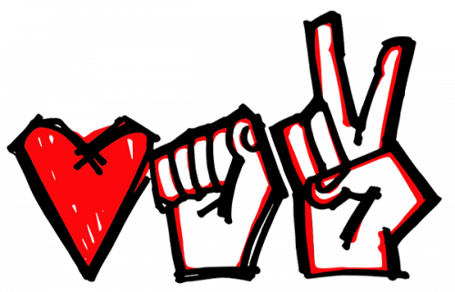
Three oppositional parties united under one logo in order to try and lead the country to a better and brighter future. On July 16th, the headquarters of the leading opposition participants of the presidential election in Belarus Viktor Babariko and Valery Tsepkalo announced their support of Sviatlana Tikhanovskaya, who was registered and a presidential candidate. The new campaign, created for a united opposition, is based on three,  women: Sveltala Tikhanovskaya herself, Maria Kolesnikova, the manager of Babariko headquarters, and Veronica Tsepkalo, wife of Valery Tsepkalo. The main idea of the campaign as a whole and its logo, in particular, is…

Soccer and the City
Soccer and the City

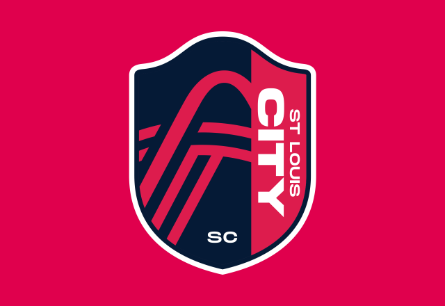
As the Major League Soccer announced its plan to expand to 30 teams last year, St. Louis has been preparing to launch its own expansion team. Initially, it was planned that a team from St. Louis would join MLS in 2022, but due to the coronavirus pandemic and the delay in the construction of the St. Louis soccer stadium, it may start playing in the league only in 2023. Waiting for the franchise’s debut in MLS, the ownership group has unveiled the club’s name and logo. St. Louis City SC, the name for the team, was chosen in a vote…

Michael Joseph gets new brand identity

In 1935, British writer and publisher Michael Joseph founded his own imprint and named it after himself. 50 years later, Michael Joseph Ltd, along with some other British and American imprints, was bought by Penguin Books, a prominent publishing house where it has received a leading role as a division specializing in lifestyle books, detective stories, memoirs and women’s fiction. To refresh Michael Joseph’s look, Penguin hired Mother Design which created a brand identity emphasizing the imprint’s heritage and individuality. Since its founding, Michael Joseph used a mermaid logo that appeared in several iterations over fifty years until the company…

Rolls-Royce introduces new brand identity

Today, For advertising materials and other Rolls-Royce products, a simpler version of the Spirit of Ecstasy has been designed. She will be depicted facing towards the right – according to the designers, this has to symbolize the company’s committing to the future. As Marina Willer, the head of the designing team, said, the Spirit of Ecstasy is an excellent image for a modern brand, and her use in terms of branding will bring new vibes into Rolls-Royce’s identity. The stretching posture of the flying lady corresponds with the company’s aspiration to the superior quality in its luxury products. Now, the…

Arnott’s unveils its corporate logo confusing fans

Established in 1847, Arnott’s is a popular Australian brand producing biscuits and snack-foods including Tim Tams, Saos, Mint Slices and Wagon Wheels. Throughout most of its history, it has used a logo with a detailed drawing of a macaw parrot. And when the company has recently rolled out a new, much simplified emblem, many were disappointed, thinking that it would replace Arnott’s iconic macaw. The Arnott’s new logo, unveiled on social media, evoked a backlash. People expressed their disapproval, calling it ugly, “big fat no” and even a blasphemy. However, the company was quick to calm its fans, saying that…

Intel makes changes in its look

Since its inception in 1968, Although it dropped the swoosh, Intel’s new logotype inherits general traits from the previous emblem, including the square dot over the “i” (however, its color will be different from the color of the letters now) and the sans-serif style for the letterforms which, however, were a bit altered with the right corners in the “i” and the “l” as well as a more traditional shape of the “n”. While presenting the new brand identity in her corporate blog, Karen Walker, Intel’s Senior Vice President Chief Marketing Officer, said that the rebranding is based on the…

A new logo to help the world understand electronics recycling

Growth of waste is one of the biggest issues of the present. According to some researches, the most quickly increasing waste stream today is electronic waste (or e-waste). Over 50 million tonnes of e-waste are produced in the world every year, but less than one fifth of it is designated for recycling. To draw public attention to the problem, Material Focus, a British organization advocating electronic waste recycling, has introduced a logo that is supposed to mark e-products to be recycled. The logotype is a result of Material Focus’ cooperation with the London-base design studio Truant, established as a part…

Ottawa Senators bring back old logo slightly altered

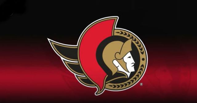
Last week, the According to Eugene Melnyk, the franchise’s owner, while restoring the side-view depiction of the Roman legatus, the Senators are returning to their roots. This emphasizes that the team has strong heriage, and their goal is to build something new and bold on it and to start a new chapter in their history. The revived logo still features a couple of small details that distinguish it from the vintage Senators emblem. The legionary now has a gold cape instead of the red one that was in the original version – probably, the change was done to look more…

More