Blog

DocMorris: A new logo for a new business scheme

Founded in 2000, DocMorris is one of the largest online mail-order pharmacies in Europe. With the annual income of $50 millions, it operates in Germany and the Netherlands. Transforming from a simple online pharmacy to a digital health care provider, the company has recently changed its brand identity. While many things have been done to digitalize its health care services, DocMorris is saying goodbye to its old logo with a cross symbol it has used since its inception. As the pharmacy’s press-release says, with growing expectation of customers, digitalization can be a driver for a health care service to enter…

Omlet: Tender loving care for animals

Founded in 2004, Omlet is a British brand involved in the production of various breeding and care devices for chickens, rabbits, guinea pigs, and other domestic animals and pets. In fact, the business originated as a graduation project by four students at the Royal College of Arts in London, UK. They started with a chicken coop model called Eglu, which has already sold 150,000 units. Omlet’s success is rooted in research that addresses questions like “Can my chickens go outside while I stay indoors?”, “How high can my cats climb?”, or “Is this rug truly comfortable for my dog?”. These…

CIA updates its logo, implementing new recruitment policy

The first big rebrand of 2021 unexpectedly comes from the Although CIA’s revamped emblem still represents a roundel, it features an entirely new design, distinguished with wave-like patterns with multiple intersecting white lines against a gray background. It also includes the centered wordmark “CIA” and triple circular lettering “Central Intelligence Agency”. This is a really unusual design solution for such a solid governmental institution which previously used a seal in the style of the State symbols. This cliché-breaking move of CIA perfectly reflects the new recruiting and diversity policy, in which the organization aspires to enroll young and talented Americans…

America gets new logo to celebrate her 250th birthday

As part of the preparation for the United States Semiquincentennial, the nation’s 250th anniversary to be celebrated in 2026, the America250 Commission has unveiled a special logo for this event. Created by the prominent design studio Chermayeff & Geismar & Haviv, the anniversary symbol aims to “help people engage with a national celebration at a crucial moment.” It is worth mentioning that the presented design is not the first attempt at creating a Semiquincentennial logo. In 2022, the organizational commission adopted an emblem featuring the number 250 in a currency-style typeface. However, this design was later deemed unsuitable for display…

Petco removes cat and dog from logo, making consumers outraged

Enjoying a decent sales growth over last two years, Petco has large-scale business plans with a more orientation toward health care for pets. The pet retailer already announced it would expand its chain of veterinarian clinics up to 140 locations by the beginning of 2021, and the process will likely be continued. Aiming to establish itself as a solid pet health care provider, Petco has recently rebranded itself as “Petco, The Health + Wellness Co”, replacing its cat and dog logo with a new one featuring only the company’s new name. However, the brand overhauling faced a harsh criticism. Mews…

Foursquare updates its brand identity

Launched in 2008, To overhaul its look Foursquare hired PlayLab, a Los Angeles-based design studio, that developed the service’s new identity based on its activities and current level in terms of business and technology. While the previous Foursquare logos looked quite generic, featuring a cartoon character or representing a simple lettering (in the latest iteration), the updated visual identity of the service includes a new wordmark in the Authentic Sans 90 typeface, complemented by the FSQ abbreviation. As David Godycki, the art director of Foursquare, says, this design creates a scalable system retaining the company’s traditional playful style. In addition,…

Bluesky declares itself as Twitter’s successor with new identity

The renaming of Twitter to X in July 2023 caused quite a stir, as Elon Musk’s unexpected move disappointed many users and raised concerns about the future of the social network. Amidst this backdrop, few people recall an interesting fact related to the short blog service – the existence of Bluesky, a twin of Twitter on the web. Bluesky was launched in 2021 by Twitter’s former CEO Jack Dorsey and software developer Jeremie Milller. It operates on a decentralized social network protocol and has been in test mode, with user sign-ups limited to pre-applications. Initially, Bluesky served as the name…

We Compost: Composting for everyone

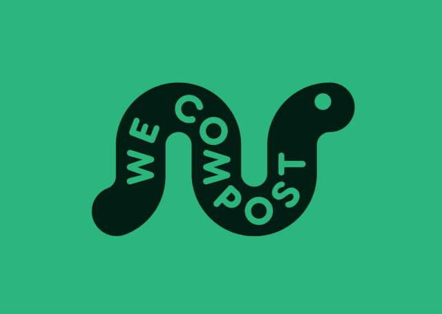
Launched in 2009, We Compost is a company from Auckland, New Zealand, providing a food waste collection service. Each week, it collects more than 50 tonnes of organic waste from health care institutions, schools, hotels and restaurants. Advocating for cleaning environment and recycling waste, the company aims to promote the ideas of sustainability and eco-friendliness. This goal is also contributed by We Compost’s new brand identity. The central element of the We Compost look is an earthworm. This animal was chosen as the company’s symbol for its ability to digest a wide range of organic matter that helps fertilize soil,…

More