Blog

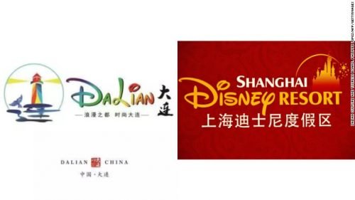
China’s Dalian presents a logo accused of plagiarism

Identity updating is a common step taken by local authorities to attract more visitors to their cities or towns. Following this strategy, the Dalian Culture and Tourism department has recently unveiled a new logo for the city, hoping it will assist in development of the local economy. The refreshing of the visual brand of Dalian, wouldn’t have drawn much attention if the city’s new welcoming emblem weren’t so similar to Disney’s logo. Indeed, if you take a look at the Dalian logo, you can easily see that the “D” and the “i” with a swoop over it are quite identical…

MAAM: Imagine the Unimagined

One of the oldest art schools in the United States, the Massachusetts College of Art and Design (MassArt), is going to launch its own museum. The MassArt Art Museum, or MAAM, is planned to be opened in February 2020 on the territory of the college campus. Projected as a “kunsthalle”, a museum without a permanent collection, MAAM, according to Lisa Tung, MassArt’s executive director, will be a unique gallery for the contemporary art in Boston, a place where visitors will be able to see the works of modern artists. Forming MAAM’s identity, the administration of MassArt started collaborating with the…

Louisville City Football Club scrapped new logo three days after its introduction

The Louisville City FC unveiled a new logo this Monday. The team also changed its colour scheme in new design to white, gray and black shades, complementing the trademark purple hue. Besides, the primary crest included main elements from Louisville’s city flag, such as the circle of stars and the fleur de lis. According to the team president Brad Estes, one of the rebranding aims was to pay homage to the city, while trying to create a new look that will be bright and clear. Moreover, the updated crest was an additional sign of the club’s continued growth and achieved…

Canadian Energy Center introduces new emblem replacing initial unsuccessful logo

When the Canadian Energy Center, an organization advocating oil & gas industry safety, had unveiled its new logo in a tweet this Thursday, it called forth a backlash. It turned out that the CEC emblem is similar to the logotype of a US software company. On Tweeter, users noticed that the Canadian agency’s white dimensional blocks on a blue field is a copy of the patern in green used by the Boston-based Progress Software Corp. Informed of that, the US company thanked those who drew their attention to CEC’s new logo, saying they would be looking into this issue. Meanwhile,…

Sechelt unveils new brand

The council of Sechelt, British Columbia, has approved a plan for changing the brand, but the council members still have to decide which of the final logo variants will be the next symbol of the district. The main element of all the three visual brand versions feature the big letter “S” with patterns symbolizing the sun, mountains and sea. This brand evolved from a graffiti project launched by the authorities a year ago. Looking at wall posters placed over the Sechelt neighbourhoods, the residents were sharing their opinions about it, and expressing their vision of the image of Sechelt. To…

Turkey’s Yünsa presents new logo and slogan as a fashion brand

Established in 1973, Yünsa is a Turkish textile brand owned by Sabancı Holding, one of the largest conglomerate in Turkey. Due to its excellent production and trade policy, innovative products and rich experience in the industry, Yünsa is ranked in the top five of the world’s largest woolen cloth manufacturers, and holds the leading position in its sector on the Turkish and European markets. Exporting its production to more than 50 countries, the company has sales offices in the United Kingdom and Germany as well as smaller agencies in 20 countries. Moving into a new business phase, Yünsa aims to…

Joget Inc. rolls out a new logo for its next-gen application platform

Joget Inc. is a company developing an open source workflow application platform. Launched as a project on Sourceforge.net, it has eventually evolved into a serious business. Having moved to Columbia, Maryland, in 2014, the company started a new chapter in its history. Offering its flagman application development platform Joget Workflow, which has been downloaded over 200,000 times, Joget Inc. created a community of more than 10,000 members. With business model transformation and new workflow digital solutions, Joget has recently presented a new logo that reflects the company’s growth and pays a tribute to its Malaysian origins. As Joget itself was…

Koei Tecmo rebrands its technical department

Created after the merger of Koei and Tecmo, Koei Tecmo Holdings Co. Ltd. has carried out a rebranding of its Technical Support Department. Since the functions of the department have nothing to do with technical support provided for users, the Japanese video game developing company made a decision to rename it to “Future Tech Base”. According to a statement from the company, the updated identity, including a new logo, is intended to express the leading role of FTB in the working process. The division is considered to be a base for the future growth of Koei Tecmo as it develops…

More