Blog

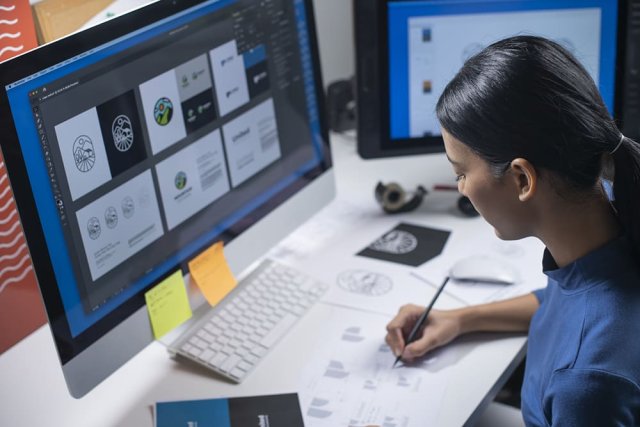
A new logo to help the world understand electronics recycling

Growth of waste is one of the biggest issues of the present. According to some researches, the most quickly increasing waste stream today is electronic waste (or e-waste). Over 50 million tonnes of e-waste are produced in the world every year, but less than one fifth of it is designated for recycling. To draw public attention to the problem, Material Focus, a British organization advocating electronic waste recycling, has introduced a logo that is supposed to mark e-products to be recycled. The logotype is a result of Material Focus’ cooperation with the London-base design studio Truant, established as a part…

Arnott’s unveils its corporate logo confusing fans

Established in 1847, Arnott’s is a popular Australian brand producing biscuits and snack-foods including Tim Tams, Saos, Mint Slices and Wagon Wheels. Throughout most of its history, it has used a logo with a detailed drawing of a macaw parrot. And when the company has recently rolled out a new, much simplified emblem, many were disappointed, thinking that it would replace Arnott’s iconic macaw. The Arnott’s new logo, unveiled on social media, evoked a backlash. People expressed their disapproval, calling it ugly, “big fat no” and even a blasphemy. However, the company was quick to calm its fans, saying that…

Online music brand Deezer updates its visual identity

Launched in 2006, Deezer is a French music streaming service that allows users to listen to the musical tracks of different recording labels, including Sony Music, Universal Music Group, and Warner Music Group. The service’s database currently includes over 90 million tracks and 34,000 radio stations. Deezer has more than 14 million monthly visitors as well as 7 million paid subscribers. Recently, the platform presented new designs for its logo and website. Although Deezer is not as popular as Spotify or Apple Music, its fresh visual identity can surely be named one of the brightest. Deezer’s overhauled brand look is…

Danaher: A poweful asset for a global leader

Established in 1984 by brothers Steven and Mitchell Rales, Danaher is an American company manufacturing commercial, industrial, and medical products. Through a number of mergers and acquisitions, Danaher is essentially a conglomerate that has implemented advanced business strategies and principles, such as Kaizen, a philosophy focusing on continuously improving all functions of manufacturing. Ahead of its 40th anniversary, the company has updated its visual identity, collaborating with the multinational design agency Lippincott. For the new Danaher identity, the agency took an original approach, which is expressed by the slogan “Innovation at the Speed of Life”. According to the design team,…

NASA launches the Mars 2020 mission with a rover logo

On July 30th, NASA launched the carrier rocket Atlas V as a part of the Mars 2020 mission. The rocket is carrying the Perseverance rover whose goal, among other things, is to explore the Red Planet to find an evidence of possible life in the past. As most of the NASA projects, the latest mission to Mars has its own logo created in cooperation with the New York-based design agency House of van Schneider. The name for the Mars rover was chosen by a vote from school students, and should reflect steadfast endeavors in explorations of Mars and outer space….

United States Space Force reveals its new logo and motto

This January, the US Space Force, as a separate branch of the US Army, presented its logo that, however, drew a lot of criticism for being pretty similar to the emblem of the Starfleet from the Star Trek tv-series. In the wake of critical reactions and a lawsuit from Netflix, the military service made a decision to change the logotype. Recently, USSF has rolled out its new insignia on Twitter. Back in June, Netflix initiated a lawsuit over the right to the Space Force trademark after it had launched a new comedy series with the same name. The real Space…

The Netherlands’ mobile carrier reborn as a new brand

The Dutch mobile carrier T-Mobile, a former subsidiary of Deutche Telekom in the Netherlands, is carrying out a rebranding. From now on, the company will operate under the name of Odido. This change, however, appeared to be unexpected for many, raising some questions. While the company used light red in its previous visual identity, the rebranded Odido now maintains a bright and bold color palette. In addition, the brand’s simplified forms implemented in the new logo demonstrate a serious approach. Interestingly, the new name is a palindrome, a word that you can read the same backwards as forwards. According to…

1694 – The Art of Crafting Memorable Logos: Graphic Design Jobs in Branding

All the most popular businesses in the world have had one thing in common; a fantastic, eye-catching logo. These logos have helped make the most basic of companies become a recognizable figure in the people’s eyes. This is all thanks to the wonderful work of graphic designers. There are many variations to a graphic designer that can come in handy when making logos. There is so much work for graphic design Montréal since many artistic set pieces can be found there. You could also find industrial design remote work if you prefer to not travel. Most of these jobs can…

More