Category: News

共有 416
UD Las Palmas returns to La Liga with updated brand identity

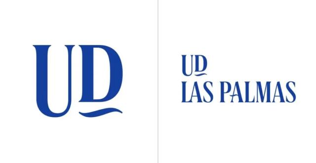
Unión Deportiva Las Palmas is coming back to The new look of UD Las Palmas, created by the local design agency More Amore Brands, is built around the wave symbol which derives from the original typography from the club’s crest and is also used as an architectural element in many buildings on the island. The wave also gave inspiration for a custom typeface for the club, named UDLASPALMAS. Designed by Aillatyped Studio, the font is distinguished by wavy strokes and special ligatures which give it a strong individuality. It plays a crucial role in the new identity, being a uniting…

Markel: Warm shades of respect

In recent times, Markel Group has especially stood out from the brands with strong global growth. Known for its versatile insurance offerings, this corporation is currently included in the Fortune 500 list. The large business group has evolved from a small bus factory founded in 1930 in Norfolk, Virginia. Now over 90 years later, Markel can boast a global presence. Besides being a holding company and a fund, it is primarily an insurance business with a staff of nearly 5,000, which underwrites everything – from cargo ships to wind farms and stadiums. Continuing its development, the brand has just started…

Twitter blue bird has flown as Musk changes social network’s name and logo

Last weekend, Elon Musk announced “Not sure what subtle clues gave it way, but I like the letter X”, Musk posted on Twitter (or X.com?), while Twitter’s CEO Linda Yaccarino shared a photo with a big “X” projected on the company building. The letter is already displayed on the website, instead of the bird. Musk also said the logo is not final, and it can be “polished” in the near future. Indeed, the presented X logo is quite generic, distinguished only by a double line in the left-to-right stroke. People on the web noticed that the “X” is identical to…

Glassdoor unveils new visual identity by Koto

Established in 2007, The goal of the rebranding carried out by Koto was to transform the platform so that it could be something more than just a source of information and become a community for real job interviews. To reach this goal, Koto was collaborating with graphic designer Josep Puy. Together they created a library of images, many of which are animated, intended to express Glassdoor’s basic principles. The new Glassdoor logo, according to Koto, focuses on the company’s “Real work talk” positioning. In other words, the company’s name is in the center of the conversation, which is illustrated by…

Expedia presents new logo for better sustainability

Launched in 1996 by Microsoft, Although the rebranding was carried out several weeks ago, there has been no official information from Expedia Group so far. The company apparently refreshed its logo right after publishing the Open World strategy in May. The press release said Expedia aspires to develop more sustainable ways for the tourism industry. The brand also stated that its strategy will focus on eco-friendliness, climate protection, and responsible use of natural resources. In this regard, the brand’s design was adapted to visually express all these goals. Compared to the 2021 redesign, the new iteration is a more serious…

Minnesota initiates redesign of the state flag

Following Mississippi and Utah, which adopted new flags not so long ago, Minnesota is moving toward a new flag design. The rebranding project is still in its early stages. However, two requirements make the Minnesota redesign process especially tough. According to NY Times, lately more and more US states have taken the decision to change their banners. Mississippi, which did it three years ago, pioneered this trend. Last year, the Utah people voted for a new state flag designed in a simpler manner compared to the previous one. It is to be adopted officially in March 2024. Now, the Democratic…

Cupra facelifts its car brand emblem, named the future of SEAT

In 2018, SEAT launched Cupra as a separate car brand. And it was a complete success, as the creation of Cupra appeared to be the key to reviving the Spanish automaker. Less cars and more money – that has been the strategy of SEAT, which has allowed it to stand out in a very competitive market. The manufacturer just followed the approach of other big car brands like Fiat, Renault, and Citroën. Before Cupra was created as a brand, its name was just an abbreviation of Cup Racing, which was used for the sportiest model of SEAT. With Cupra as…

Very: A very digital rebrand

Established in 2009, Very is a British online retail brand focusing on household goods. Through its parent body, The Very Group, the enterprise traces its roots to Littlewoods, a once-famous retail and football betting company. According to recent research, Very is still seen as a brand oriented mostly toward a female audience. Not content with that, the brand decided to gain credibility among a wider group of consumers. And this new strategy is expressed by its fresh visual identity, created by design studio SomeOne. For the new identity, the design team reworked Very’s recognizable look, including the iconic pink square….

More