Category: News

共有 416
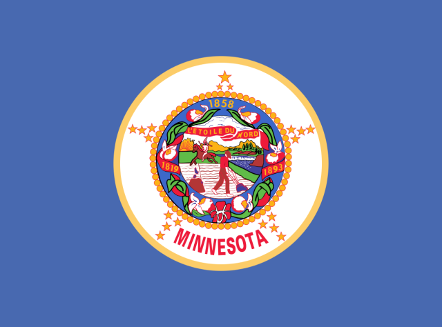
Minnesota initiates redesign of the state flag

Following Mississippi and Utah, which adopted new flags not so long ago, Minnesota is moving toward a new flag design. The rebranding project is still in its early stages. However, two requirements make the Minnesota redesign process especially tough. According to NY Times, lately more and more US states have taken the decision to change their banners. Mississippi, which did it three years ago, pioneered this trend. Last year, the Utah people voted for a new state flag designed in a simpler manner compared to the previous one. It is to be adopted officially in March 2024. Now, the Democratic…

Cupra facelifts its car brand emblem, named the future of SEAT

In 2018, SEAT launched Cupra as a separate car brand. And it was a complete success, as the creation of Cupra appeared to be the key to reviving the Spanish automaker. Less cars and more money – that has been the strategy of SEAT, which has allowed it to stand out in a very competitive market. The manufacturer just followed the approach of other big car brands like Fiat, Renault, and Citroën. Before Cupra was created as a brand, its name was just an abbreviation of Cup Racing, which was used for the sportiest model of SEAT. With Cupra as…

Very: A very digital rebrand

Established in 2009, Very is a British online retail brand focusing on household goods. Through its parent body, The Very Group, the enterprise traces its roots to Littlewoods, a once-famous retail and football betting company. According to recent research, Very is still seen as a brand oriented mostly toward a female audience. Not content with that, the brand decided to gain credibility among a wider group of consumers. And this new strategy is expressed by its fresh visual identity, created by design studio SomeOne. For the new identity, the design team reworked Very’s recognizable look, including the iconic pink square….

Town of Fountain Hills gets a fresh new look

Located in the center of Arizona, the town of Fountain Hills is known for its impressive fountain. When constructed in 1970, this local attraction was considered the world’s tallest fountain, as it sprays water to a height of 560 feet. And it’s obvious that the structure has since become the immutable symbol of the town, being the central element of the Fountain Hills brand identity. While the town’s authority has recently carried out a rebranding, the famous fountain has received a fresh, more modern design in the new logo of Fountain Hills. As is often the case with local brand…

Inside Wolff Olins’ global brand refresh of LG Electronics

This April, LG Electronics The overall task of Wolff Olins was to fully reimagine the entire range of the brand’s visual assets, including physical carriers, digital apps, and promo activities that could be harmoniously suited to each other and, most importantly, the recognizable LG character. As Tom Carey, the studio’s creative director, says, the company’s look is more people-oriented, as it doesn’t just tell you about a brand from which you can get this or that appliance but adds some warmth and vividness that will guide customers through LG’s experiences. This concept gave new perspectives on the principles and philosophy…

AI tech company Perplexity gets multi-meaning logo

Today, amid the neuronal networks boom, there are more and more companies using AI technology. One of them is Perplexity, which offers a chatbot and a search machine, based on algorithms for natural languages. Launched just last year by experienced specialists who worked at IT giants like According to the agency, the Perplexity project was complicated yet interesting, as it seemed as if they changed everything, changing, ironically, nothing. In fact, the starting task was to create a new symbol, and it should at least be as simple as the old Perplexity icon. Plus, it would be great to add…

Munson: Austerity and minimalism

Located in Utica, NY, Munson (formerly Munson-Williams-Proctor Arts Institute) is one of the oldest arts centers in the state, as it was established in 1919 by Mary Munson-Williams and Frederick and Thomas Proctors, based on their family art collections, which were partly initiated by entrepreneur Alfred Munson. Designed by the famous architect Philip Johnson, the museum building hosts a substantial permanent collection of internationally recognized works. Apart from it, Munson includes a Performing Arts division, providing a stage for solo singers and bands as well as artistic and educational activists. Rebranding itself with a shorter name now, the arts center…

Air India presents new visual identity, turning into world-class airline

Last week, The airline, owned by Tata Group, says that its new logo, called The Vista, “reflects the essence of the bold new India, celebrating the milestone of Vihaan. AI, a five-year strategy to transform Air India into a world-class airline”. For the new branding, the airline reimagines the traditional design that has been used for windows on Air India aircraft for many years. So the gold “window frame”, as the company calls it, is adopted as the company’s new symbol, alluding to a “Window of Possibilities”, according to an official statement. Air India’s totally new aircraft livery is distinguished…

More