Category: News

共有 416
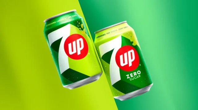
7Up updates its brand with a clear and vigorous visual system

The logo of The package design got simpler, showing off a minimalistic style. The same goes for the new 7Up logo which has graphically become flatter in a way, getting rid of some elements, like the green bordering of the 7. Remarkably simplified, the outline of the digit now has less crookedness, which was previously emphasized by the roundness of the corners. So it feels more solid and vigorous, with sharper corners and straighter lines. However, the roundness was changed to a different design solution – a shadowing that is in accordance with the brand’s new color palette and reinforces…

Jonathan Ive creates an emblem for Charles III coronation

In late 2011, Queen Elizabeth II knighted Jony Ive had worked at Apple for 27 years, creating, among other things, Bondi Blue, a shade of blue, that was used for the back of the legendary iMac introduced in 1998 — a turning point in Apple’s history. The forms of iPhone and MacBook Pro owe to Ive, too. In 2019, he left the company to start his own business with LoveForm, a team of creative people working in different directions. The coronation emblem designed by Ive and LoveForm will officially be presented during the festivities in May, including the coronation service…

Burberry brings back the Equestrian Knight to its logo

The British luxury house Initiated in September 2022, the creation process of the new look for the company this time is led by Daniel Lee. Burberry’s visual identity will again include classic lines and a serif font, adapted, however, to the digital environment, as well as elegant and modern features, more stylized and in a larger size. Another thing to specially mention is the color. Now, the Burberry logo is executed in deep blue, against the background of ivory white, which will also be featured in the black-and-white version. The return of the Equestrian Knight is one of the most…

Eurostar: How to transform a symbol into a flexible design system

Launched in 1994, Eurostar is a pioneer brand involved in international high-speed railway transportation. Its network connects the United Kingdom, France, Belgium, the Netherlands, and more recently Germany. This year, the company is undergoing a rebranding after a merger with Thalys, a high-speed railway provider that connected Paris and Brussels. The prominent DesignStudio developed a new look for Eurostar, having made a great job, completely changing the visual identity of the company. The project was based on a new concept named Spark which comes to life under the motto “Spark new experiences” and puts forward a new symbol replacing the…

Fans get offended by the logo of Pink Floyd re-edition of Dark Side of the Moon

Fifty years ago, Long-time fans of Pink Floyd surely know that the original Dark Side of the Moon of 1973 featured a cover depicting a triangular prism dispersing a white light beam into the colors of the rainbow. Designed by Hipnognosis, a design group that worked with many musicians and bands at that time, that gatefold became as classic as the album itself. But apparently, the new generation of fans is unaware of this fact as the cover logo for the re-edition caused a backlash when presented. Alluding to the 1973 edition, the anniversary logo combines a triangle, the number…

Daniil Medvedev gets a personal logo by Lacoste

On the occasion of the 2023 Australian Open which started this Monday in Melbourne, Daniil Medvedev has unveiled his own logo created in cooperation with Lacoste. Thus, the Russian tennis player has joined Roger Federer, In his logo concept, Medvedev aimed to highlight one of his passions – gaming – designing the emblem to resemble the buttons of a gamepad. Presenting the logotype, the tennis player published a gaming-style video featuring two fans of Daniil who fight in a “guess game”, with Medvedev himself as a judge, and try to guess what the logo’s elements mean. “Very happy to launch…

Italia’s Azzurri are about to start new season with new identity

At the beginning of the year, Federazione Italiana Giuoco Calcio (Italian Football Federation) announced a new identity for the Italian National Football Teams, including a logo and even a sound logo. The new symbols will officially be adopted in March. According to FIGC, the refreshed shield is “an expression of the feelings and the passion of the Italian football fans”. The Azzurri, the national football team, will present it to the wider public in the opening matches of the qualifying round for the 2024 Euro which will be held in Germany. The redesign also coincides with the fact that the…

Holiday brand Center Parcs updates its logo

Established in 1968 by Dutch entrepreneur Piet Derksen, Center Parcs is an international network of holiday villages that currently operates a number of resorts in eight European countries as well as China. The tourism brand has entered the new year with a new visual identity, hoping to refresh its image in the industry. Tourism has accelerated much after the tough times of coronavirus, promising to increase the income for many providers. According to Frank Daemen, a member of the board of Center Parcs, the company became one of the leaders in the industry last year. “We can now look back…

More