Category: News

共有 416
Bugatti updates its look with new color palette and typography

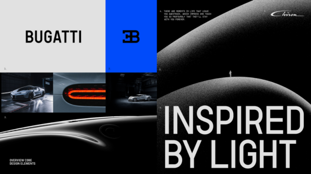
The sports car maker As Bugatti’s marketing director Lorenz Nause says, the redesign was a serious task for the company as it needed to find a balance between creating new things, that would allow to express the manufacturer’s ambitions for the future, and saving the basic elements to continue the visual tradition of Bugatti. The new Bugatti branding is based on the brand’s iconic EB symbol and blue color which is new for the company’s identity and alludes to the history of French motorsport. The EB monogram will be used as a logo. Being a simpler sign, it is more…

GE unveils logos for three planned public companies

The multinational conglomerate The unveiling of the emblems, which took place a few days ago, is an important milestone in the history of GE. And the three divisions will enjoy the rich traditions of the GE brand. According to the corporation, the establishment of three separate companies allows them to improve focusing on their activities, fund allocation as well as flexibility for growth and price formation. And here are the details on the newly created companies and their identities. GE Vernova: the company’s name is a combination of “ver” that derives from “verde” meaning “green” and “nova” meaning “new”. The…

Aston Martin redesigns its logo with “subtle but necessary enhancements”

Aston Martin’s iconic wings are ready for a new flight in 2022 as the brand is aiming to be increasingly competitive in the new conditions of the luxury car market. This plan is going to be implemented under a revised branding. To refresh its visual identity, including a logo, the British car maker hired Peter Saville, one of the UK’s prominent designers. The famous wings were first adopted as the car maker’s logo in 1927, and the new version is the eighth overhaul of the emblem in Aston Martin’s history. The logo’s modern structure was created by SCH Davis in…

Olympique Lyonnais carries out doubtful logo update

Playing in Ligue 1, France’s top football division, While the club’s traditional red and blue are brighter now, the gold bordering in the big “O” and “L” was removed, and the outer borderng became thinner. The “Olympique Lyonnais” is redesigned in the Trenda typeface which was developed by Daniel Hernandez and Paula Nazal Selaive in 2013. With this, the lion’s outline was optimized – now, it has smaller dimensions, with smaller claws and fewer clumps of hair. Overall, such a design makes the logo more scalable.     At the same time, the logo update is rather surprising, and besides,…

Zapier: Orange storytelling

Launched in 2012, Zapier is a product that allows end-users to integrate the web application they use and automate workflows. In other words, it serves as a kind of translator between different application programming interfaces and helps improve worker productivity as it saves time, automating recurring tasks. To celebrate its 10th anniversary, the IT brand has updated its visual identity, which better expresses the functionality and utility of the technology. Although Zapier’s rebranding is not flashy and not too exciting, as the company’s creative director Michael Jeter says, the new design “serves as a base for the whole business and…

Linktree gets a new visual identity

Founded in 2016, Linktree has unveiled a new logo which, however, is only a surface layer of an interesting rebranding as the brand has entirely been renovated. Having a moving-centered visual language, the company’s updated look is flexible and adaptable, and that can be seen in the whole identity of Linktree, including new typography and a fresh color palette. The rebranding is a result of the collaboration of Linktree’s in-house design team and the New York-based design studio Collins. Previously, the Linktree logo was composed of a wordmark in black font and a special symbol formed as three arrows or…

French search engine Qwant unveils new logo

Launched in 2013, Qwant is a French search engine which is mainly used in France and other francophone countries. The website doesn’t generate income from advertising. Instead, it is funded by providing its technology to other websites and businesses. In this regard, Qwant doesn’t employ user tracking or personalize search results. The brand has recently updated its design to express its revised ambitions and aspirations for being more available and modern. Initiated by financier Jean-Manuel Rozan and computer security specialist Éric Léandri, Qwant, which generates almost two-thirds of search queries in France, rolled out its new design coincided with the…

Google continues unifying its products with a new Google Play logo

While the Play symbol still consists of four sections in different colors, it has been somewhat altered. First of all, its corners are rounded now, making the emblem softer. The four parts have been redrawn and adjusted as well, having less space for blue which was dominating in the previous version. Thus, the other sections have received more space, while the general design is more proportional. The logo looks flat as the subtle gradient was removed. The logo redesign comes with other brand elements featuring the same rounded corners and colors as the main emblem. This solution makes the Google…

More