Category: News

共有 416
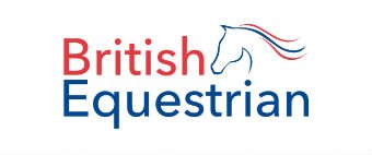
British Equestrian Federation changes its name and logo

Founded in 1972, the British Equestrian Federation is the national organization for equestrian sport in United Kingdom. Recently, BEF has carried out a rebranding by renaming itself to British Equestrian and rolling out a new logo. According to British Equestrian’s officials, while changing its name, the organization follows the trend among many sports governing bodies that drop such words as Federation, Union or Association from their names as this fits more the spirit of the present time. Under its auspices, the new brand will unify Equestrian Team GBR that brings together UK’s professional horse riders, and Hoof, a body advocating…

HP presents new logo for the Omen gaming line-up

While announcing new desktop and monitor models for its Omen gaming line-up, HP has unveiled the brand’s new logo that should symbolize the developing of the company’s gaming direction. Omen derives from Voodoo, a luxury computer brand acquired by HP in 2006. Although the company gave a new name to the brand, it left the Voodoo logo unchanged then. Keeping the “tribal mask” diamond meant the continuity of the VoodooPC technology including water cooling and top Nvidia video cards. Later, HP refreshed Omen’s logo by putting the Voodoo mask in white into a red-to-white gradient square. But new times requires…

Cadbury rolls out first new logo in 50 years

The British confectionery company Cadbury has updated its logo for the first time in fifty years. The redesign that comes along with a new packaging for the brand’s Dairy Milk chocolate bar is a part of the rebranding program launched a year ago. Cadbury’s iconic logo, however, hasn’t been changed much. Derived from the signature of William Cadbury, who was a grandson of John Cadbury, the brand’s founder, the emblem has received a finer design with straight lettering. Apart from the thinner letterforms, it is distinguished with a loop in the “b” from the old logo. According to the official…

Microsoft’s Xbox Series X logo leaks online

Microsoft is currently developing the The logotype features a vertically-oriented word “Series” along with a big “X”. Having a laconic design, it reminds of some design solutions for the Xbox 360 as well as the Xbox One with a similar splits in the “X”. However, the Xbox Series X’s strokes are thicker and the gaps are larger. While the new logo follows the Xbox’s recognizable style, the slight changes in it tells that the Series X will differ from its predecessor. At the same time, the emblem can give a hint how the logotype for the Xbox Series S should…

New York Liberty updates its logo for the first time since its inception

Acquired by Joseph Tsai in 2019, WNBA’s New York Liberty started new era in its history. For the 2020 season, the team have moved to the Barclays Center in Brooklyn, sharing the arena with the Brooklyn Nets that are owned by Tsai as well. Recently, Liberty’s renovations has been supplemented with a new logo. This is the first emblem update since the team’s inception in 1997. According to an official press release, the new logotype unites the past and the future as it symbolizes the heritage of the Liberty and New York City and, at the same time, reflects the…

NASA returns its worm logo to space

After 28 years, NASA brings back its worm logo that was used from 1975 to 1992. This iconic emblem will be drawn on the side of the SpaceX Falcon 9 rocket that planned to be launched to the ISS in May. The revival of the worm emblem is connected with the fact that the Falcon 9 is the first manned space mission to launch from the Cape Canaveral since 2011. While American astronauts have been sent to the International Space Station by the Russian Soyuz rockets from the Baikonur space port for nine years, the new old NASA logo is…

BMW introduces new logo, first update in 23 years

As this year’s Geneva Auto Show has been canceled due to the threat of the coronavirus epidemic, some automakers have to content themselves with their own more modest events while presenting their new cars. So, BMW has unveiled its new i4 concept with an electric engine at a simple press conference. Apart from the sleek exterior and powerful eco-friendly motor, this electrocar has been distinguished with a new BMW logo. Compared to the classic As BMW’s chief management officer Jens Thiemer said, the company is striving for closer relationship with customers, and its new emblem is intended to convey clarity…

UNC Health Care rebrands for $1 million

After the merger negotiation with Atrium Health had failed, UNC Health Care, the largest healthcare system in North Carolina, set a course for a comprehensive transformation. Apart from the renovation of its medical services and management policy, the non-profit has overhauled its brand by dropping the word “Care” from its name and adopting a new logo. According to UNC Health’s spokesman Alan Wolf, the healthcare system is changing its identity for the first time since it was established in 1998. The organization’s new look was created by Monigle, a design studio from Denver that collaborated with many different entities including…

More