Category: News

共有 416
Microsoft updates Windows logo along with 100 app icons

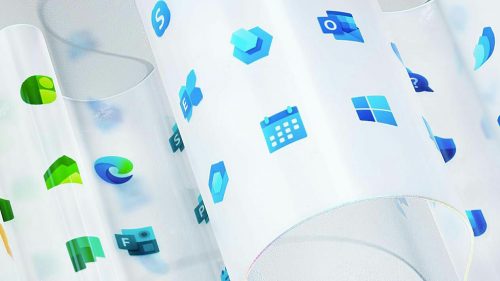
Microsoft is modernizing While redesigning icons, the main challenge was to show new look and maintain familiarity for PC users, said Jon Friedman, corporate vice president of design and research at Microsoft. He noted, that the other task of the redesign was to maintain consistency, because today some of the old icons after decades since their last renovation look rather dated and inconsistent. According to J. Friedman, the team of designers also had to create an open design system flexible enough to span a range of contexts while still remaining true to Microsoft.   In the refined icons software maker…

Trainline has got a new visual identity

Trainline, till 2015 branded Thetrainline.com, the leading UK online provider of rail tickets, has changed its visual identity. Trainline’s main offices are located in London, Paris and Edinburgh. It is included in the list of the London Stock Exchange and is a constituent of the FTSE 250 Index. Established in 1997 by the Virgin Group, today the company presents an independent digital rail and coach platform. The company started selling tickets online since 1999 and has become popular not only in the UK, but also in Europe and worldwide. It’s very convenient easy to use service, allowing you to purchase…

Somersby: The Tree of optimism

Since 2008, Danish brewing giant Carlsberg offers cider beverages under the brand Somersby. Initially, the Somersby cider of 4,5% abv was being sold in Danmark, then the brewing company gradually introduced its product in 46 countries across the globe. For a better marketing, Carlsberg created a special story saying that the branded cider was invented by English lord Somersby who supplied his excellent beverage for the Royal court. Recently, Somersby has received a new identity forged by Elmwood, a design company headquartered in Leeds, UK. While working on this “juicy challenge”, the designers proceeded from the idea of joy and…

The Fort Myers Miracle becomes Mighty Mussels

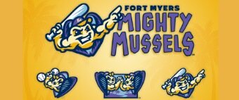
The According to Andrew Kaufman, the owner of the Fort Myers franchise, one of the reasons for making the rebrand was the wish to show more connections between the team and the local community. The main goal in the task of choosing a new name was to make it regionally specific while also conveying the idea of leading a sport healthy lifestyle. Mighty Mussels perfectly satisfied both conditions. Florida’s freshwaters is a habitat for over 60 species of mussels, which are useful for ecology, as they cleanse water by removing bacteria, algae, and organic material.   The new identity was…

Re-merged Viacom and CBS present a logo combining their names

After 48 years, CBS and Viacom are together again. With the deal signed on December 4th, both companies have put a period to the saga initiated by National Amusements, their parent entity, that was encouraging them to re-merge since 2016. The new combined company has got the combined name “ViacomCBS” with a similar logo. The logo features a lettering representing a combination of the names of the two companies, where the “C” in “CBS” overlaps “VIACOM”’s “M” with a kind of cut-out – and that’s one of the interesting details about this emblem. Another remarkable thing is that it is…

Open Systems Inc. changes its name and logo

Headquarted in Shakopee, Minnesota, Open Systems Inc., a software company known for its ERP solutions, has carried out a rebranding and changed its name to Open Systems Adaptable Solutions (OSAS). With the new identity, it is also going to present an updated line-up of software products.   The new name has certainly been backed with a new logo. It features the all-caps sans-serif lettering “OSAS” with the “O” looking like a sphere due to a bit curved stripe. According to a statement released by the company, while unveiling its new brand, OSAS shows an aspiration to continue supporting innovative businesses…

Santee unveils its brand

Having a population of more than 58,000, Santee can be considered as a preferable place to live due to its ideal location between the Pacific Ocean and Cleveland National Forest renowned for its natural beauties. Unlike other costal cities, it still has vast unsettled areas that points out development prospects. New shopping centers, upmarket housing and a recreational complex witness to the rushing growth of this suburb of San Diego. A year ago, as a part of the development plan, the City Council initiated a rebanding program, hiring NorthStar, a design company from Nashville, that specializes in creating identities for…

Batavia is to get a new city logo

The current logo of Batavia, Illinois, was introduced in 1983. It represents the lettering “Batavia” in a simple all-caps typeface with a windmill wheel looking like a dot over the “i” and the slogan “City of Energy”. While the windmill wheel is connected with the windmill manufacturing launched in the city in the late 19th century (it even gave Batavia the nickname “The Windmill City”), the slogan refers to Fermilab, a particle physics laboratory located outside the city. The fact that the city hasn’t changed its identity for 36 years made the authorities think of a rebranding. So, after some…

More