The story of Aagrah begins in 1977 when Mohammed Sabir, an immigrant from India, opened a small restaurant in Shipley, Yorkshire, UK. Over a few decades, Mohammed and his brothers Aslam and Iqbal have developed their family business into the largest chain of Indian restaurants in Britain.
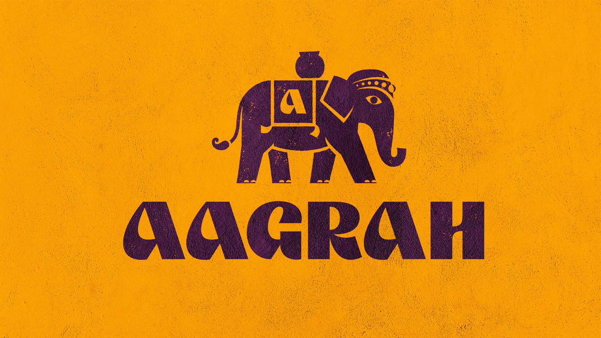
Besides its rich menu, which includes popular dishes such as curry chicken, Samosa cakes, and Chaat snacks, Aagrah also offers its branded cooking sauce range, Tarka. Expanding its business, the company is currently launching new food and cooking lineups that will be available across Tesco stores. To emphasize this fact and elevate the business to a new level, Aagrah has updated its visual identity in cooperation with the London-based Red Dot Studio.
While there is no dramatic change in the Aagrah logo, one can notice that the wordmark was redefined to be more readable. The letters with some oriental touch were redrawn to have a clearer and fresher appearance. This moderate yet reasonable facelift is accompanied by a bright visual system that revolves around Lulu the Elephant, who will play an important role as Aagrah’s mascot. In addition, the brand’s product range will be represented by a wide color palette and vibrant illustrations.
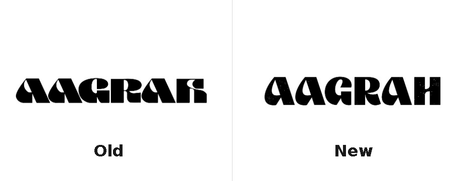
Interestingly, the general style of the Aagrah logo hasn’t been changed since the company’s inception. It clearly indicates that customers can find something beyond ordinary local snacks, promising an exquisite oriental cuisine. While continuing this graphic tradition, RDS made the brand signature more balanced, with less contrast between the strokes and larger openings in the letters. This is particularly noticeable in the ‘A’s as well as the ‘H’, which was “too stylized” to be readable in the old version.
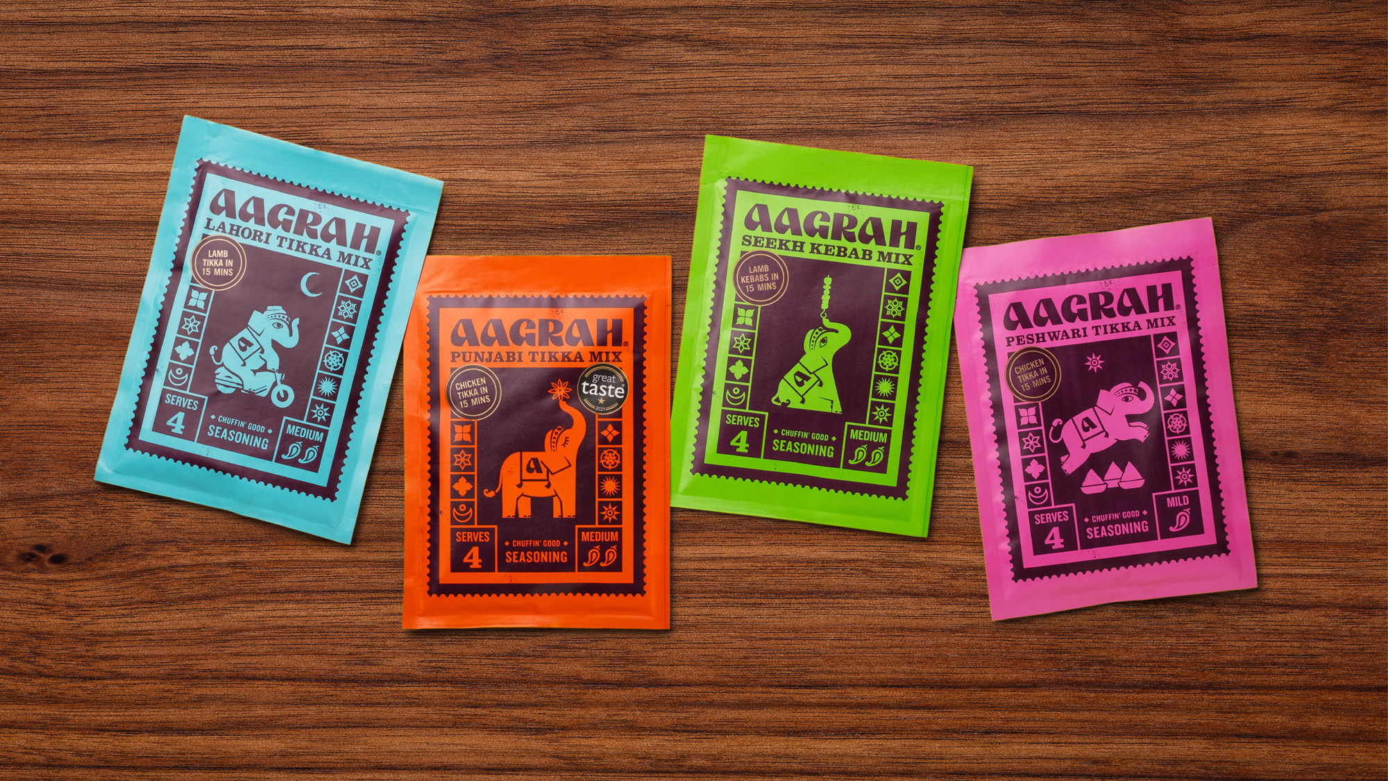
Lulu, at the same time, is the most remarkable element of the new branding, highlighting the Indian heritage of Aagrah. The mascot is created with a strong personality, featuring big eyes, an India-style headpiece, and a saddle blanket with an “a”. It becomes more vivid in animated images. With all these details, the elephant looks adorable, suited to be a recognizable symbol of the brand on packages.
The rebranding brought a wide range of colors reflecting the diversity of Indian dishes at Aagrah. This bright palette undoubtedly evokes associations with Holi, the famous Indian festival of colors, love, and spring.
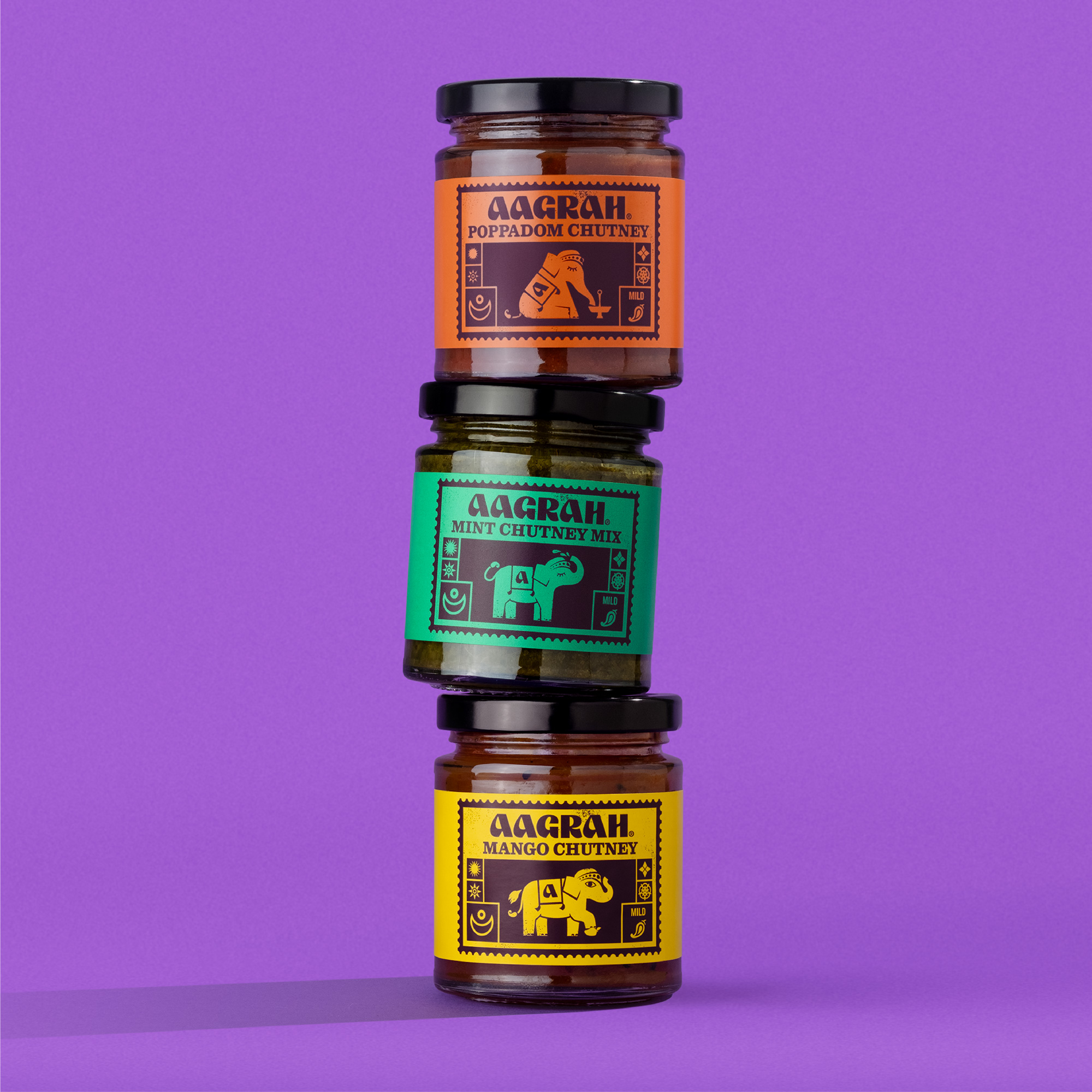
All the elements of the Aagrah visual system work effectively together when applied to the new packaging. The studio developed a nicely balanced structure, where the logo is placed on top, above the sauce name, and Lulu takes the central part, depicted in different postures depending on the product.
For Aagrah, it is also important to integrate this visual language into its restaurants, and it is a matter of the near future. In general, the redesign prioritized the visual assets of the brand. The logo, while remaining strict, symbolizes loyalty to Aagrah’s traditions, and the rest of the identity certainly captivates with an abundance of colors and whimsical elements inspired by Indian culture.





Leave a comment