
Last month, Anheuser-Busch announced its new global goal, beginning to hold a customer-oriented strategy under the motto “We Dream Big to Create a Future with a More Cheers”, which has to drive further growth. While betting on this, the St. Louis-based company has unveiled its new look.
According to AB, the revamped visual identity better reflects the things the company is advocating for, and where it wants to move to. Showing off simple and contemporary motifs, the design perfectly fits the company’s ambitious and optimistic spirit, celebrating the great plans of Anheuser-Busch, as the group’s global brands vice-president Richard Oppy said. And the new logo embodies a clear business positioning and respectfulness to the history of the company.
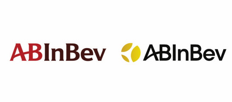
With the partly completed rebranding, the brewing giant, created after AB’s merger with the Belgian-Brazilian InBev, has received a special emblem for the first time as a combined company. Placed before the ABInBev wordmark, the sign symbolizes “a clink of glasses in the moment of cheers”, being in accordance with the company’s mission announcement. The logo’s golden hue conveys the cornerstones of ABInBev – beer and barley.







Leave a comment