Days after AB InBev presented its new visual identity, its American subsidiary Anheuser-Busch followed the lead, unveiling its new logo as well.
Headquartered in St. Louis, Missouri, 
Based on the mission announcement “Futures with more cheers” which was recently published by its parent entity, the company used the opportunity to furtherly develop its brand identity. Over last four years, Anheuser-Busch has been implementing a steadfast business strategy more oriented towards customers, and now, it has to make it visible to the world outside, as an official press release says.
Refreshing its corporate colors, logo and typography, the brewing company is announcing its priorities including customers and innovations. According to Anheuser-Busch CEO Brendan Whitworth, innovations mean “what” and “how” not only in terms of brands and products but also relating to experiences, technology and influence on society. So the business has got an opportunity to accelerate its activity and positively influence a large number of people. And the new brand identity helps reflect the ongoing transformation of this great company.
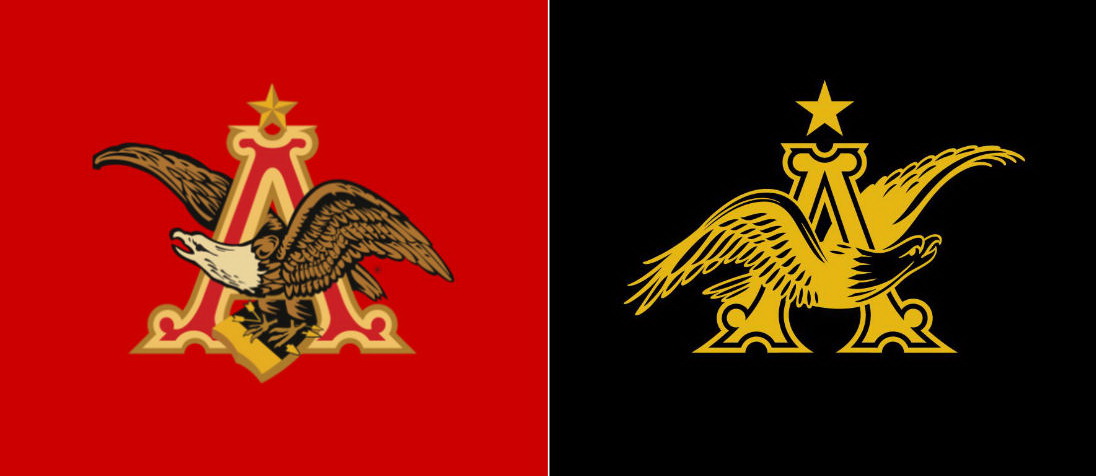
Against the background of the strategic restructuring, Anheuser-Busch’s trademark, the so-called A&Eagle, was revised. Over decades, the logo made up of a capital “A” and a sea eagle has undergone a lot of changes. Now, for the first time in the company’s history, it has received a monochrome design, while intended to be drawn either in gold or in black.
The eagle itself was simplified. Turned to the right, the bird now hovers inside the “A”, instead of sitting on the book. For the company, hovering stands for the capability of facing the future, while signs pointing to the right are usually used as a visual metaphor for progress and positive development.





Leave a comment