Last month, 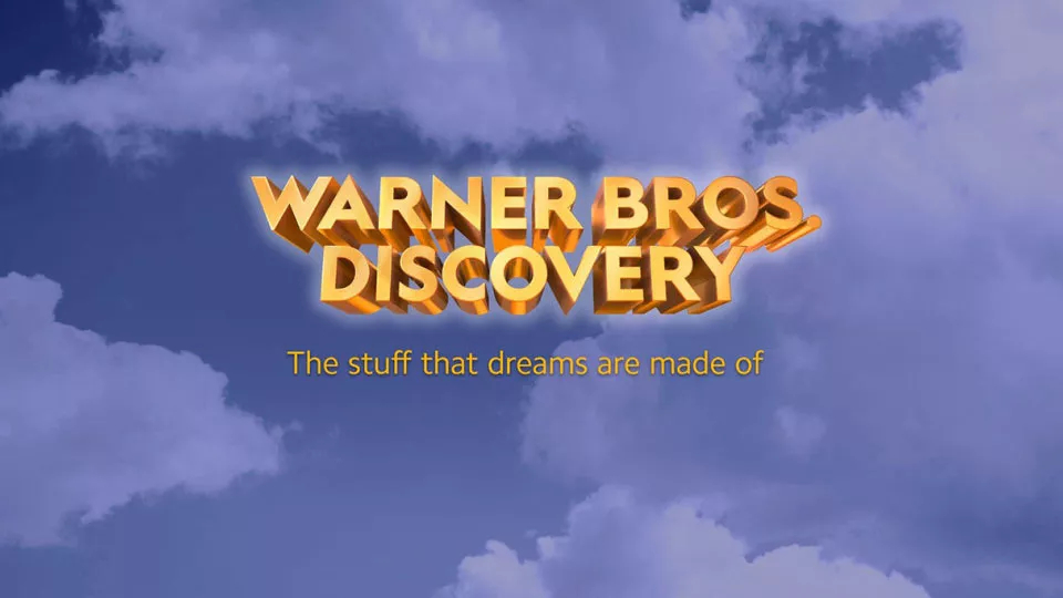
The name and visual identity for the company were presented by Discovery’s CEO David Zaslav, who will also be the head of the emerging venture. Warner Bros. Discovery’s logo represents a 3D wordmark designed in gold which is associated with the iconic WB shield. It is complemented with the slogan “The stuff that dreams are made of”, a phrase taken from the 1941 href=”https://www.picpapa.com/discovery-logo”Warner Bros. movie “Maltese Falcon” – this is an additional respectful nod to the rich heritage of the studio, giving a hint what we should expect from the company.
While the emblem’s design has already received its share of critics for being quite generic as if it was created in Microsoft’s WordArt, Discovery says it is only an “initial wordmark” made to introduce Warner Bros. Discovery to the employees and general public. So, we’ll probably see a different logo after the company has finally been formed next year.







Leave a comment