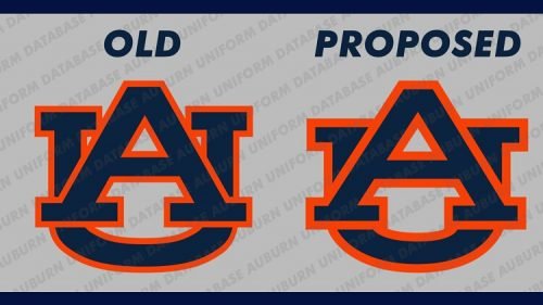
This year suggestion of the traditional mark renovation was also negatively met by fanbase. The most active of them signed a petition against the redesign of the original emblem, as they think the logo change budget could be spent more effectively on other university needs, for instance, facility upgrading, etc.
To make fans opinion more loyal the University explained in its August press release that they don’t change the logo but do updating of their “visual identity system,” which is the demand of time as the uni needs a mark more convenient for using in “digital forms.”
As for the logo new look, it has got slight changes, which include removing the white space between the upper part of the abbreviated “A” and “U.” For the font it is utilized Sabon instead former Copperplate and the size of the two letters is also marched to make the logo look more symmetrical.
It seems that this time despite outside pressure the University is strong in its decision to refresh the primary academic and athletic logos and hired a design firm to complete the launched project.


Leave a comment