In the ever-evolving world of professionals, it is crucial to illustrate how individual satisfaction and collective success are interconnected. This concept underpins Bloch Consulting’s new identity, an executive search firm specializing in lifestyle and sports based in Paris, France. The global transformation, led by design agency Be Dandy, signifies a pivotal moment in the company’s organic growth towards international markets.
By implementing contemporary methods, Bloch Consulting is dedicated to meeting applicant expectations while aligning with company objectives. Maintaining this equilibrium, the firm firmly believes that the professional skills of its candidates are pivotal for employers’ advancement. Hence, the brand values narratives that transcend mere resumes, basing its choices on recently affirmed principles: acuity, confidence, freedom, and vigor. This commitment is encapsulated in Bloch’s unifying slogan: “For everyone to find their place”.
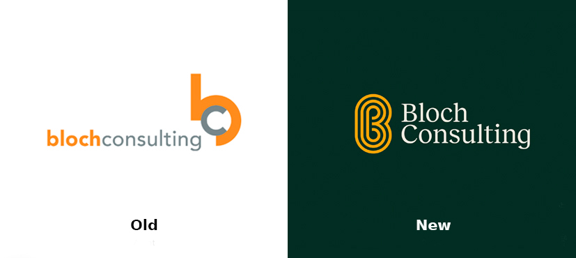
The brand’s fresh identity centers around a symbol described as a “dynamic typographical emblem”, incorporating elements reflective of Bloch Consulting’s activities. The design of the capital “B” serves as a universal monogram reminiscent of running tracks, symbolizing the competitive nature of job interviews within the company, and binoculars representing Bloch’s search-focused endeavors. Accompanying the icon is a wordmark in the Reckless typeface by Displaay, blending traditional elegance with contemporary design trends through its elongated stature.
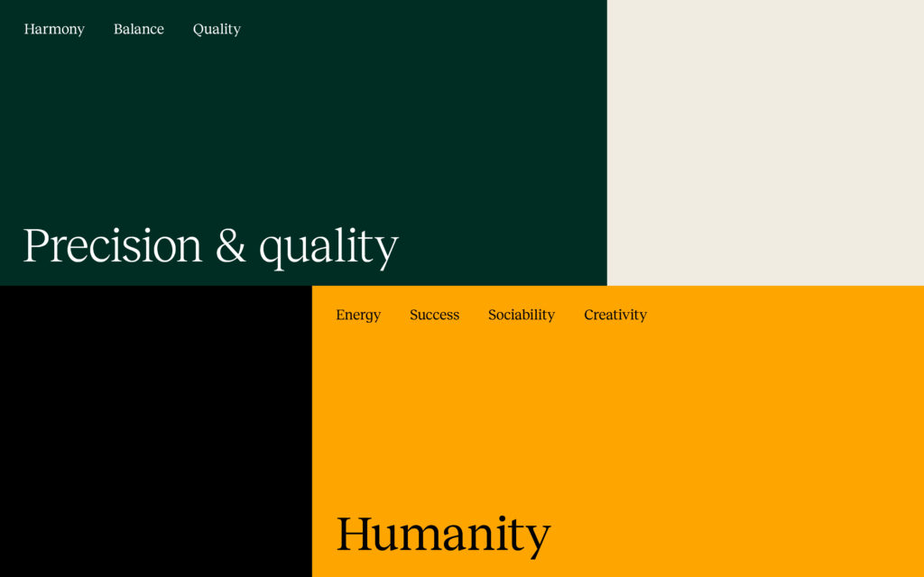
The color scheme also plays on this duality, bridging modernity with tradition by leveraging contrasts, luminosity, and additional hues. For instance, the vibrant orange shade juxtaposes Pine Green and warm light gray tones, creating immediate impact, especially when Reckless is paired with the sans-serif Raleway for conveying the brand’s assertive messages.
This unified approach results in a brand identity that excels organically, devoid of excessive graphic embellishments. Bloch’s iconography, featuring sports and artistic motifs, reinforces key communication points, while branded animations breathe life into them, mirroring dynamic shifts in various sectors. With its new monogram and efficient graphic system, Bloch Consulting is now better positioned than ever to reinforce its distinctive recruitment approach.




Leave a comment