 Barcelona Logo PNG
The logo of the football club Barcelona comprises several heraldic symbols with a long and interesting history. The most notable modifications of the logo took place in 1910. After that, the emblem hasn’t gone far from its roots.
Meaning and history
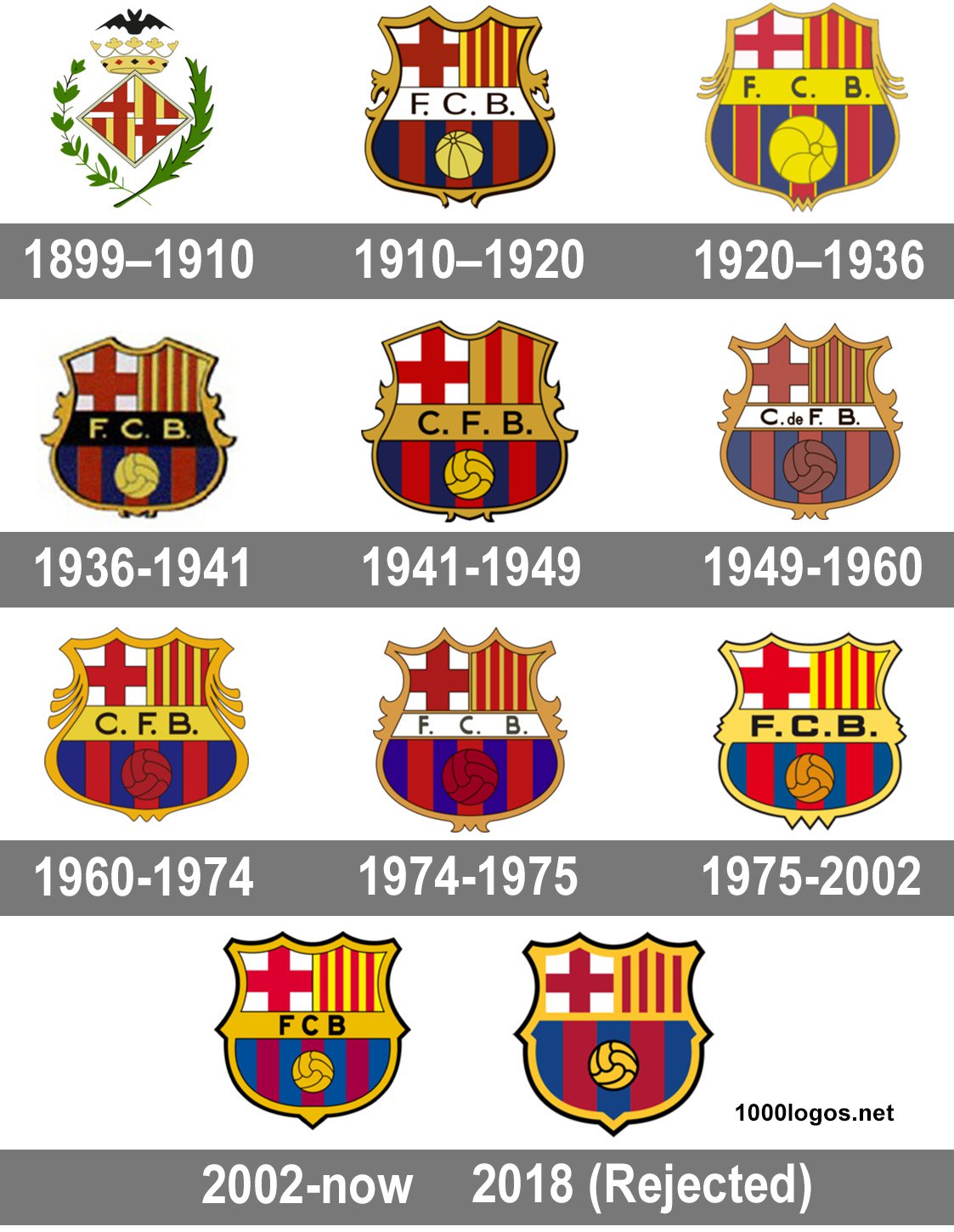
The visual history of the FC Barcelona visual identity boasts ten redesigns of its logo, though the last one, held in 2018, brought an emblem that has never been used by the club. All the other versions of the logo is a graphical representation of the club’s evolution and progress. Built around one heraldic symbol, its logo is instantly recognizable across the globe, and look as if it was created today.
1899 — 1910
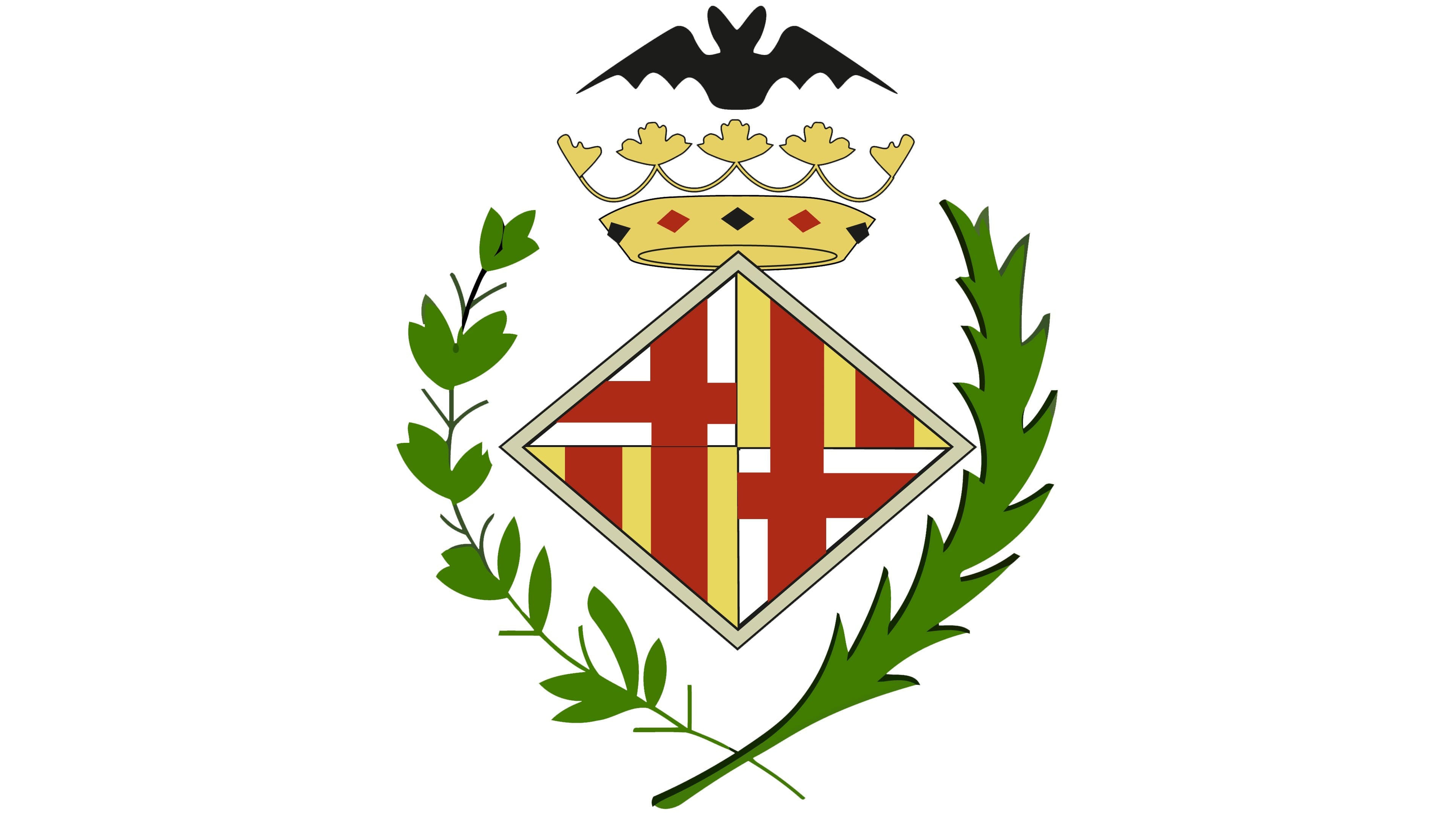
The initial Barcelona badge comprised a heraldic rhombus enclosed in a green wreath with a golden crown, which had a black bat with its wings spread above it. The setting of the rhombus featured a red, yellow, and white geometric pattern: the badge was divided into four segments, where the upper left and bottom right has a Red Cross on a white background image, and the upper right and bottom left — red and yellow vertical stripes.
Depending on the arrangement, the emblem could be used on its own or enclosed in a double circular frame with a “Foot-Ball Club Barcelona 1899” headline in bold sans-serif.
1910 — 1920
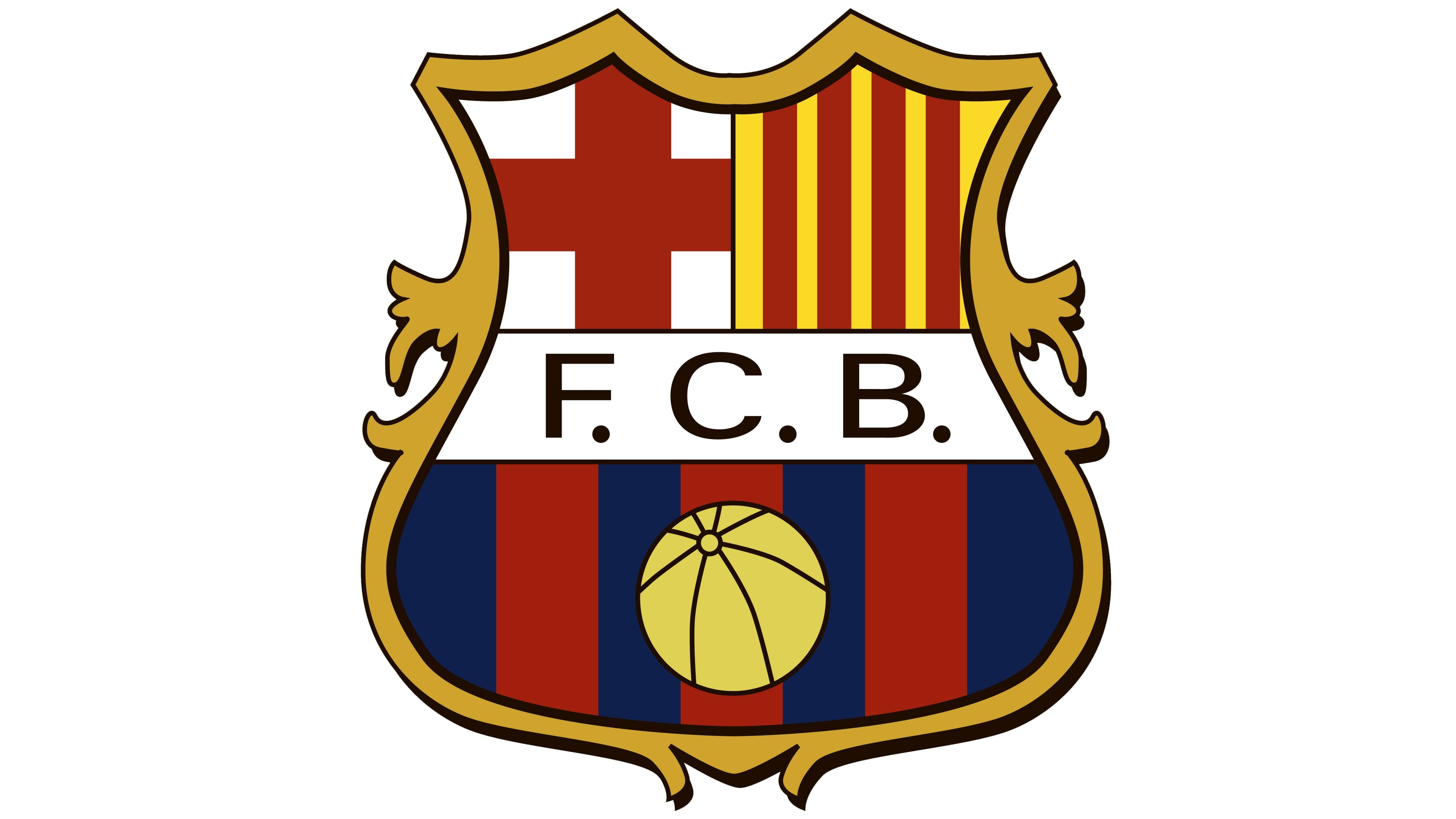
The first interpretation of the iconic logo we all know today was submitted in 1910 and featured a sleek ornate shield with a gold outline. The shield was horizontally divided into two parts by a wide white banner where the black “F. C. B.” Lettering was written in a simple sans-serif. The upper part of the shield consisted of two parts — the left with the Red Cross on a white background, and the right one with red and yellow vertical stripes.
As for the bottom part of the emblem, it was composed of three red vertical stripes and four blue. The yellow football in clean and neat lines was placed in the middle of the striped segment.
1920 — 1936
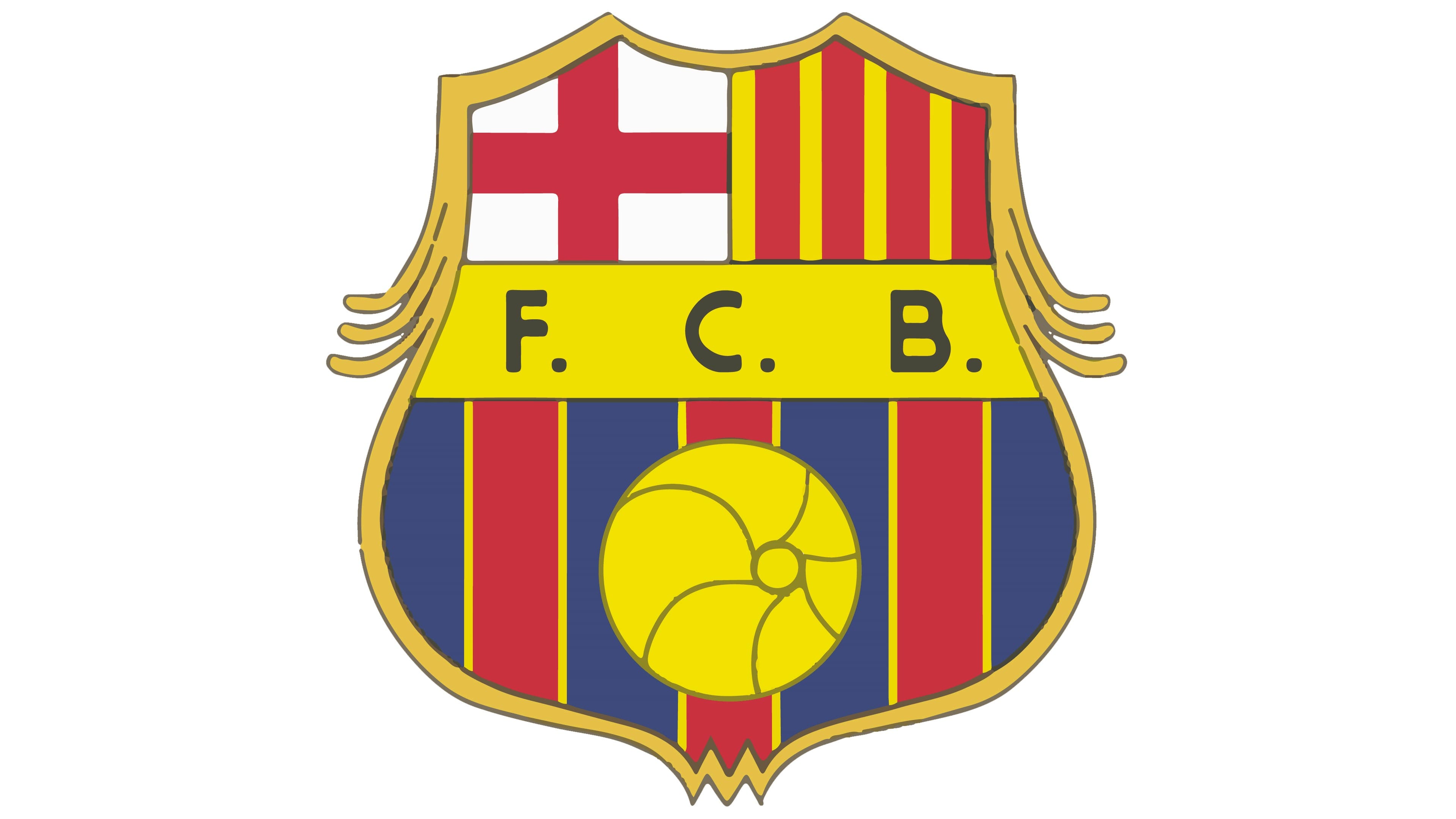
The silhouettes and colors of the badge were first revised in 1920. The insignia became brighter due to the use of lighter shades of red and blue. The white banner with a wordmark now featured a yellow background, which made the badge happier and more enthusiastic. The shape of the shield has also been shifted to a stricter and more modern one.
1936 — 1941
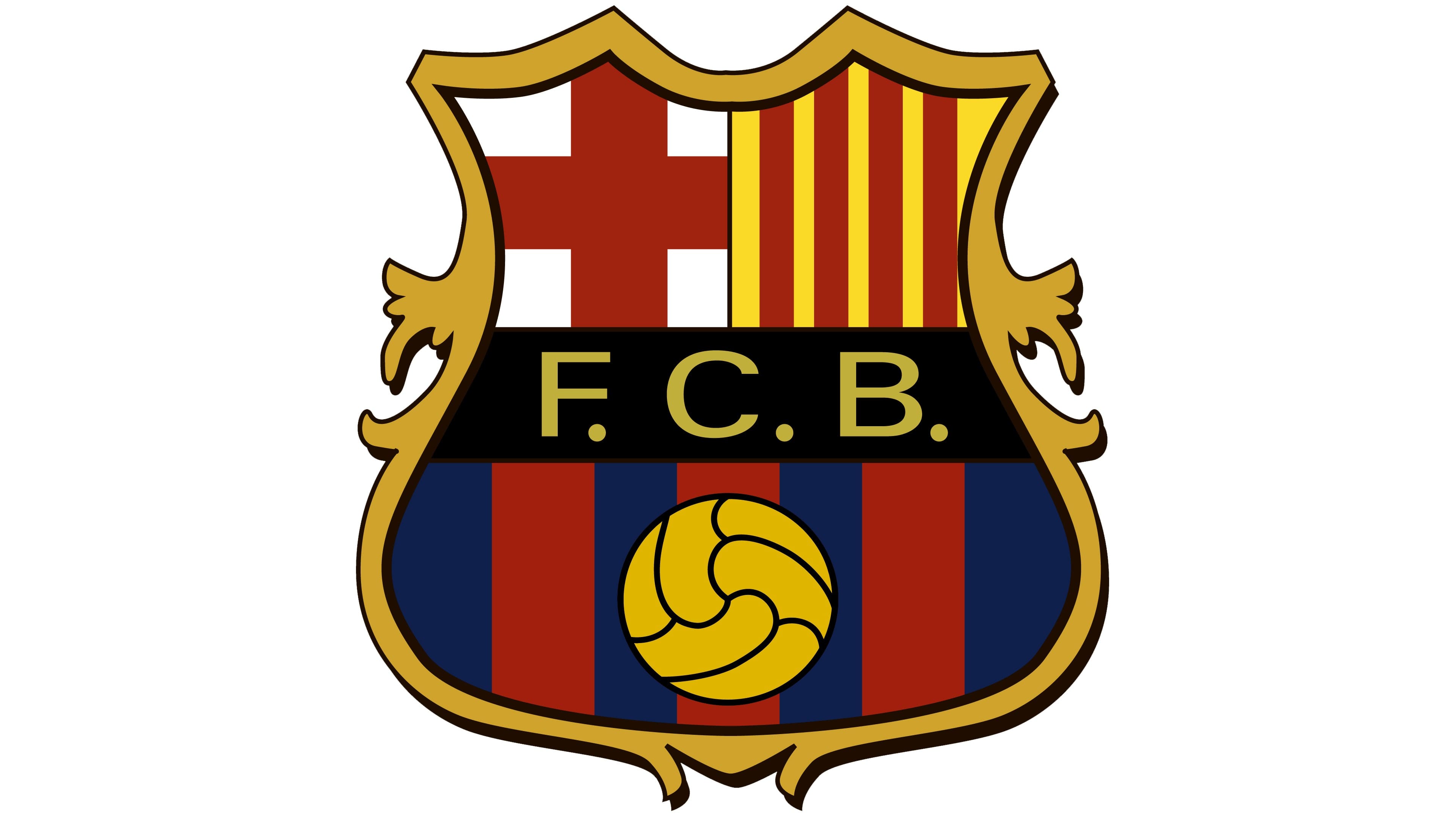
In 1936 the club decides to return to the color palette from the beginning of the 20th century, but now the banner with “F. C. B.” is in black, while the lettering is white. The golden football is drawn more detailed now, with smooth black lines creating a classic pattern.
1941 — 1949
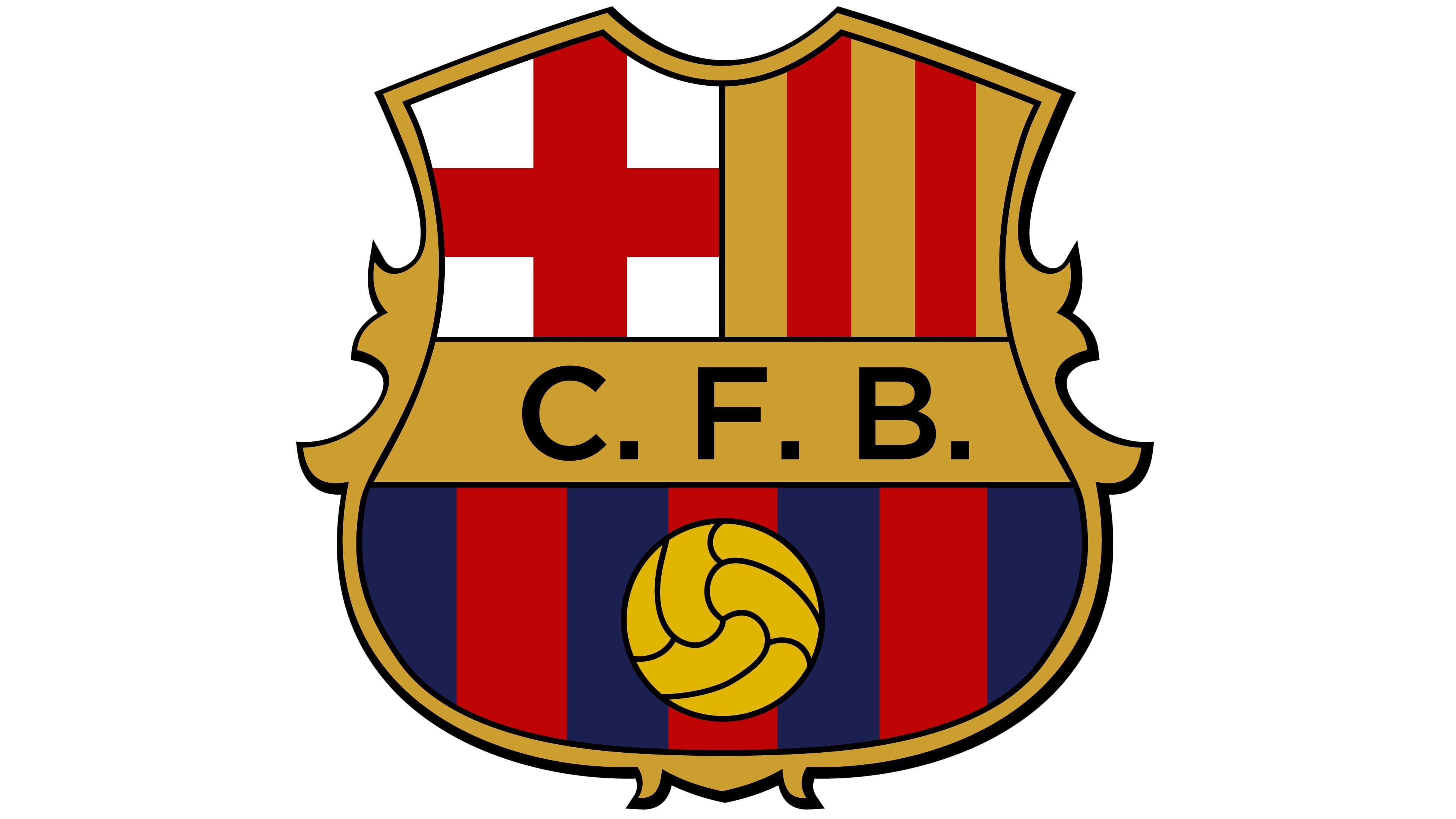
In 1941 the wordmark is changed from “F. C. B.” To “C. F. B.”, and the black background of its banner becomes gold again. The overall composition of the Barcelona badge remained unchanged, though all the contours were cleaned and refined.
1949 — 1960
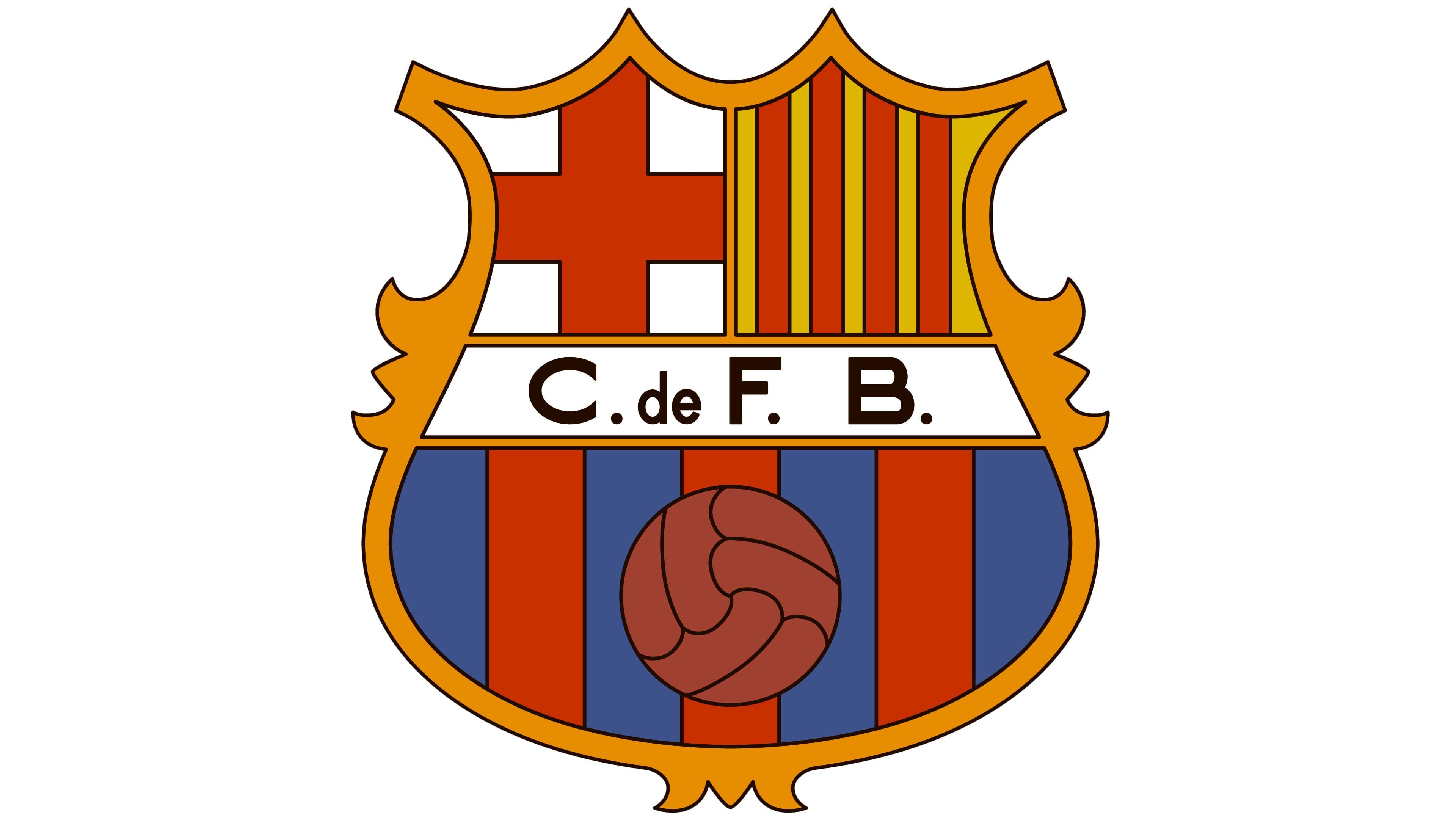
The nameplate gets edited again in 1949, and now it is “C. De F. B.”, which stands for “Club de Fútbol Barcelona”. The colors of the badge in this version and muted and dark, and even the golden football, which has always been bright and visible, became burgundy-brown. The banner with the lettering is executed in a monochrome palette, which refreshed the emblem with its contrast.
1969 — 1974
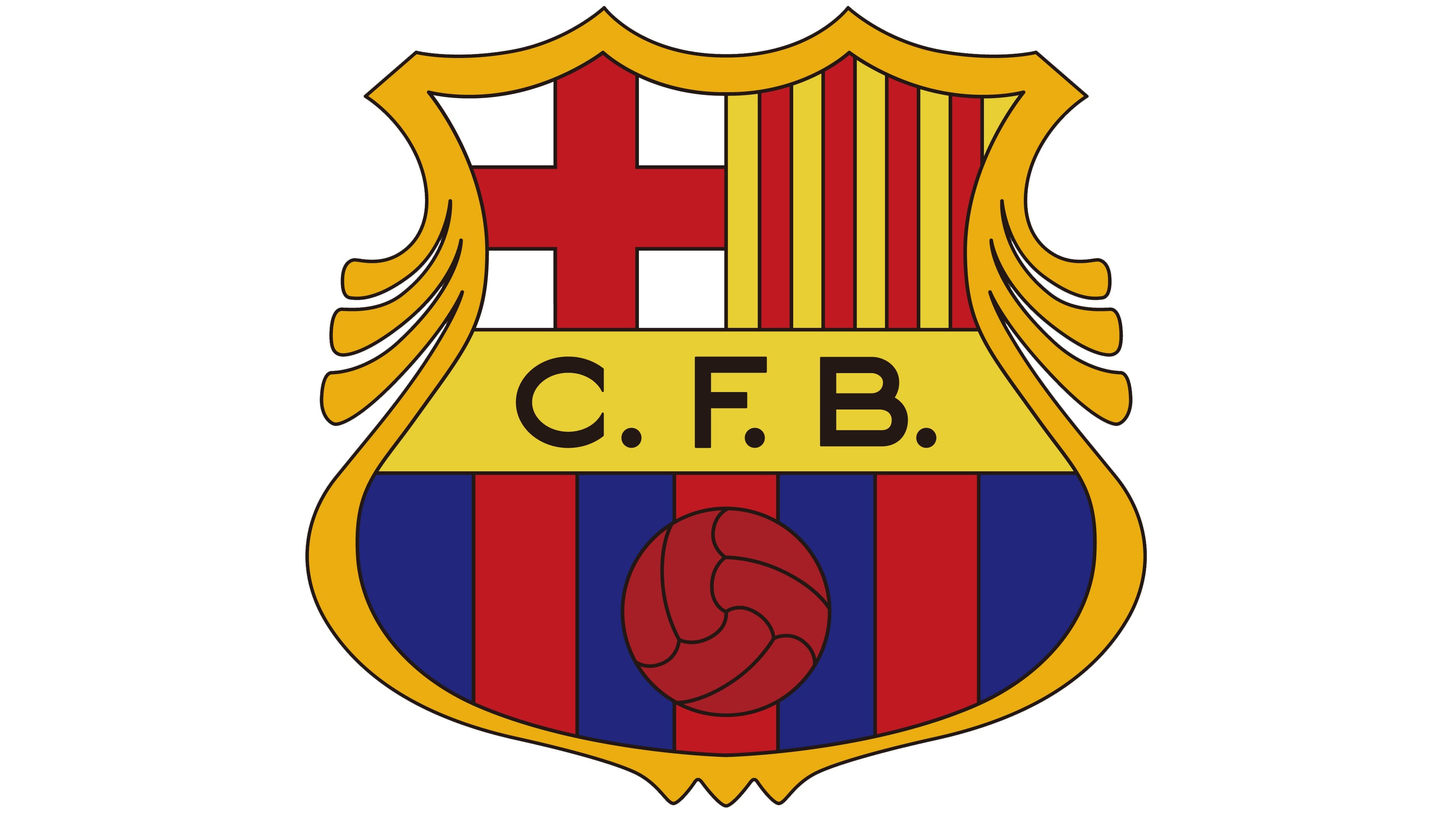
The delighted and luminous color palette comes back in 1969. Lots of yellow-gold particles and an intense red football is what makes this edition stand out from all the previously created versions. The logo from the 1970s evokes a sense of joy, fascination, and friendliness.
1974 — 1975
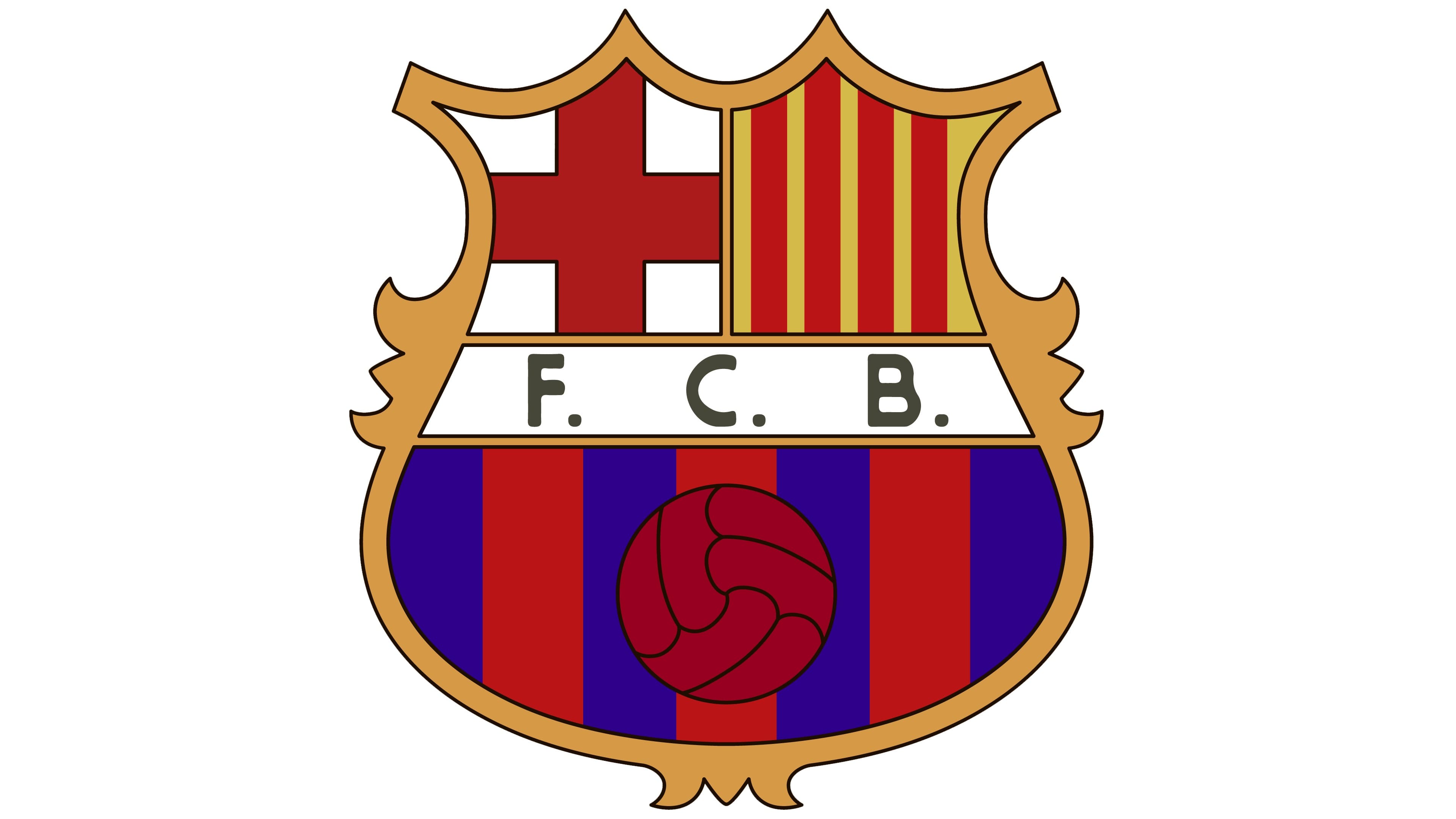
With the redesign of 1974, the gold banner becomes white again, yet all the other elements keep their colors untouched. The shape of the crest has been modified and now its upper part featured pointed peaks. The wordmark is again written as “F. C. B.”.
1975 — 2002
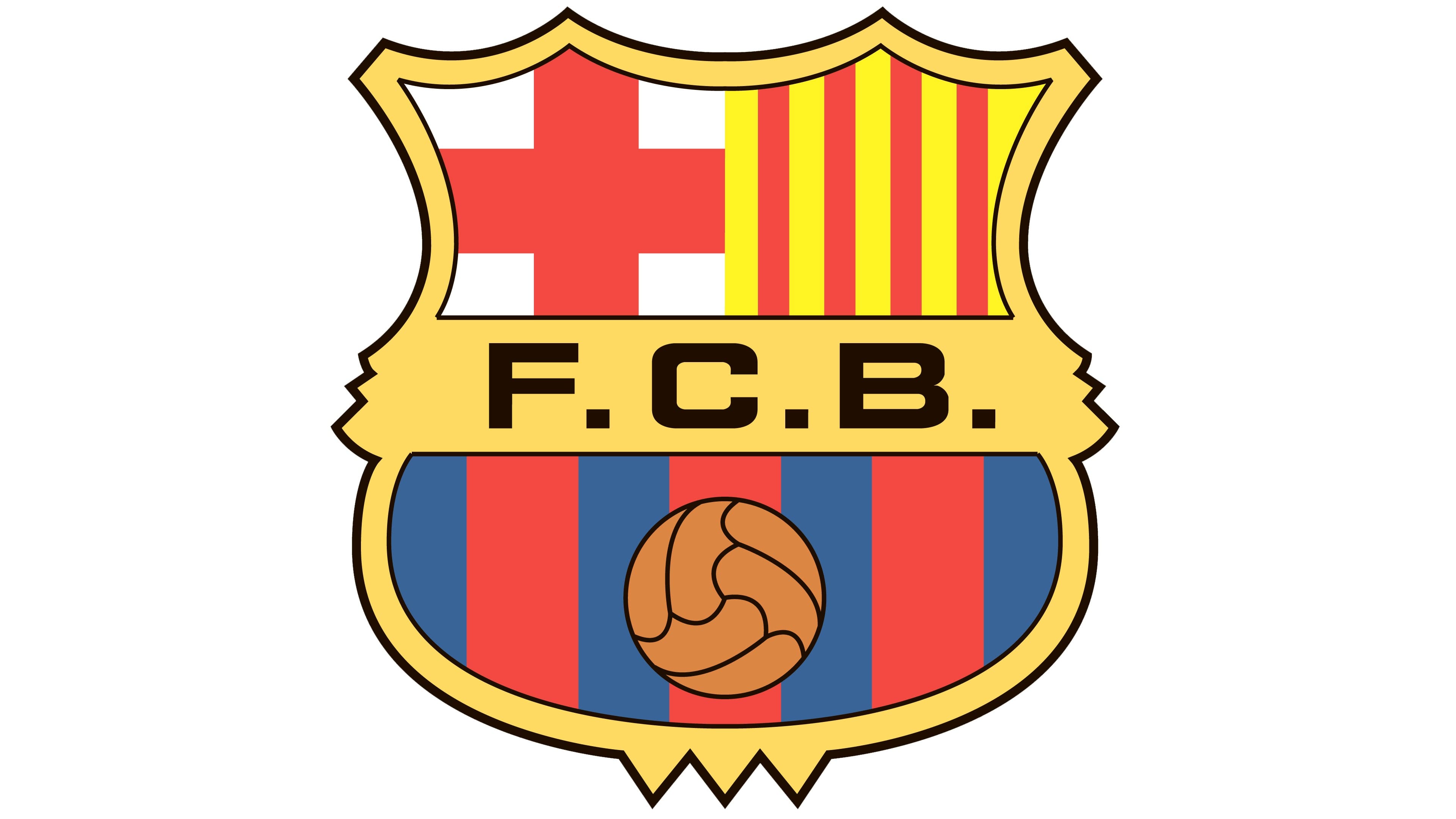
A more modern typeface and a brighter color palette — this is what the redesign of 1975 brought to the Barcelona visual identity. The solid black letters featured a massive geometric sans-serif typeface, which looked brutal and powerful on a yellow background. The football gained a new calm orange shade and finally became visible again.
To celebrate the club’s 100th anniversary, the crest was placed in a blue and red circle with the “1899-1999” date mark in white, placed horizontally on both sides of the shield.
2002 — Today
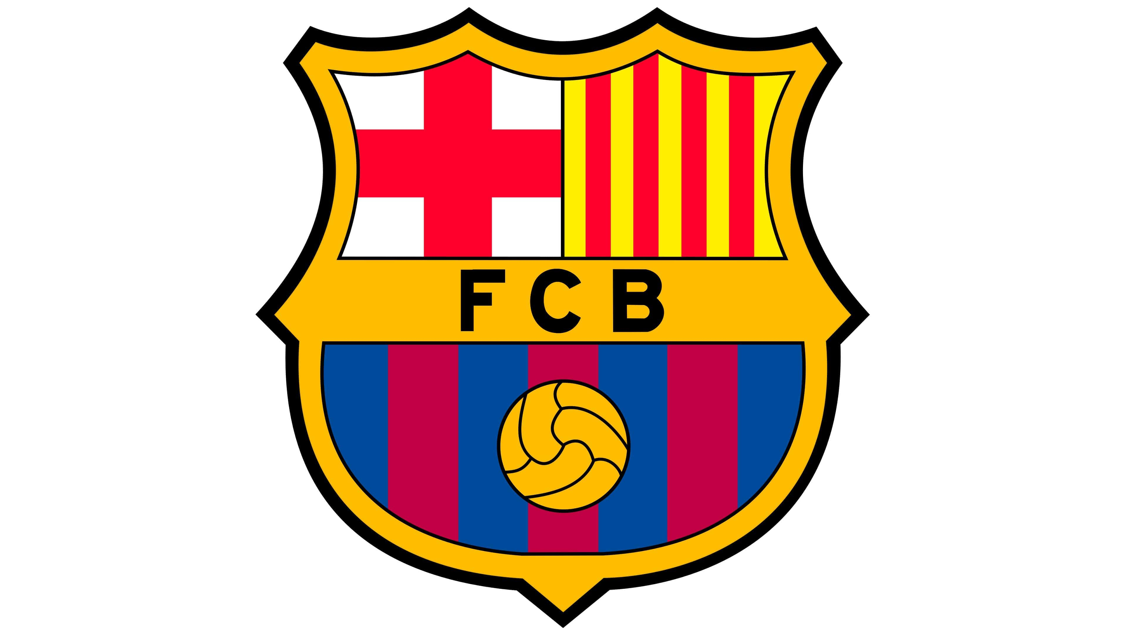
The Barcelona badge we all can see today was inaugurated in 2002 and is a modern interpretation of all the previous versions. The most crucial change of the 2000s is that the dots have been removed from the wordmark. Now the “FCB” lettering in a popular sans-serif typeface looks neat, delicate and evokes a sense of professionalism and fundamental approach.
The football is drawn in gold and black again, and it equalizes the golden frame of the crest and the banner with the wordmark.
2018 (Unused)
The next version of the logo was designed for the club in 2018, but it has never been employed, as was denied. The main controversy of this emblem was in the complete absence of any lettering on it. And the wide gold banner was replaced by a narrow gold line.
Font
The sans serif typeface featured on the Barcelona logotype is called Interstate Bold. It was developed by Tobias Frere-Jones and officially introduced by Font Bureau.
Colors
Two of the most prominent FC Barcelona colors blue and red (featured on the bottom part of the football logo) come from the club’s first uniform. Moreover, the FC is often called “Blaugrana,” because these are the names of the colors in the Catalan language. It’s still not known whether the colors come from the founder Joan Gamper’s FC Zurich colors or the colors of the Merchant Taylors School, where two of the club’s most known early players, Arthur and Ernest Witty, studied.
Why is there the flag of England?
One of the structural elements of the FCB logo is the red cross on the white background – the one that is known, for instance, as the flag of England or the flag of the international Red Cross movement. What’s the connection between the football club and England or the Red Cross, someone may wonder?
In fact, the red cross on the white background (so-called Saint George’s Cross) is a universally recognized heraldic symbol, which has been used in a variety of contexts. The history of Cross of Saint George dates back to the Middle Ages. Most likely, it started to be used as an emblem in the 12th century.
Saint George was a charismatic saint, who, according to legends, played an active part in the early Crusades. He was known as the patron saint of many cities and countries. The Cross is believed to have been the symbol of the Republic of Genoa in the 13th century. Later, it was adopted by several areas across Northern Italy, from Bologna to Milan. One of such areas was Catalonia, the community in Spain which includes the Barcelona province. So, the reason why the cross appears on the FC Barcelona logo is simple – it’s one of the historic symbols of Catalonia.
England was one of the lands that adopted this cross, too, as Saint George became the “national saint” here after the English Reformation.
To sum up, there isn’t the flag of England on the FC Barcelona logo, it is Saint George’s Cross on both the English flag and the football club emblem.
Dream League logo
Are you looking for the pictures of the emblem and kits for the Dream League Soccer app? Barcelona Dream League logo and kits are available for download. Typically, players choose Barcelona logo 512×512, but it’s also possible you’ll prefer the Barcelona logo 256×256.
Barcelona Colors
GOLD
PANTONE: PMS 7408 C
HEX COLOR: #EDBB00;
RGB: (237, 187, 0)
CMYK: (8, 26, 100, 0)
BLUE
PANTONE: PMS 7687 C
HEX COLOR: #004D98;
RGB: (0, 77, 152)
CMYK: (100, 79, 9, 1)
BURGUNDY
PANTONE: PMS 7426 C
HEX COLOR: #A50044;
RGB: (168, 19, 62)
CMYK: (24, 100, 70, 15)
RED
PANTONE: PMS 199 C
HEX COLOR: #DB0030;
RGB: (219, 0, 48)
CMYK: (8, 100, 88, 1)
YELLOW
PANTONE: PMS 3945 C
HEX COLOR: #FFED02;
RGB: (255, 237, 2)
CMYK: (3, 1, 97, 0)
BLACK
PANTONE: PMS BLACK 6 C
HEX COLOR: #000000;
RGB: (0, 0, 0)
CMYK: (0, 0, 0, 100)



Leave a comment