Owned by Germany’s 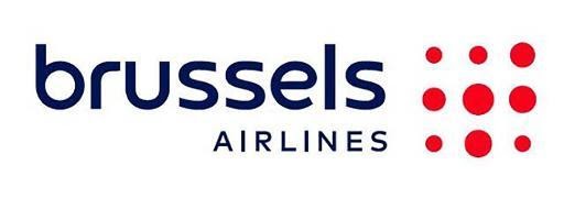
Brussels Airlines’ new logo inherits a dot motif from its previous emblem that represented a lowercase “b” made up of red dots. Now, the company’s symbol is nine red dots of different sizes. The wordmark has been redesigned as well, featuring a bigger “Brussels”, still lowercase though, and an uppercase word “Airlines”.
Commenting on the logo, Brussels Airlines said it regards its new brand identity as a symbol for the future of the company. The company aspires “to reinvent itself”, expanding its fleet with new A320neo planes and digitalizing its services.

However, the rebranding was not without oddity. It turned out that the new BA look is not so new and fresh. At least, a logo with alike red dots against a white background is used by the news website Gazeta.pl from Poland.
In the Brussels Airlines account on Facebook, the Polish edition jokingly commented: “Hi Brussels Airlines! We like your new logo, great minds think alike!” Also, Gazeta.pl hoped that the owners of both companies would address the issue.








Leave a comment