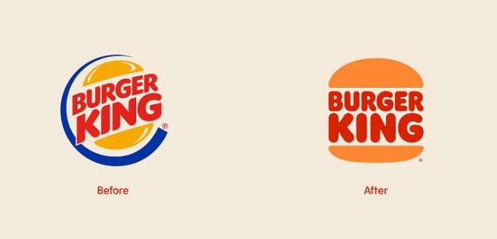
According to the company’s press-release, the updated logo with its minimalistic design reminds of the seamless evolution of the brand, while paying homage to its rich history. Copying Burger King’s vintage logotype in general, the new emblem, nevertheless, is distinguished with more intense colors, a bit reshaped bun halves and a new custom typeface called “Flame” whose design is intended to reflect the chain’s “bold, rounded and yummy” food.
As Burger King’s chief creative officer Rafael Abreu said, the chain decided to get back to the vintage design as it is the best visual reflection of Burger King, being a true classic for the brand. The logo is also a sign of the fact that the company will pay greater attention to its food instead of service speed, Abreu added.
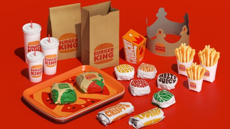
The renovated emblem will mark the Burger King packaging that will also carry pictures of ingredients and words describing the food like “crunchy” or “crispy”, drawn in a cheerful manner. Burger King’s new look will also appear in the design of its restaurants remodeled accordingly to the social distancing rules. Some of them will receive multi-lane drive-thrus, takeout counters, burger pick-up lockers and more.





Leave a comment