The US food brand 
Campbell’s has taken the rebranding, carried out for the first time in many years, as a chance to launch an NFT Art Collection. The company owned designs, created by artist and illustrator Sophia Chang, which are based on the NTWRK e-commerce platform, the largest platform on the NFT market. Using the NFT system (non-fungible tokens), virtual merchandise, including digital pieces of art, can be assigned with a non-fungible token.
Art objects, such as pictures, are increasingly being sold in digital form. More and more companies like Charmin or Taco Bell, as well as celebrities like Snoop Dogg or Lindsey Lohan, jump on the bandwagon of NFT.
Launching the first NTF art objects, Campbell’s would like to highlight the modern artistic mean and celebrate the place the brand took in the pop art since Andy Warhol’s era.
 .
.
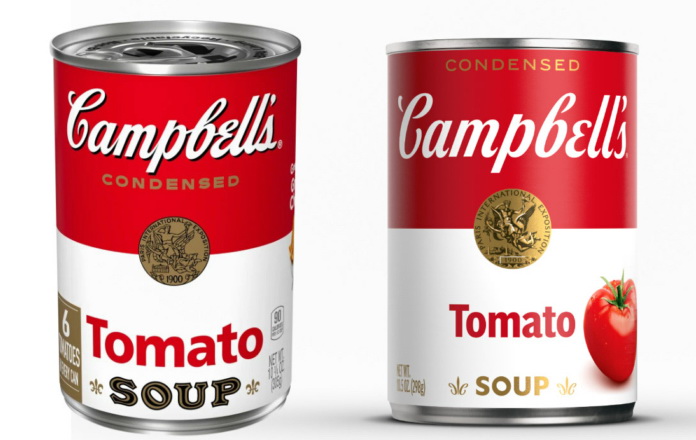
As for Campbell’s new design, the wordmark, based on the signature of the brand’s founder Joseph Campbell, has been altered, dropping the connections between the letters as well as the loop in the “b”. All the product names were redesigned in a different typeface as well. The package design retains the distinctive color division (red top and white bottom) and the central position for the gold medal Campbell’s won at the 1900 Paris Exposition.


Leave a comment