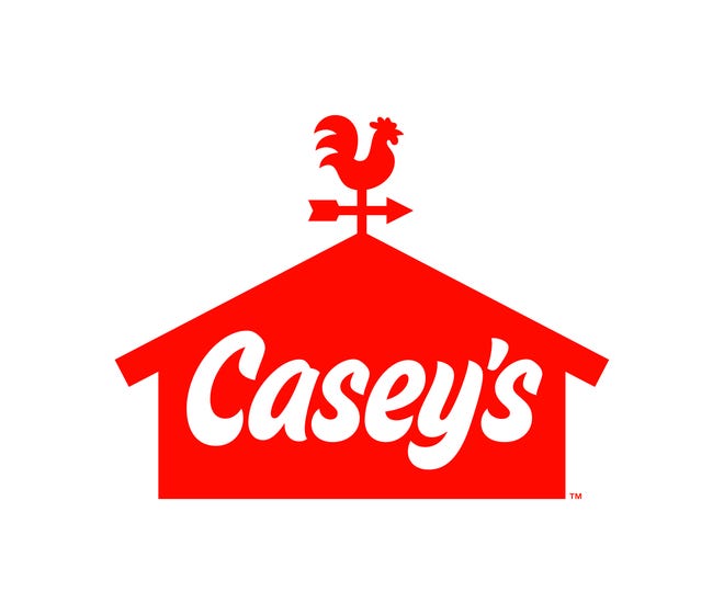
Casey’s General Store, a gas station and convenience store chain operating in 16 states in the Midwest, is changing its look for the first time since its inception in 1959. Realizing that its name is too long and its logo is too complicated for 2020, the company has shortened the former to just Casey’s and simplified much the latter.

According to Casey’s, the rebranding was preceded by a research which showed that the “General Store” was unclear for younger customers, and the logo, representing a big barn with the company’s name in serif fonts and a weathercock on the top, looked old-fashioned.
Renovating its visual identity, the company has overhauled its traditional and recognizable symbols, creating a simplified emblem featuring a red silhouette of a barn with a rooster weathervane and the white wordmark “Casey’s” in a handwritten style. With all of this, the logotype looks quite modern, offering simple and easily perceived elements fitting for a convenience retail. The new branding will gradually appear across more than 2,000 stores of the chain.
As the company’s communication director Katie Petru said, the Casey’s new logo will help the business promote in the conteporary world including social media and other digital platforms. Indeed, the rebranding is starting a new chapter in Casey’s history as the company is launching a new website and a mobile application with loyalty programs, and also is planning to open new store in Ankeny, Iowa.


Leave a comment