Identity updating is a common step taken by local authorities to attract more visitors to their cities or towns. Following this strategy, the Dalian Culture and Tourism department has recently unveiled a new logo for the city, hoping it will assist in development of the local economy. The refreshing of the visual brand of Dalian, wouldn’t have drawn much attention if the city’s new welcoming emblem weren’t so similar to Disney’s logo.
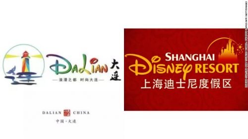
Indeed, if you take a look at the Dalian logo, you can easily see that the “D” and the “i” with a swoop over it are quite identical to those on the Disney logotype. Published on the Chinese social media Weibo, the emblem was mocked by users. They wondered if the tourism department officials have never seen the iconic Walt Disney logo, and supposed that an investigation should be conducted.
The carelessness of those who has selected the new emblem for Dalian is truly amazing as China has its own Disneyland launched by the American entertainment company in Shanghai in 2016. Though, it could have been done purposely, in hope that such a lettering would attract tourists like the Shanghai Disney park does.
Reportedly, the plagiarized logo was chosen for being “vivid” and having “few strokes” – this, according to the administration, corresponds to the spirit of Dalian. Responding to the criticism, the organizational committee said that this logo won’t be used and a new competition will be held.







Leave a comment