For more than three years, 
Indeed, the French automaker introduced a new version of its famous emblem a few days ago. According to the company, the oval sign with the double corner conveys the development of the brand. But, the press release published by Citroën makes no mention of the iteration that was made last year.
In October 2021, the brand href=”https://www.picpapa.com/news/citroen-introduces-new-logo”presented a new chevrons logo and a Citroën wordmark in a new corporate typeface. The branding was going to be used in digital environments and other visual means of communications.
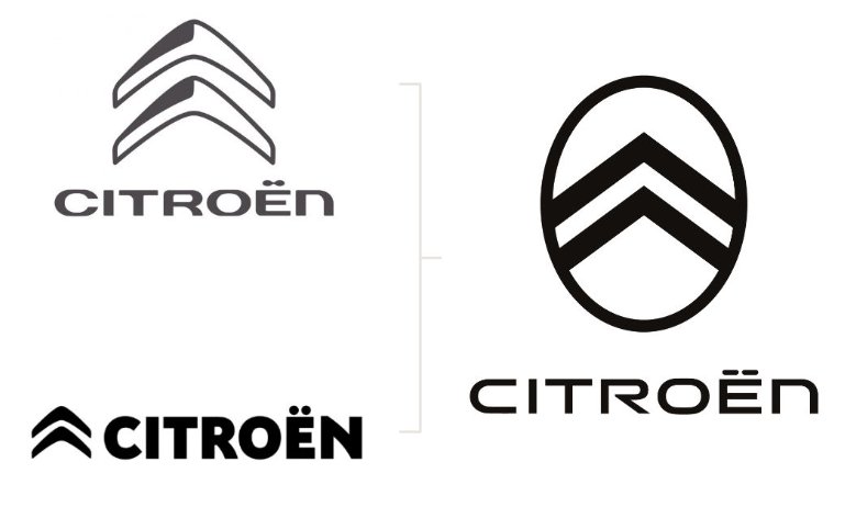
Obviously, the company wasn’t too confident with that version. Even now, the Citroën websites are displaying the logo introduced in 2016. The chromed chevrons are still in use for the manufacturer’s vehicles as well. As many car brands, Citroën makes distinction between the brand logo for communications/advertising and the brand emblem for cars and other brand products.
The brand’s new logo follows the original design of the Citroën emblem of 1919, and the chevrons are circumscribed by an oval again since the 1980s. Unlike the previous versions, the corners are sharp. The wordmark was also redesigned with wider letters with sharp edges to correspond to the logo.
Citroën says the logo is a part of a comprehensive identity renovation of the brand. With this, the French manufacturer wants to highlight its aspiration for e-mobility as well as widen its DNA towards accessibility, boldness, and wellbeing for customers, as the press release goes on.
The double corners oval will go beyond the digital environment to be also used for cars, encompassing all the elements of the branding – from merchandise to the signboards for dealerships. The company also says it will launch a new direction speaking the design language of future vehicles in which the emblem will become a recognizable feature of the Citroën signature.




Leave a comment