Today, we observe exponential growth in AI technology. The promises from the super-trained algorithms are as amazing as frightful. Over the past few weeks, ChatGPT, a neuronal network developed by OpenAI, has been in the spotlight due to its ability to create texts and chat like a real person.
However, when it comes to the practical application of artificial intelligence, the technology can be used, for example, in linguistics to automatize research processes dealing with a large amount of data. And it’s the challenge that is going to be met by Cohere, a Canadian company providing natural language processing (NLP) models that help companies improve human-machine interactions.
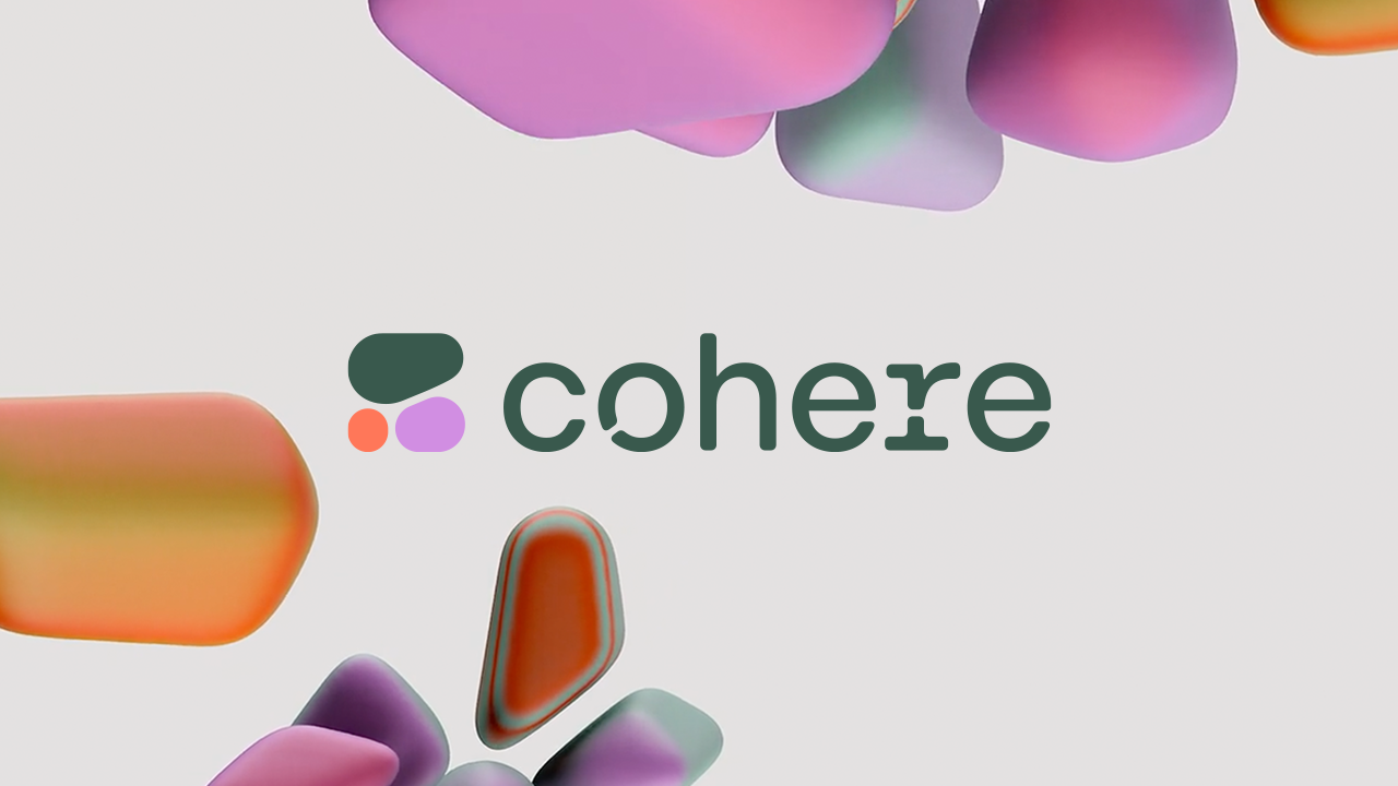
Founded in 2019, Cohere has been growing over the past three years amid demand for the NLP models. So, the company applied to Pentagram to develop a brand ecosystem that would help to advance NLP beyond experimental technology.
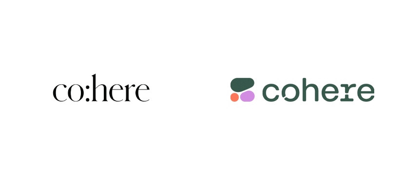
Cohere’s old logo demonstrated almost a literary approach to the startup’s activity. The nameplate was split by a colon that gave it a rhythm as soon as it was pronounced: co:here. The wordmark was designed in a serif font referring to the textual characteristic of the product offered by the company.
The linguistic model of Cohere offers countless opportunities for managing and reproducing a language more rapidly than ever. From this point of view, the relationships between humans and machines will move in the direction which has to be opened today.
In accordance with this idea, Pentagram’s work to entirely remaster Cohere’s image is based on a concept of a “new nature”. It tells how to connect the fluidity and inconstancy of nature with the rationalism and efficiency of computing. The visual identity thus revolves around the so-called Voronoi pattern inspired by a partition diagram named after mathematician Georgy Voronoi. This pattern can be found across the biological world, including the skin of giraffes and the wings of dragonflies. “Just like the natural environment represented by a network of living cells”, the studio explains.
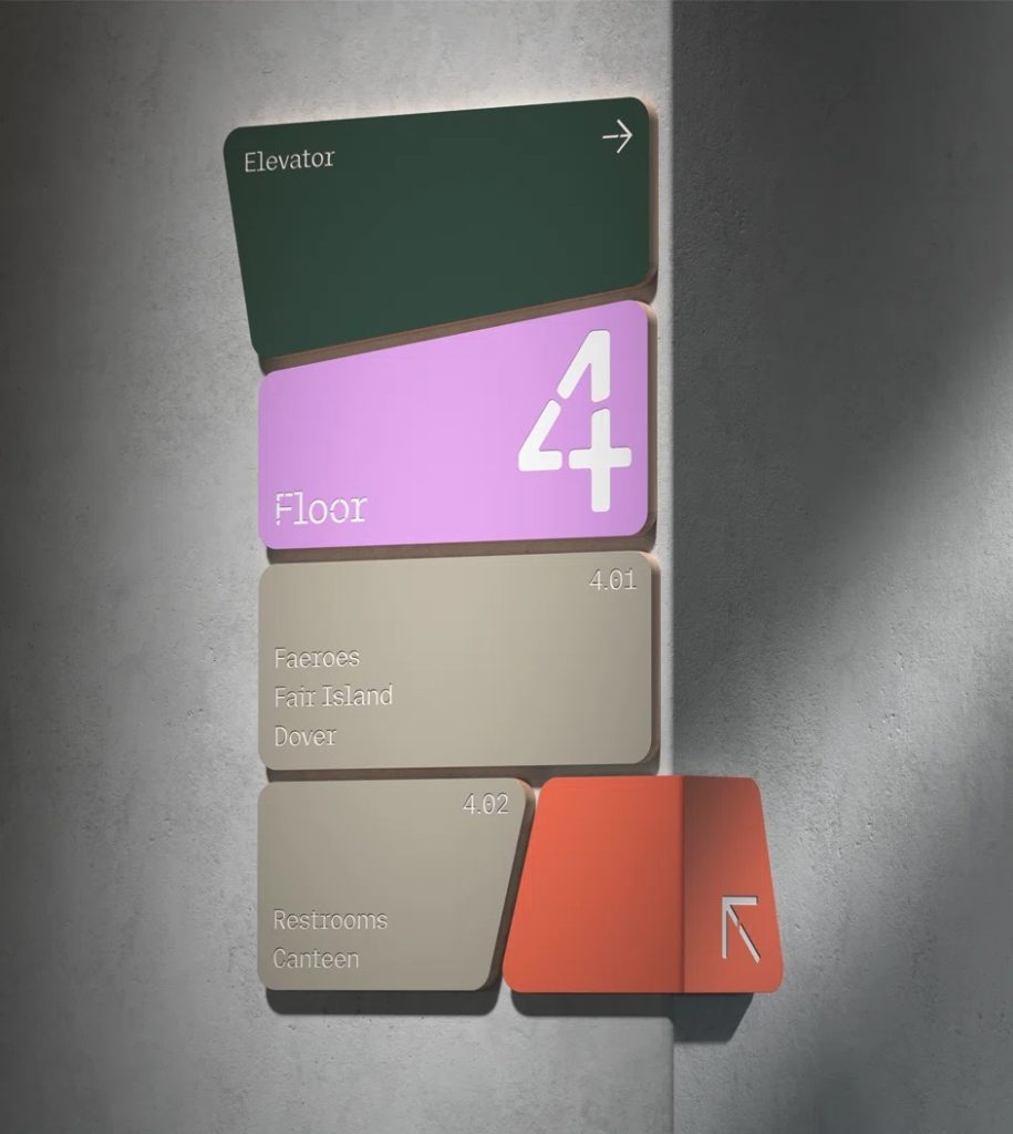
The new Cohere logo includes a sign made up of three elements. Colored in Mineral Green, Wisteria, and Bittersweet, these “cells” are depicted as if they are in different stages of development. A similar “cell design” is designated for the Cohere wordmark. Essentially, it’s a custom sans-serif typeface that will partly be used for digital and printed materials. The logo version features letterforms designed with Voronoi cell gaps.
Making up a sequence of graphic languages, Pentagram has managed to create a reliable and integer brand ecosystem. While this specific approach to the natural and digital worlds seems amazingly uncommon, it demonstrates humanity and singularity, revealing Cohere placing itself in a digital and technological domain. In almost a dichotomous co-existence, the cells adjoin lines of code, and information takes organic forms.






Leave a comment